All Posts

Greetings, insignificant souls. You may call me … Gregor Castamere. It is not my true name. I stalked this strip of land when it was called New Amsterdam. My family’s name is well known. I have lived for more than 600 years, concealing my terrible secret. I am a vampire.


Perhaps it is my astrological sign, but as a Gemini, I seem to be cursed blessed with a duality that consists of balancing my creative side with exacting nature of my logical side. In my personal life, I enjoy woodworking. Whether it is creating “art in the round” from a


The Global Hadoop market was valued at $1.5 billion in 2012 and is expected to grow at a compound annual growth rate of 58.2 percent, to reach $50.2 billion by 2020, according to a Hadoop Market Analysis report prepared by Allied Market Research. There is no doubt that IT teams are
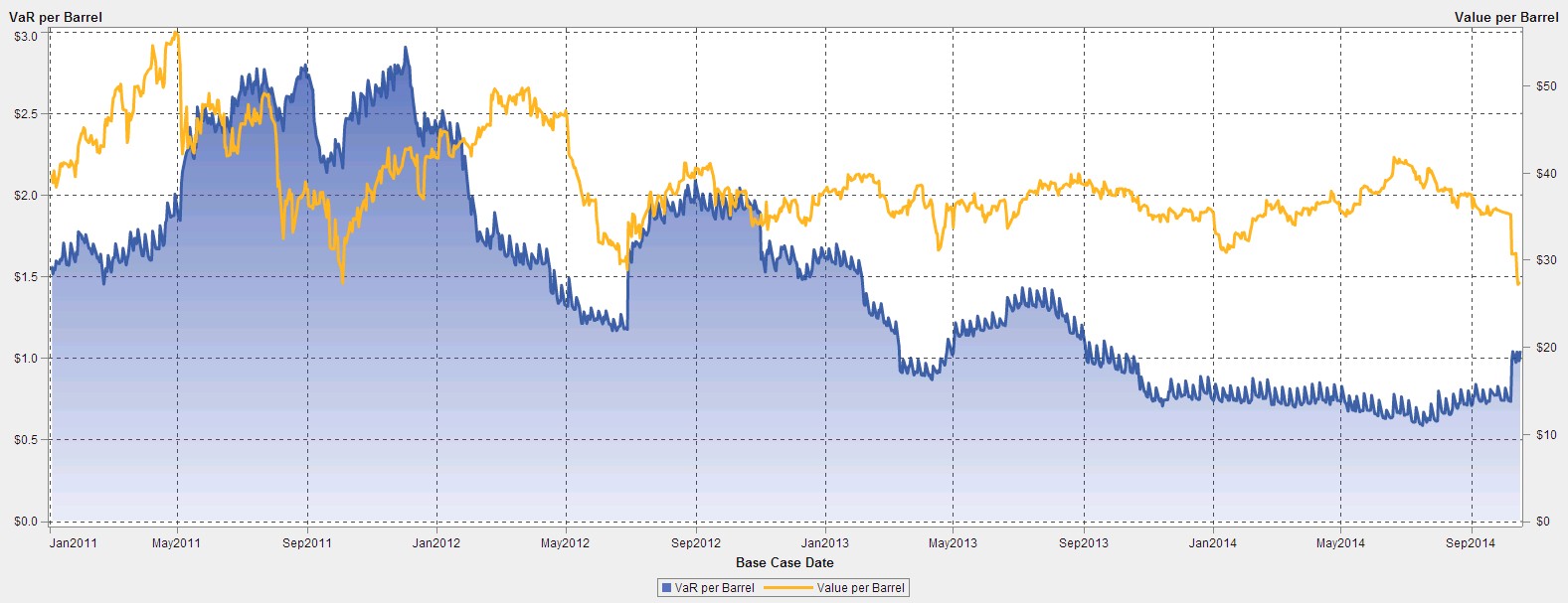

Volatility. It’s a business reality for energy market participants and it’s been a wild ride for the oil marketing business over the past few weeks. How has your energy risk data helped you navigate the recent increase in volatility and precipitous price drop? This month, we are launching a recurring


Perhaps the greatest legacy that Ford Motor Company’s former chief executive, Alan Mulally, left behind is a culture of analytics. Ford began using analytics in the late 1990’s, but it wasn’t until their financial woes in the 2000’s and Mulally’s arrival in 2006, that analytics started to be used regularly for


If you are a citizen of a western industrialized country and were born in the 1970s, you probably grew up in a multicultural society. Personally, I come from such a society and I was always extremely excited about meeting people with different cultural backgrounds. My classmates and friends came from
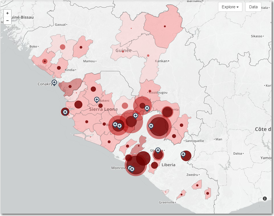

In a previous blog post, I showed how to layer colored areas on a SAS map to show both countries, and the areas within countries that had cases of Ebola. But as the Ebola epidemic has spread, more data has become available, and in this blog I show how to

Last week, I was fortunate enough to attend the Insurance Networking News Analytics Symposium. This great event had several engaging speakers. As analytics becomes more prevalent within insurance, it was refreshing to see that many organizations discuss their successes and share best practices in this essential aspect of the business.


Did you know: For 13 percent of car buyers a new vehicle without internet access is a no-go? Obviously, no-go means no-buy. Thirteen percent! If I have ever seen a market demand, it is this. For sure, the industry will respond to that. The management consulting company Bain even expects

Heat maps are a great way to visualize the bi-variate distribution of data. Traditionally, a heat may may have two numeric variables, placed along the X and Y dimension. Each variable range is sub divided into equal size bins to create a rectangular grid of bins. The number of observations
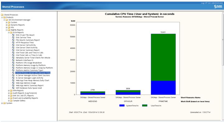

If you’ve used SAS Environment Manager, you know what kind of information it’s capable of providing – the metrics that show you how the resources in your SAS environment are performing. But what if it could do more? What if it could automatically collect and standardize metric data from SAS


We seem to hear about new diets almost on a weekly basis. Many of these diets will come and go, but here are some that have been around for a very long time. There are also heated debates around what diet is the best: Vegetarian, Vegan, Paleo, Low Carb, High


Companies like Amazon, Netflix, Zappos and Pandora have changed what consumers expect from a brand – they want brands to “know” what they want before they ask for it. To provide those kinds of personalized products and services, brands have to collect and analyze huge quantities of customer and industry


In a city built on hedging your bets, it is fitting that the Analytics 2014 conference kicked off Monday in Las Vegas with a look at all the unscientific ways people try to predict the future. John Elder, Founder and President of Elder Research, Inc., entertained the audience with examples of how


Europol, the law enforcement agency of the European Union, in its recently released 2014 Internet Organized Crime Threat Assessment (iOCTA), cited a report by U.S. security firm IID that predicts that the first “online murder” will occur by year end, based on the number of computer security system flaws discovered