All Posts
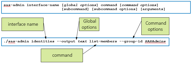

SAS Viya 3.3 introduced a set of command-line interfaces that SAS Viya administrators will find extremely useful. The command-line interfaces(CLI) will allow administrators to perform numerous administrative tasks in batch as an alternative to using the SAS Environment Manager interface. In addition, calls to the CLI’s can be chained together


Much has been written about the value that North Carolina’s Criminal Justice Law Enforcement Automated Data Services (CJLEADS) system has brought the state’s court personnel and law enforcement officers. CJLEADS integrates dozens of NC criminal justice and law enforcement data sets, a vast improvement over the state’s legacy processes. Law

인공지능 활용 엔터프라이즈 분석 가능한 ‘SAS 플랫폼’ 최신 오퍼링 출시 SAS 코리아, 최신 머신러닝·자연어처리 등 인공지능(AI) 활용 분석 기능 강화 머신러닝·자연어처리로 비정형 데이터 가치 극대화 및 전 과정 시각화하는 엔드투엔드 비주얼 환경 제공 웹 인터페이스로 전체 분석 라이프사이클을 통합하고, 초보자부터 전문가까지 전사 협업 지원 미국적십자사·시스코·뮌헨재보험 등 도입… 분석 인사이트로 비즈니스
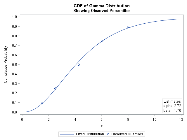

Data analysts often fit a probability distribution to data. When you have access to the data, a common technique is to use maximum likelihood estimation (MLE) to compute the parameters of a distribution that are "most likely" to have produced the observed data. However, how can you fit a distribution


Have you ever experienced that “gut feeling” ….you know the one that’s trying to tell you something and you don’t know why? I remember having a feeling I couldn’t quite explain fifteen years ago. There was a job opportunity in Canada. As a way to entice moving there, I was provided


Cuando se trata de invertir en nuevos mercados, mantener la rentabilidad de un negocio, o ayudar al crecimiento de una marca o compañía, las gerencias corporativas deben asumir retos que suponen riesgos. Sin embargo, la avanzada tecnología de analítica digital permite estudiar diversas variables y factores, con base en complejas

The R SWAT package (SAS Wrapper for Analytics Transfer) enables you to upload big data into an in-memory distributed environment to manage data and create predictive models using familiar R syntax. In the SAS Viya Integration with Open Source Languages: R course, you learn the syntax and methodology required to
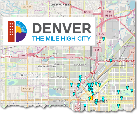

Are you going to Denver, Colorado, and wondering what fun/interesting/eclectic things you can do there? Then this is the map for you! For the past couple of years, I've made maps of the city SAS Global Forum is in, pointing out some of the attractions that conference attendees might want
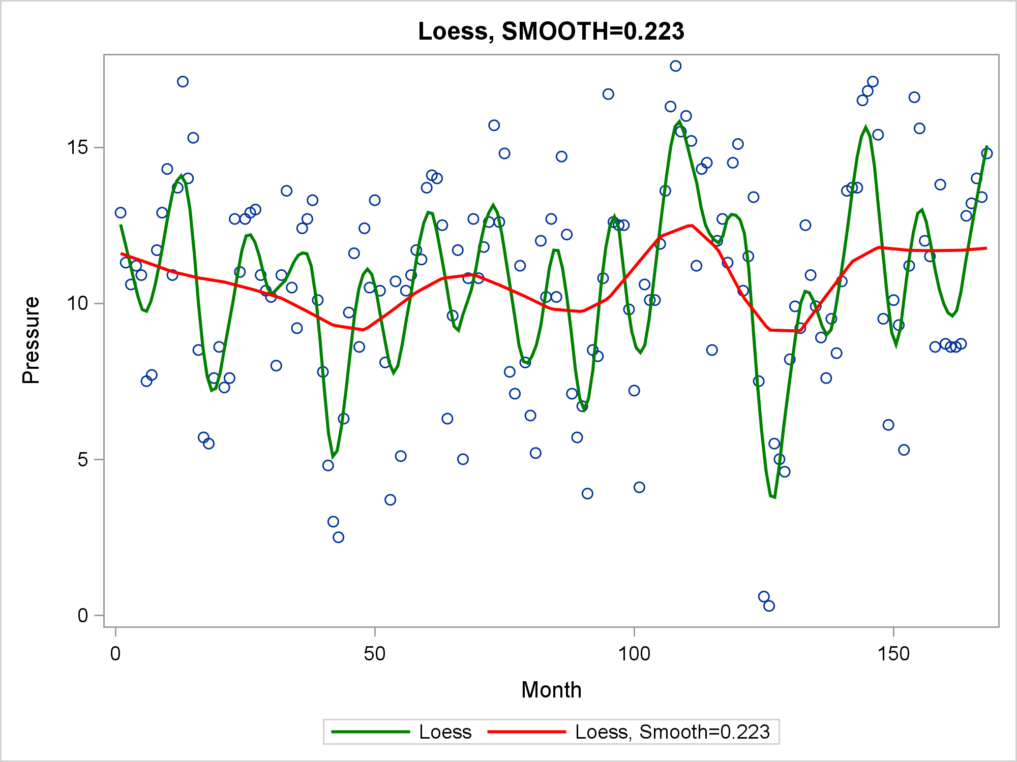

The LOESS statement in PROC SGPLOT finds a fit function while making no assumptions about the parametric form of the regression function.

‘국영수코(co)’라는 신조어 들어보셨나요? 국어, 영어, 수학, 코딩(coding)의 약자인데요. 교육부의 ‘2015 개정교육과정’에 따라 올해 3월부터 중학생, 내년부터는 초등학교 5, 6학년 학생의 소프트웨어(SW) 교육이 의무화되면서 코딩 교육과 관련 자격증 열풍이 불고 있습니다. 미국, 영국 등 IT 선진국들은 이미 발 빠르게 코딩 교육을 의무화하며, 4차 산업혁명 시대의 인재 확보에 나섰는데요. SAS 역시 2014년, 학습이나 비상업적인


Planeación y optimización, la fórmula para las empresas demand-driven Sus clientes tienen mucho qué decir; más de lo que usted cree. ¿Los está escuchando? No necesariamente tiene que charlar con ellos cuando realizan una compra –en la tienda o el portal de comercio electrónico. Lo que comunican va más allá


“There’s so much free time on my work calendar this week” said No SAS Employee Ever. For most of us there's never a lot of downtime at work but there are certain times of the year that we consider our ‘busy season’. For Work/Life it’s January, right after the holidays.


Numa era em que o cliente/consumidor ganha ainda mais importância junto de todos os negócios as empresas têm de se valer de todas as ferramentas existentes com o intuito de proporcionar melhores e mais valiosas experiências. O recurso a ferramentas analíticas e à Inteligência Artificial (AI) é, talvez, a melhor


Joyce Norris-Montanari starts this two-part series with some suggested actions you can take to help you comply with the GDPR.


최근 금융감독원은 2017년 국내 보이스피싱 피해액이 2,423억원에 달하며, 전년 대비 26% 증가했다고 발표했습니다. 특히 하반기에만 가상화폐를 이용해 148억원이 탈취된 것으로 밝혀지며 논란이 되고 있는데요. 이렇게 IT 기술이 발달함에 따라 신종 자금세탁 수법이 등장하면서 사기 탐지는 더욱 어려워지고 있습니다. 결국 산업에 관계없이 모든 금융 범죄 조사관은 사기 탐지 기술과 전략을 지속적으로 강화하고,