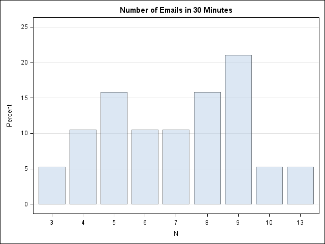
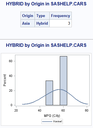
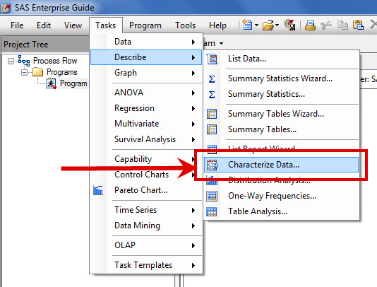
Search Results: sgplot (969)

Data Visualization
Sanjay Matange 0
Bar chart with response sort

A graph in a recent article in Fortune magazine caught my eye.  The graph shows the cost of hosting the Summer Olympics over the past eight events.  Here is what I termed the "Medal" graph. Now, practitioners of the art of Effective Graphics would likely find some shortcomings in the graph.  Clearly

Data Visualization
Sanjay Matange 0
PharmaSUG 2012 update

PharmaSUG 2012 conference drew to a close today, concluding two and a half days packed with papers, presentations, posters, hands-on demos and super demos by SAS staff.  While the weather outside was a bit chilly from time to time, the conference what hopping with many user papers on how to

Rick Wicklin 0
The curious case of random eigenvalues

I've been a fan of statistical simulation and other kinds of computer experimentation for many years. For me, simulation is a good way to understand how the world of statistics works, and to formulate and test conjectures. Last week, while investigating the efficiency of the power method for finding dominant

Data Visualization
Sanjay Matange 0
Axis values and hint

Getting the axis values just right generally requires some work, and the values you want can change from case to case.  One such example was discussed by Dan Heath in his post on custom axis values.  Here Dan shows the usage of non uniform axis values using the VALUES option on

Data Visualization
Sanjay Matange 0
Bar chart on interval axis

Recently, a user asked about creating a Bar Chart of Value by Date, where the dates are displayed on a scaled interval axis.   Consider this simulated data set of value by date and treatment shown below.  This data set only has one value for each date and treatment combination. We can use the VBAR statement

Rick Wicklin 0
The Poissonness plot: A goodness-of-fit diagnostic

Last week I discussed how to fit a Poisson distribution to data. The technique, which involves using the GENMOD procedure, produces a table of some goodness-of-fit statistics, but I find it useful to also produce a graph that indicates the goodness of fit. For continuous distributions, the quantile-quantile (Q-Q) plot

Data Visualization
Sanjay Matange 0
Simpler is better

A recent article in the SAS and R blog was about current winter temperatures in Albany, NY.  The temperature data for the recent winter (Dec 2011 - Mar 2012) was plotted on a polar graph. Robert Allison posted an article on displaying the same data as a Polar Graph using SAS/GRAPH .  Here is his

Rick Wicklin 0
Creating a periodic smoother

In yesterday's post, I discussed a "quick and dirty" method to smooth periodic data. However, after I smoothed the data I remarked that the smoother itself was not exactly periodic. At the end points of the periodic interval, the smoother did not have equal slopes and the method does not

Rick Wicklin 0
Smoothers for periodic data

Over at the SAS and R blog, Ken Kleinman discussed using polar coordinates to plot time series data for multiple years. The time series plot was reproduced in SAS by my colleague Robert Allison. The idea of plotting periodic data on a circle is not new. In fact it goes

Data Visualization
Sanjay Matange 0
Bar-Line graph

A user recently posted a question in the SAS communities forum about  how to best display two measures by one classifier using a Bar-Line graph, where the scale of the two measures is vastly different.  This got me thinking about various different ways to represent such data.  Here are some of my thoughts,

Data Visualization
Sanjay Matange 0
Cluster groups

The topic of cluster groups comes up often.  By cluster group I am referring to the feature in bar charts where the group values are displayed side by side. With SAS 9.3, SG Procedures support stack or cluster grouping for Bar Charts and overlay or cluster grouping for all other

Data Visualization
Sanjay Matange 0
Graphs with class

When the data is classified by multiple class variables, you can certainly create graphs using BY variables.  This results in separate graphs, one for each level of the BY variable crossings.  Each graph is scaled by its own data subset, and comparisons across BY levels is harder. When comparisons need to be

Rick Wicklin 0
Quantiles of discrete distributions

I work with continuous distributions more often than with discrete distributions. Consequently, I am used to thinking of the quantile function as being an inverse cumulative distribution function (CDF). (These functions are described in my article, "Four essential functions for statistical programmers.") For discrete distributions, they are not. To quote

Rick Wicklin 0
Testing data for multivariate normality

I've blogged several times about multivariate normality, including how to generate random values from a multivariate normal distribution. But given a set of multivariate data, how can you determine if it is likely to have come from a multivariate normal distribution? The answer, of course, is to run a goodness-of-fit

Data Visualization
Dan Heath 0
Roses are red, violets are blue...

This classic start to a romantic poem assumes that the correct colors are always assigned to the correct flowers; but, for those who create graphs for reports, consistent color assignment can be more of a challenge than an assumption. This challenge is particularly true for the display of group values.

Data Visualization
Sanjay Matange 0
Comparative density plots

Recently a user posted a question on the SAS/GRAPH and ODS Graphics Communities page on how to plot the normal density curves for two classification levels in the same graph. We have often seen examples of a  distribution plot of one variable using a histogram with normal and kernel density curves.  Here is a simple example: Code Snippet:

Data Visualization
Dan Heath 0
A (tool)tip for band plots

Recently, I had a discussion with a user concerning the volume of imagemap data generated for an interactive,  web-based visual contain a large number of graphs. The large amount of imagemap data was causing problems with the current version of their web browser. The graphs consisted of either bar charts

1 28 29 30 31 32 33