When the data is classified by multiple class variables, you can certainly create graphs using BY variables. This results in separate graphs, one for each level of the BY variable crossings. Each graph is scaled by its own data subset, and comparisons across BY levels is harder.
When comparisons need to be made across by variable levels, a classification panel is useful. The SGPANEL procedure is a great tool to create such classification panel graphs. Based on the need, panels can be in columns, rows or both. The SGPANEL procedure supports multiple types of layouts for the panel, and you can select the one most suitable for your needs. These are:
- Panel (default) - supports multiple class variables. Only cells that have data are displayed. Cell headers show the class values.
- Lattice - for Row x Column layout, one class variable each. All crossings are displayed with column and row headers.
- RowLattice - Lattice of rows. Row headers are shown on the side.
- ColumnLattice - Lattice of columns. Column headers are shown at top (or bottom).
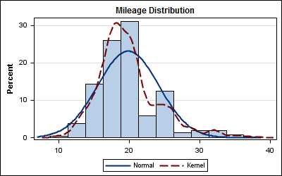
Here is a histogram of mileage for all the cars (except Hybrids) for the SASHELP.CARS data set:
Code:
title "Mileage Distribution"; proc sgplot data=sashelp.cars; where type ne 'Hybrid'; histogram mpg_city; density mpg_city; density mpg_city / type=kernel; xaxis display=(nolabel); yaxis grid; run; |
This data is classified by country of origin. To compare car mileage by ORIGIN we can create a panel by ORIGIN arranged as multiple columns in one row, useful to compare the density magnitude across cells:

Code:
title "Mileage Distribution"; proc sgpanel data=sashelp.cars; where type ne 'Hybrid'; panelby origin / novarname rows=1; histogram mpg_city; density mpg_city; density mpg_city / type=kernel; colaxis display=(nolabel); rowaxis grid; run; |
Only change needed it to replace the SGPLOT procedure with the SGPANEL procedure along with the PANELBY statement. To compare the distribution of the data along the analysis variable, we could arrange the panel as multiple cells in one column, as follows:

Code:
title "Mileage Distribution"; proc sgpanel data=sashelp.cars; where type ne 'Hybrid'; panelby origin / novarname layout=rowlattice; histogram mpg_city; density mpg_city; density mpg_city / type=kernel; colaxis display=(nolabel); rowaxis grid; run; |
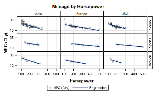
The LAYOUT=LATTICE option creates a Row x Column panel as shown below with ORIGIN and TYPE as class variables:
Code:
title "Mileage by Horsepower"; proc sgpanel data=sashelp.cars; where type eq 'Sedan' or type eq 'Sports' or type eq 'Wagon'; panelby origin type / novarname layout=lattice onepanel; scatter x=horsepower y=mpg_city / markerattrs=(symbol=circlefilled) transparency=0.8; reg x=horsepower y=mpg_city / nomarkers; colaxis grid; rowaxis grid; run; |
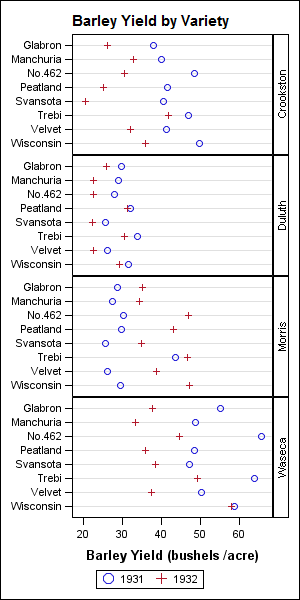
The class panel is useful to identify the anomaly in the "Barley" data set as discussed in this paper. I have reduced the data just for demonstration purposes.
Code:
title "Barley Yield by Variety"; proc sgpanel data=barley; panelby site / novarname layout=rowlattice onepanel; dot variety / response=yield group=year markerattrs=(size=11); discretelegend; rowaxis display=(nolabel); run; |
SAS Code: Class_Panels


6 Comments
This is a great tip! Previously I thought that you could only have column headers in SGPANEL, but it's good to know that you can also have row headers!
Your book is really very good but very thin on how to get your graphs to look good with respect to font rendering quality, etc. The last couple of chapters are just way too brief and confusing. I can make all the graphs in the book but none of them look good enough to put in a publication because the labels look jagged, nothing like the labels and text in your charts. It would be helpful if you could show us the ODS code that you used to get charts of high quality, small and large that would be suitable for publication. If I make a chart in R or STATA it looks great right from the start, not so in SAS. Lots of experimentation with various ODS options has not produced good results.
Thanks a lot -
Mostly, I have used IMAGE_DPI=300 for all small graphs in the book. This generally produces good results. You can go higher. It is best to use a graph width and height close to what will be used in the final document. Since the graphs in the book are about 3" x 2", I have used the following settings:
ods listing image_dpi=300;
ods graphics / WIDTH=3in HEIGHT=2in;
The default DPI setting for LISTING destination is 100. This will result in a balance between image quality and image size that works well while you are in the "Draft" stage. Setting higher DPI consumes more resources, both image output size and processing time. So, it is left to the user to request higher DPI output. You probably want to do that for the final graph that you will use in the report. With SAS 9.3, real scalable vector graphics outout is created for PDF, PS and EMF formats. This should provide the best quality.
I will work up a blog article on the topic. It is good to know you are finding the book useful.
Pingback: Implement BY processing for your entire SAS program - The SAS Dummy
Hi,
Im used to create the density plots using proc SGPLOT . I have created Normal, and Kernel types. I'm looking for an option to create the following density curves:
1) Uniform density plots of ED50 Value(I have calculated the ED50 value already)
2) Inverse gamma distribution curve for Variance(variance have been already calculated, not sure how to plot it). Please note I couldn't find a function or statement I sgplot to create these.
ED50 ~Uniform(5, 50)
Var (σ2) ~ inverse gamma(1,1)
Kindly help?
Thanks.
If you have already computed the density curves, use the SERIES plot to plot the values by providing the X and Y values.