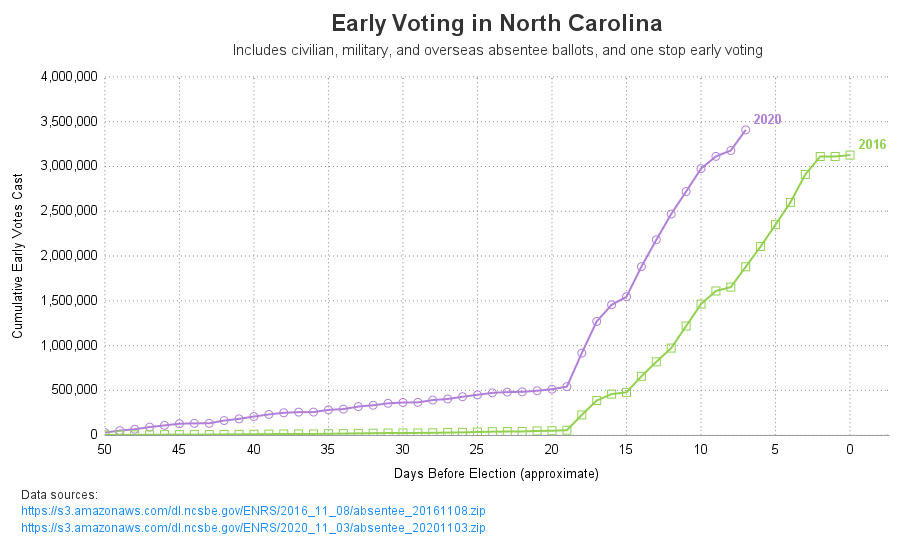
Here in the United States, we have our general election (where we elect the president) every four years - and 2020 happens to be one of those election years. This time we seem to have a lot more people voting early. I can't tell you the reason they're voting early
Tag: SGAnnotate
We've had record high 90+ degree temperatures here in the southeast US this past week (September / October), and it has made me appreciate having an air conditioner. Indeed, air conditioners were pretty much invented here in North Carolina (see Eric Cramer). They are used in pretty much every building
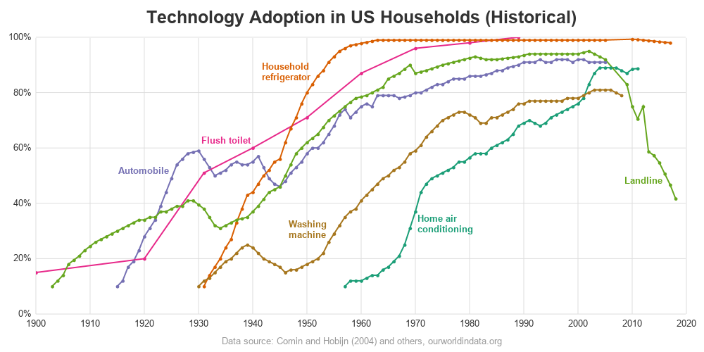
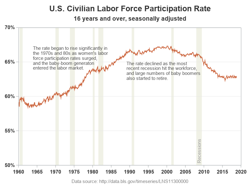
Plotting just your data often helps you gain insight into how it has changed over time. But what if you want to know why it changed? Although correlation does not always imply causation, it is often useful to graph multiple things together, that might logically be related. For example, recessions
You can use SG annotation to display graphs inside of other graphs.
You can use PROC SGPLOT, BY variables, and a SG annotation data set together to put separate annotations into each BY group. However, you need two more steps to make it happen. This post shows all of the steps necessary to put different annotations into each graph when you have a BY variable.
DRAW statements provide to GTL what SG annotation provides to the SG procedures--a way to add text, shapes, lines, and arrows to graphs.
This post shows you how to animate text to create a message that appears one character at a time.
SG annotation is a powerful technique for adding text, lines, arrows, shapes, and images to graphs. This post provides a macro that can help you when you make a mistake in writing the annotations.
Fitting of long category values on a x-axis is usually a challenge. With SAS 9.4, the SGPLOT procedure tries to fit the values by first splitting the values at white space to see if the values will fit in the space available. This normally works well for a small number
In his recent blog article on Drawing Paths on a Map using SGPLOT, Robert Allison showed us visually the path computed by the captain of his return flight from Orlando. As usual, one can rely on Robert to put in visual form some interesting bit of information. Thanks, Robert. I
In the previous article I described a way to create a box plot with multiple connect lines using SAS 9.40M1 or later release . I created the graph using SGPLOT with VBOX and overlaid SERIES statements. Such an overlay of a basic plot on the VBOX statement is supported starting
I have written a new book on advanced ODS Graphics examples. It is available as a free PDF file on the web. It is in color, and all of the SAS code is available by double clicking a link at the beginning of each example. Advanced ODS Graphics Examples Update:
In the past few weeks, I have written two posts on SG annotation and on saving and then modifying the graphs that analytical procedures produce: Modifying dynamic variables in ODS Graphics Annotating graphs from analytical PROCs Today, I finish this series with one more post. This one shows how you
There are many ways to modify the graphs that SAS creates. Standard graph customization methods include template modification (which most people use to modify graphs that analytical procedures produce) and SG annotation (which most people use to modify graphs that procedures such as PROC SGPLOT produce). However, you can also
Often, we have data where most of the observations are clustered within a narrow range, with a few outliers positioned far away. When all the data is plotted, the axis is scaled to accommodate all the data, thus skewing the scale. Techniques to handle such data have been addressed earlier
A key element of graphs used for analysis of safety data for clinical research is the inclusion of statistical data (or tables) about the study that are aligned with the x axis of the graph. A common example of this comes from the paper "Graphical Approaches to the Analysis of