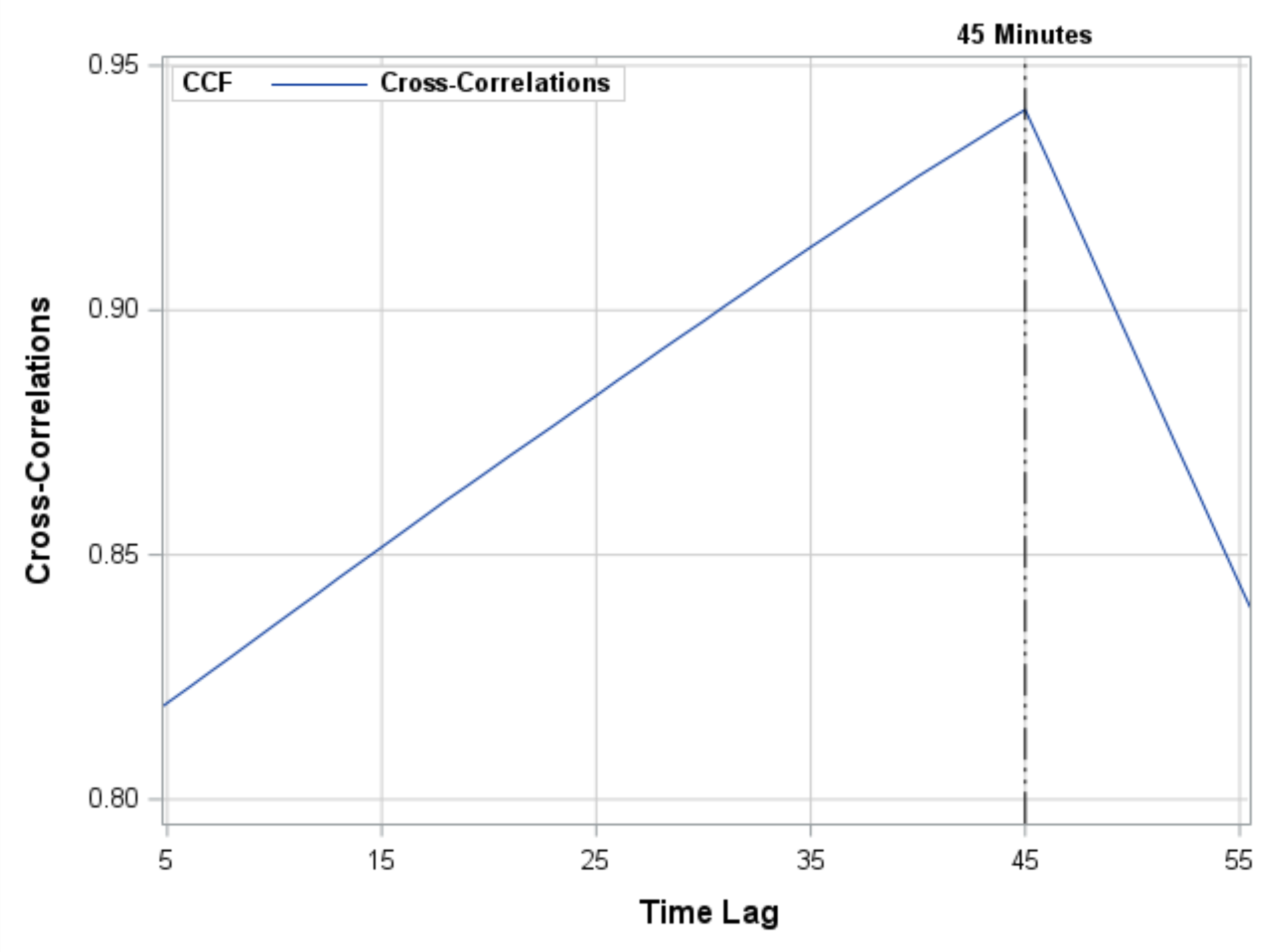
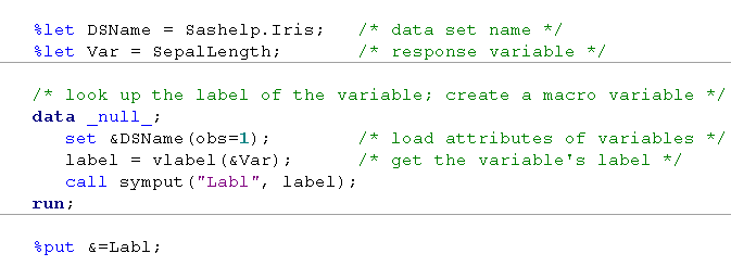
In 2013 I published 110 blog posts. Some of these articles were more popular than others, often because they were linked to from a SAS newsletter such as the SAS Statistics and Operations Research News. In no particular order, here are some of my most popular posts from 2013, organized
English
Sure, you have a great looking table and you produce it with PROC TABULATE. And then, bam! Your boss comes along and decides that since your output looks so good in Word, that he’d like that boilerplate paragraph inserted automatically. Currently, you produce the tables and then pass the RTF
Because I began my SAS career in the Publications division, I like to think that I have a keen eye when it comes to SAS documentation. When I first visited the SAS 9.4 online documentation, I immediately noticed that it had a different look. Examine the image below; can you
Ron Cody starts things off right with our first SAS tip of 2014. If you resolve to become a better statistical programmer this year, Ron's book SAS Statistics by Example is a great place to start. After you take a look at this week's free excerpt from the book, head over to Ron's author page. You'll
Recently a user new to GTL and SG procedures asked how to create a Bland-Altman graph on the SAS Communities site. He included an image of the resulting graph to indicate what he wanted, I described to him how that graph can be created, but since he is new to the art
Welcome to the SAS administrator blog series for 2014! Back in early 2013, the most popular posts on the SAS Users Groups blog were all about the roles and responsibilites of SAS administrators. I was reminded of them during a presentation at WUSS 2013 in Las Vegas. Carey Smoak of
In my previous post I described the new Polygon plot statement that is included with the SAS 9.4M1 release. So, a valid question is - what is my motivation for discussing the new features in SAS 9.4M1 when most users are at SAS 9.3 or SAS 9.2 versions? Here are a
In November, I resumed the “it’s all about the data” series, laying a foundation for helping SAS administrators understand how SAS stores and manages data for use in business intelligence and analytic applications. For this article, I culled our internal Thotwave knowledge base and queried our consultants who get questions
My children learned this skill early in life: when you want to secure permission for a questionable activity (say, "watch 5 hours of Phineas and Ferb" or "eat a bowl of candy for breakfast"), you should approach the most lenient adult in the household. In my early days of fatherhood,
The SAS 9.4 Maintenance 1 release is now shipping to users. This is great news for GTL and SG procedures users as this release includes some useful new features. Some of these are in direct response to your requests, and others are enhancements that we think you will come to like.
Analytics is not just about algorithms and numbers. Every analytics practitioner will tell you that there is an “art” to it – when to combine variables to extend data in the data warehouse, what options to set in the algorithm to get the best balance of accuracy and interpretability, how
As we near the heights of this festive holiday season, children have thoughts of sugar plums dancing in their heads and adults look forward to a long winter’s nap, but we elves of the SAS media relations team reflect on the fruits of a year’s worth of labor. This is
Often we have situations where the category values on the graph have long character strings. This is often the case when graphing survey responses to questions. The questions may be sentences, sometimes moderately long. With SAS 9.4, GTL and SG now support the ability to display tick values split over
If there's anyone who represents the global nature of SAS software, it's Falko Schulz. He's a German who lives in Brisbane, Australia while he works for SAS R&D based in Cary, NC. Falko works on the team that produces SAS Visual Analytics, specifically the "explorer" portion of the tool. He
The farther you try to forecast into the future, the less certain you are -- how can you represent that graphically? One way is to draw a shaded/colored "confidence interval" around your forecast line, but this is something a lot of SAS users have trouble with. That's why I decided to create
Being so close before Christmas I thought it would be a good idea to see what route Santa Claus is planning this year. Not just because I'm living in Australia and Santa usually comes in t-shirts & shorts but also because it's a long way to get down here. So
SAS Visual Analytics is so easy to use – even a fifth-grader can do it! Take a look at Emily Short’s Visual Analytics demo that she put together for her school project. (Her dad, Nick Short, is a Sales Manager at SAS) Isn’t she adorable? Now that you see
We want to extend a huge thank you to everyone who donated their leftover (and excess) Halloween candy this year, you outdid yourselves!! We tipped the scales at more than 220 pounds of candy- 65 more pounds than we collected last year! Wondering what happened to all that Halloween candy?
O Christmas tree, O Christmas tree, Last year a fractal made thee! O Christmas tree, O Christmas tree, A heat map can display thee! O tree of green, adorned with lights! A trunk of brown, the rest is white. O Christmas tree, O Christmas tree, A heat map can display
A standard joke among venture capitalists is that often the only well-developed section of the many business proposals they receive is the exit strategy. “We’re going to be acquired for $10-20 million by a Fortune 500 company within 6-8 years.” Exactly how they are going to achieve that $10M valuation is,
Creating a Bar Chart with a table of statistical data aligned with the bars is a popular topic. With SAS 9.4, creating such graphs gets easier with the new AXISTABLE statement in GTL and SG procedures. But some use cases can flummox the latest gizmos. Such is the case I ran into recently. Here
As I crossed the finished line, I could feel the tears welling up. “Don’t do it," I thought. "Athletes don’t cry." Somehow, I managed to pull myself together, but instead of my usual post-race celebration of high fives and cheering on other runners, I walked to the race result board
“Life moves pretty fast. If you don't stop and look around once in a while, you could miss it.” We all remember that famous quote from Ferris Bueller’s Day Off and can probably relate to it. In the chaos of trying to find time for everything life throws at you
Drilling a well is costly, risky and fraught with hazards for both man and machine. So why does most well behavior surveillance rely solely on historical data? Why not include a data driven approach that can also predict what might happen next? One great example is wellbore breathing. Annular pressure
Recently a SAS/IML programmer asked a question regarding how to perform matrix arithmetic when some of the data are in vectors and other are in matrices. The programmer wanted to add the following matrices: The problem was that the numbers in the first two matrices were stored in vectors. The
Data on punched-cards, SAS software delivered on tape, jobs in the queue on the mainframe, printouts on green-bar paper ... we really appreciate all our SAS users, but if any of the above are part of your "SAS memories" we especially appreciate you! I guess I'm a computer geek, because
Last week I covered some of the interesting graph-related papers presented at WUSS. There were quite a few, so I broke up the report into two parts. Here is the second installment. In the paper Creating Graphical Patient Profiles using SAS by William Garner of Gilead Sciences, the author describes how to create
On any given day, on an average, good programmers spend maybe about 10-20% of their time writing code. And the remaining 90% thinking, researching, and experimenting to find the best design. With so much thinking time, they need every bit of help to reduce the amount of typing time. Not-so-good
Pomegranates are popping up everywhere and are in everything from ice cream and rice cakes to body wash and even candles! So what’s the big deal about pomegranates?
A heat map is a graphical representation of a matrix that uses colors to represent values in the matrix cells. Heat maps often reveal the structure of a matrix. There are three common applications of visualizing matrices with heat maps: Visualizing a correlation or covariance matrix reveals relationships between variables.