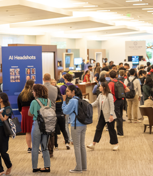
English

Analytics | Data for Good | Data Visualization
Robert Allison 0
How to make infectious diseases look better

The Wall Street Journal recently published some graphs about seven infectious diseases, and I tried using SAS to improve the graphs ... it's a veritable infectious disease (graph) bake-off! Let's start with Measles ... here's a screen-capture of WSJ's measles graph: In general, their graph is eye-catching, and I learned a lot

Data Visualization
Sanjay Matange 0
Margin Plots

Last week a user wanted to view the distribution of data using a Box Plot.  The issue was the presence of a lot of "bad" data.  I got to thinking of ways such data can be visualized.  I also discussed the matter with our resident expert Rick Wicklin who pointed

Advanced Analytics | Analytics
Mike Gilliland 0
Brilliant forecasting article from 1957!!! (Part 2)

Combining Statistical Analysis with Subjective Judgment (continued) After summarily dismissing regression analysis and correlation analysis as panaceas for the business forecasting problem, Lorie turns next to "salesmen's forecasts."* He first echoes the assumption that we still hear today: This technique of sales forecasting has much to commend it. It is based

SAS Events
Sara Jones, CMP 0
SAS love is in the air!

Love is in the air and things are starting to heat up for Valentine’s Day. OK—maybe not for Connecticut and the rest of the northeast buried in another foot of snow and more on the way! Perhaps some stories of love could help melt the ice away. They’re happening every

Data Management
Jim Harris 0
Crowdsourcing data improvement: Part 3

In this blog series, I am exploring if it’s wise to crowdsource data improvement, and if the power of the crowd can enable organizations to incorporate better enterprise data quality practices. In Part 1, I provided a high-level definition of crowdsourcing and explained that while it can be applied to a wide range of projects

1 216 217 218 219 220 328