In part 1 of this series we looked at how to acquire personal data from the Internet of Things for our own exploration. But we found that the data was not yet ready for analysis, as is usually the case.
In this part, we will look at how we can use SAS Visual Analytics to get the data in shape for our personal analytics project.
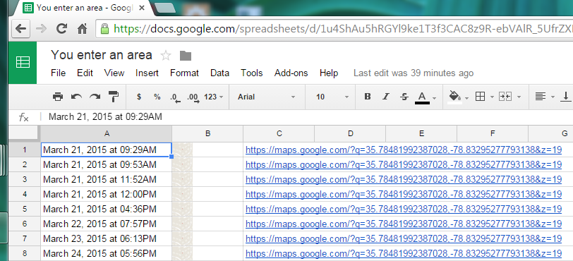
We ended the last post in this series with an automated data acquisition process for tracking my comings and goings around the SAS campus buildings. But a closer look at the resulting spreadsheet showed a few issues. The first hint was the lack of column headers - not a good sign.
Then there was the data itself. The spreadsheet had three columns: a string with a timestamp of the location recording, an image with a Google Maps thumbnail of the location, and another string with a Google Maps URL.
The second column was useless, but the others provided the data I needed, although it was not ready to use. Numeric values like the location's latitude and longitude were embedded in the URLs. Timestamps were encoded as strings that would not be automatically recognized as containing time information.
As with most real-life scenarios, the data was not in a format suitable for analysis. Fortunately, SAS Visual Analytics provides not just data visualization and analytics, but also data transformation and cleaning tools. So I moved on to the next phase: data preparation.
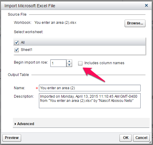
I exported my IoT data from Google Spreadsheets as a comma-separated (CSV) file which I loaded into Visual Analytics Explorer (VAE). Since the data had no headers, I unchecked the"Include column names" in the data import dialog.
With the data loaded in SAS, I quickly realized that the export process appended a large number of empty rows to the data. The raw data was "dirty" and had to be cleaned up before I could start my analysis. Thankfully, nothing that a simple global filter wouldn't solve.
The cleaned up data consisted of three categorical variables. The one corresponding to the Google Maps thumbnail had only missing values so I hid it to get it out of the way. I renamed the other two to give them meaningful names - since the spreadsheet had no column headers, VA generated automatic names for the columns.
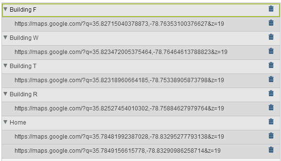
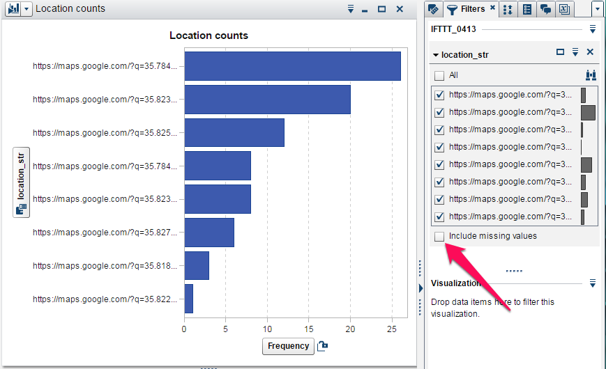
The new "location_str" column contained the Google Maps URL values. By opening them up in a browser, I was able to map the URL values to their corresponding buildings. I captured this mapping in a SAS Visual Analytics custom category data item, which gave me easy to read location names to use in my visualizations.
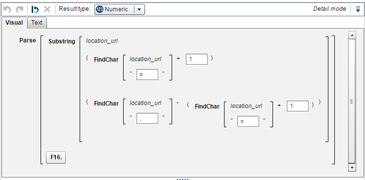
Now I had to break the coordinates out of the URL. First I had to find the delimiters around the latitude and longitude. Next I had to copy the characters between these delimiters. Finally, I needed to convert the final result to a numeric column with a proper format - making sure I didn't lose the numeric precision required to show the coordinates in the map later. I accomplished these tasks by creating calculated items with the SAS Visual Analytics expression editor and its string and numeric processing functions. I created other calculated items to extract the date and time from the timestamp column.

The last data preparation step was to combine the location name, latitude, and longitude into a custom geo category so that I could display the locations in a map. Adding new columns with specific formats and types is a basic step of data exploration as often the desired visualization requires data in a particular configuration that was not originally available.
The advantage of being able to decorate the data with calculated items is that it eliminates the need to switch to another application, breaking the exploratory flow. This is even more important when we consider that, in general, these activities are part of an interactive process. Data preparation and data visualization often build on each other.
In the next and final part, we will explore the now-ready-to-analyze data and play the role of an analyst trying to answer questions with it.