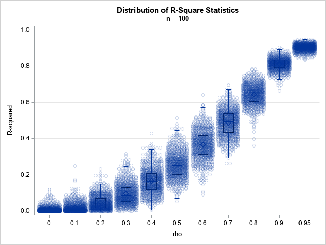
For more than 25 years, PharmaSUG has been the premier educational experience for SAS users in the pharmaceutical industry. Whether you're new to using SAS or a seasoned veteran, this year's event in Orlando, May 17-20, has something for you!
English
One of the big topics at SAS Global Forum 2015 is the analytics skills gap. Tonya Etchison Balan of the Poole College of Management at NC State University presented a case study approach for teaching analytical skills. The motto at NC State is “Think and Do.” What that means is
The SAS Business Knowledge Series now offers an online version of the "Forecast Value Added Analysis" course, taught via live web in two afternoon sessions, May 7-8. The instructor is my colleague Chip Wells, who expanded our original 1/2 day FVA workshop with new material, examples, and exercises based on his
The Institute of Business Forecasting's FVA blog series continued on March 2, with my interview of Steve Morlidge of CatchBull. Steve's research (and his articles in Foresight) have been a frequent subject of BFD blog posts over the last couple of years (e.g. The "Avoidability of Forecast Error (4 parts),
SAS recently performed testing using the Intel Cloud Edition for Lustre* Software - Global Support (HVM) available on AWS marketplace to determine how well a standard workload mix using SAS Grid Manager performs on AWS. Our testing demonstrates that with the right design choices you can run demanding compute and
I've seen a lot of recent news articles purporting income inequality in the U.S. ("the rich get richer, and the poor get poorer") ... and I wondered if the graphs were a true/unbiased representation of the data. For example, I recently saw a couple of graphs in an article on the
One area that often gets overlooked when building out a new data analytics solution is the importance of ensuring accurate and robust data definitions. This is one of those issues that is difficult to detect because unlike a data quality defect, there are no alarms or reports to indicate a
A colleague and I were looking for a good example of how analysts used to use graphics to report data, a data visualization before and after, so to speak. We needed a good "before" screenshot for a “before and after” comparison for our SAS Global Forum 2015 paper, Visualizing Clinical Trial Data.
Sometimes different communities use the same name for different objects. To a soldier, "boots" are rugged, heavy, high-top foot coverings. To a soccer (football) player, "boots" are lightweight cleats. So it is with the term "waterfall plot." To researchers in the medical field, a "waterfall plot" is a sorted bar
SAS Global Forum has just begun. Attendees are excited to see everything and everyone. A team of volunteers works hard with one goal in mind. To make sure it’s perfect to have you return time over time. There are definitely quite a few changes and I know for some past
I remember the first time I was faced with the challenge of parallelizing a DATA step process. It was 2001 and SAS V8.1 was shiny and new. We were processing very large data sets, and the computations performed on each record were quite complex. The processing was crawling along on
A very common type of graph contains two series plot, where the user is expected to evaluate the difference visually. I saw one such plot on the web today shown on the right. This graph has two curves, one for malpractice premiums and one for claims, with a shaded band
I recently spoke with John Cassara, a former U.S. Intelligence Officer and Treasury Special Agent, about the growing concern over trade-based money laundering (TBML) and how we can combat it. John retired after a 26-year career in the federal government intelligence and law enforcement communities. He's an expert in anti-money
Editor Len Tashman's Preview of the Spring issue of Foresight The Special Feature article of this 37th issue of Foresight – From Sales and Operations Planning to Business Integration – comes about through a rare but effective collaboration between an academic and a practitioner. The coauthors are Mark Moon, head
There’s a common aphorism that everything is bigger in Texas. So when SAS decided to host SAS Global Forum and SAS Global Forum Executive Conference in Dallas - it had to go big. Both conferences will kick off Sunday evening with a Texas-sized crowd of more than 4,500 attendees. But
Every college and university seems to have its own unique version of “The Quad”, where folks mingle and serious (and more often less serious!) happenings are staged. At SAS Global Forum, The Quad is the former SAS Support and Demo area, freshened up with today’s casual atmosphere, more interactive spaces
The SAS Training and Certification groups are excited to participate in SAS Global Forum 2015! We’ll have a booth in the Quad where you can stop by to ask questions, talk to your favorite instructor and register to win an iPad! We offer courses on almost every SAS product so to
Profitable growth is at the forefront of manufacturing executives’ minds¹. The math is simple: increase revenue and decrease costs. Easy, right? Unfortunately, getting there isn't that simple. The good news is that analytics can help. The better news is that there’s a new place for manufacturers to discover analytic best
Sometimes you just need a new pair of shoes or a brand new hat. Something so small can add a pep to your step and allow you to see new opportunities in the same old places. Don't believe me? Try it. We did and I can't wait for you to
What data do you prepare to analysis? Where does that data come from in the enterprise? Hopefully, by answering these questions, we can understand what is required to supply data for an analytics process. Data preparation is the act of cleansing (or not) the data required to meet the business
Smoking is an addictive habit that can kill you - if you don't believe me, check out the infographic in this blog post. Recently a friend of mine was on the episode of the Dr. Phil show that focused on "quitting smoking." Here's a picture of Traci with Dr. Phil
SAS System software supports a wide variety architecture and deployment possibilities. It’s wild when you think about it because you can scale the analytic power of SAS from the humblest single CPU laptop machine all the way up to hundreds-of-machines clusters. When SAS deployments involve many machines, it’s natural to
.@philsimon on what we can learn from Seattle's juggernaut.
Vinegar has been around for thousands of years, and it’s been used medicinally for likely just as long. We've all heard the “wives tales” about what vinegar can do (and seen the crazy claims on the internet). But does it really work? Vinegar has been researched for a while now,
Happy Earth Day, earthlings! As an outsider observing your planet, with absolutely no nefarious intentions whatsoever, I have to say you have a pretty good thing going there. I was sent by the leading…scientists on my planet, Kahnquur-7, to learn more about Earth, its dominant life form (yay, humans!), its
A customer asked: How do we go about summing a finite series in SAS? For example, I want to compute for various integers n ≥ 3. I want to output two columns, one for the natural numbers and one for the summation of the series. Summations arise often in statistical
“There’s no such thing as information overload - there is only filter failure”. ~ Internet scholar Clay Shirky Information overload is not just a recent phenomenon, it entered into human experience in the middle of the 15th century with Gutenberg and his printing press, and we’ve been devising ways to cope
If anyone knows how to finesse insight out of data, it’s Bart Baesens, professor at KU Leuven (Belgium), and a lecturer at the University of Southampton (United Kingdom). Not only has he written a book about it, Analytics in a Big Data World: The Essential Guide to Data Science and
In clinical trials, a waterfall plot is often used to indicate how patients in the study responded to treatment. In oncology trials, the response variable might be the percent change in the size of a tumor from the individual's baseline value at the start of the trial. The percent change
MicroMaps are a powerful way to display data where the display includes small, lightweight maps to provide geographical information regarding the data. This geographical information gives clues to the relationship between the data that could lead to more insight. The SAS SG Procedures and GTL do not currently have built-in