Graphically Speaking
Data Visualization with a focus on SAS ODS Graphics
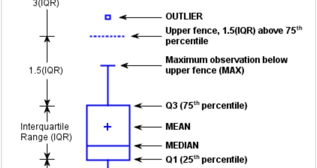
This is the 3rd installment of the Getting Started series, and the audience is the user who is new to the SG Procedures. Experienced users may also find some useful nuggets here. The Tukey box plot is popular among statisticians for viewing the distribution of an analysis variable with or without

Index of articles on "Getting Started with SGPLOT Procedure". Getting Started with SGPLOT - Part 1 - Scatter Plot. Getting Started with SGPLOT - Part 2 - VBAR. Getting Started with SGPLOT - Part 3 - VBOX. Getting Started with SGPLOT - Part 4 - Series Plot. Getting Started with

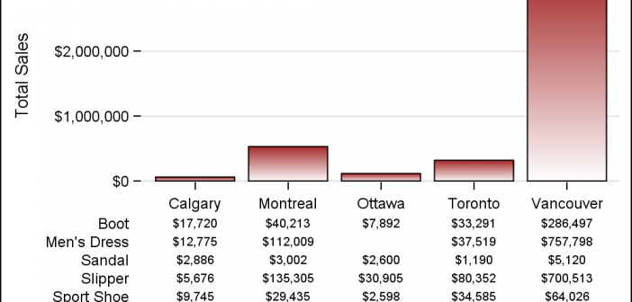
One of the key benefits of creating graphs using GTL or SG Procedures is their support of plot layering to create complex graphs and layouts. Most simple graphs can be created by a single plot statement like a Bar Chart. Complex graphs can be created by layering appropriate plot statements to
