Graphically Speaking
Data Visualization with a focus on SAS ODS Graphics
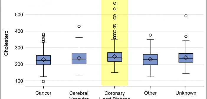
When presenting information in form of a graph we show the data and let the reader draw the inferences. However, often one may want to draw the attention of the reader towards some aspect of the graph or data. For one such case, a user asked how to highlight one

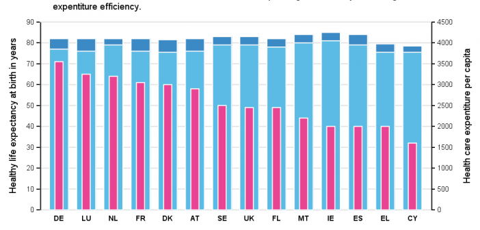
Recently, while browsing health care data, I came across the graph shown below. The graph includes the healthy life expectancy at birth by countries in the EU, along with the associated per capita expenditure. The graph also shows estimate of potential gain in life expectancy by increasing expenditure efficiency. The

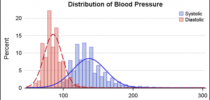
This is the 5th installment of the Getting Started series. The audience is the user who is new to the SG Procedures. Experienced users may also find some useful nuggets of information here. A histogram reveals features of the distribution of the analysis variable, such as its skewness and the peak which
