Graphically Speaking
Data Visualization with a focus on SAS ODS Graphics
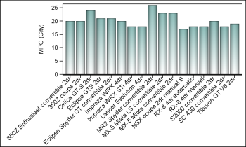
Diagonal tick values
Fitting of long category values on a x-axis is usually a challenge. With SAS 9.4, the SGPLOT procedure tries to fit the values by first splitting the values at white space to see if the values will fit in the space available. This normally works well for a small number

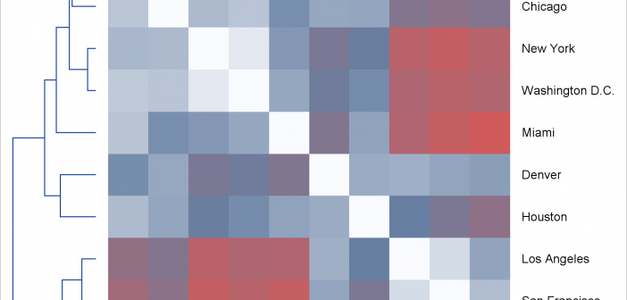
Advanced ODS Graphics: Steps to think about when creating a graph
Today, I focus on the steps needed to make a graph that is composed of multiple heterogeneous components (in this case, dendrograms and a heat map).

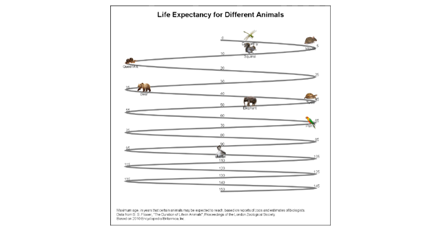
Animal life expectancy graph
Last week I published an article on creating bar charts with visual category values. The idea was to use visual icons for the category values in a HBAR of age by animal. For the data, I referred to a visual from the 2010 Encyclopedia Britannica Inc. that I found on the

