Graphically Speaking
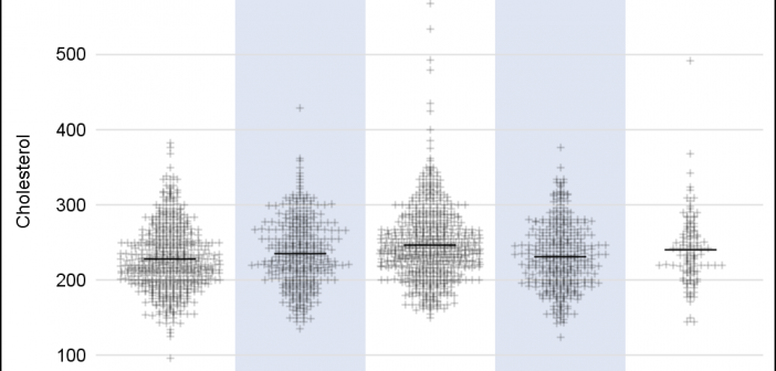
Data Visualization with a focus on SAS ODS GraphicsIn the previous post on Violin Plots, we discussed the process to create custom density plots. This work was done in collaboration with SAS user James Marcus. This is the second installment on the same topic - Creating Density Strip Plots. We will use the same data and process to compute
Over the past month or more, I have been in a conversation with SAS user James Marcus, on creation of some new displays for visual communication of uncertainty. These include display of densities using a "Violin" plot, "Density Strips" and more. With his permission, I can share some of the
Back in February, I posted an article on creating Adverse Event Timeline Graph. In the SAS 9.2 version (first one), one item that was less than ideal was the way to position the AE names to the left of the event. The AE names are displayed using the scatter plot statement
This SESUG conference was a very energetic and rewarding experience, with many user presentations on graphics using SAS/GRAPH and ODS Graphics. One standout presentation for me was on "Data Merging and Exploration to Identify Associations Between Environmental Factors and Disease Outbreaks" by Neeta Shenvi, et. al. The key part of
The Scatter Plot Matrix statement supports a couple of different configurations. The basic is the N x N panel of cells, with each cell showing scatter plots plot for a pair of variables at a time. Here is an example of a 3 x 3 scatter plot matrix for the
During SAS Global Forum 2012, I had conversations with many SAS users who wanted to create Forest Plots. However, there was one new twist. The study names were subgrouped by categories like 'Age', 'Sex', etc., with multiple entries under each subgroup. The name of each study within the subgrouped was indented