Graphically Speaking
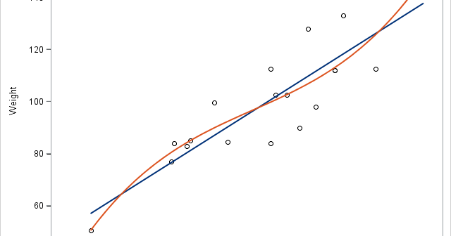
Data Visualization with a focus on SAS ODS GraphicsA customer wants to use PROC REG to fit a simple regression model but display in the fit plot markers that differentiate groups of individuals. Click on a graph to enlarge. Before we see how to do that, let's look at some simpler examples. The following step fits a linear
Let us start the new year by taking a trip back in history to SAS 9.2, first released in 2008, and the first SAS release that included the new ODS Graphics software including GTL and SG procedures. While we have recently released the third maintenance on SAS 9.4 (SAS 9.40M3),
An interesting question came up recently, where a colleague wanted to create a bar line chart with Revenue on the Y axis and Profit on the Y2 axis. The Revenues were all positive, but the Profit had positive and negative values. Some data I generated is shown on the right. Creating this
A Box Plot is very popular to view the distribution of an analysis variable with one or more classifiers. Also, everyone wants to customize the graph in different ways. One recent request was for creating a box plot by category and group along with the display of various statistics and overlaid
In the previous article I described a way to create a box plot with multiple connect lines using SAS 9.40M1 or later release . I created the graph using SGPLOT with VBOX and overlaid SERIES statements. Such an overlay of a basic plot on the VBOX statement is supported starting
This blog post is motivated by a post by a user on the communities page about creating a box plot with colored boxes by category and multiple connect lines. Normally, a box plot can be drawn by category, with a single connect line for one of the statistical values of