Graphically Speaking
Data Visualization with a focus on SAS ODS Graphics
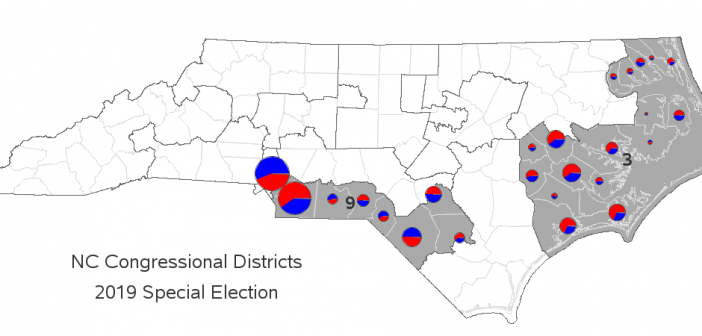
Yesterday we had a 'special election' here in NC, to elect new members to the House of Representatives for Congressional Districts 3 and 9. The election got a lot of national news coverage, therefore I thought people might like seeing the results plotted on a map. Before I decided to

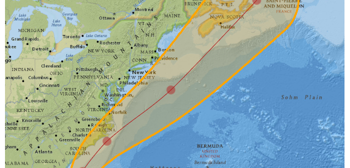
As we're in the thick of hurricane season, I'm sure some of my fellow map-makers are wanting to create their own custom hurricane maps. In this blog post, I step you through the process, so you'll know where to find all the pieces, and how to put them together. I

Summer is winding down, and cooler fall weather is just around the corner. You might soon be able to take a pleasant drive with the windows down, while enjoying the scenery. But where should you go? What are the most scenic roads for that drive? Read along to see a
