Graphically Speaking
Data Visualization with a focus on SAS ODS Graphics
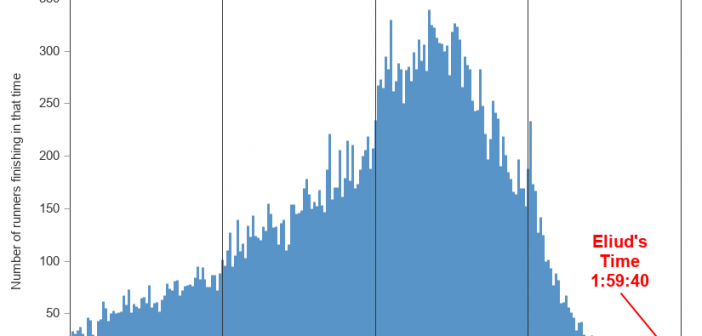
Eliud Kipchoge recently ran a marathon in under 2 hours. It was a special marathon where they had set up the best possible conditions to help him achieve this goal (such as swapping in pace-setting runners to block the wind for him), so it won't count as the world record

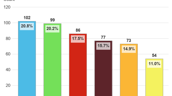
You've probably heard of the stupid 'challenges' where people usually end up hurting themselves (cinnamon challenge, Carolina reaper pepper challenge, etc). I thought it might be more helpful to society to have a challenge that could actually help people, rather than hurting them! Therefore I came up with the Halloween

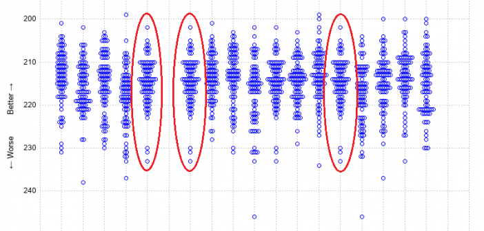
The SAS Championship golf tournament is happening this week, here in Cary, North Carolina! If you're following along and watching the scores, you might wonder how they're doing compared to past years, and what kind of scores it generally takes to win. Follow along as I plot the data from
