Graphically Speaking
Data Visualization with a focus on SAS ODS Graphics
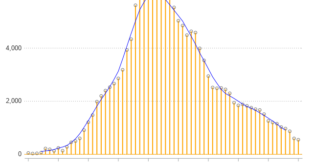
If you're close to my age, you probably remember Joe Walsh's song Ordinary Average Guy. That song popped into my head when I was writing this example about moving averages, so I encourage you to listen to it while reading the blog post. Many people are looking at graphs lately

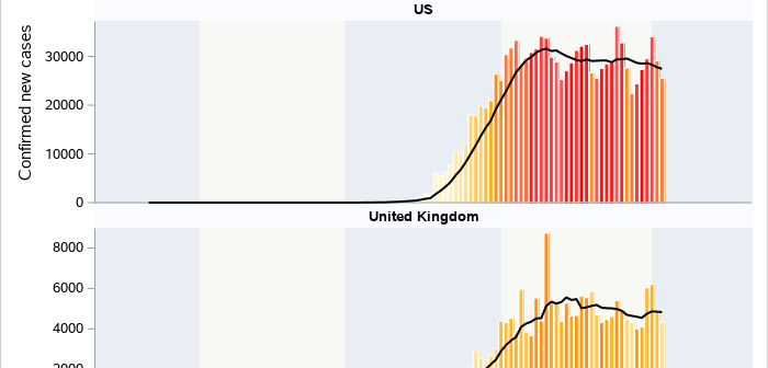
As we continue to process and understand the ongoing effects of the novel coronavirus, many of us have grown used to viewing COVID-19 dashboards and visualizations, including this popular coronavirus dashboard from SAS. If you are more accustomed to building graphs and visualizations using the SGPLOT and SGPANEL procedures, this

Now that COVID-19 is spreading in the US, I thought it might be helpful to view the data at a more granular level. Follow along as I plot the county data on a map and discuss how the color-binning can influence people's perception of the data. Maps like this can

