Did you recently lock in a mortgage rate of 3.5-5%, or perhaps even lower? How do today's rates compare to rates in the past? Let's dig a little deeper into this topic, with some graphs!
But before we get started, here's a picture to get you into the mood for for this topic. This is a picture of my realtor friend Angie (on the right), after selling another house in our hot Raleigh, NC market. The buyers look pretty happy - is it because mortgage rates are so low, or because Angie is their real estate agent? Perhaps a little of both! (Note that Angie was also one of my favorite roller derby skaters in the Carolina Rollergirls - she's all kinds of awesome!)

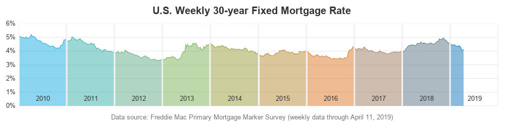
Now, let's tackle that mortgage data! This is another topic that Leonard Kiefer got me thinking about, when he recently posted this very nice graph on Twitter:
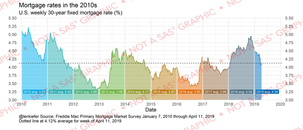
I liked Kiefer's graph in general - but do you notice a potential problem with it? Is it displaying the data in such a way that you could mis-perceive it? Give this question some thought, while I walk you through it with my alternate graphs ...
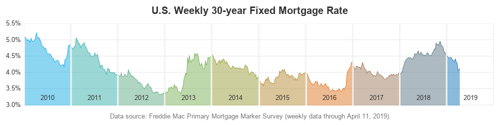
First I downloaded a spreadsheet of the data from freddiemac.com, and imported it into SAS. I then created a plot structured like Kiefer's, but I simplified it a bit, centered the year labels, and added '%' signs to the y-axis values. (The code below is summarized/pseudo-code - click here to see the full code.)
proc sgpanel data=my_data (where=(year>=2010));
panelby year / layout=panel columns=10 rows=1 noheader;
band x=day_of_year lower=0 upper=rate;
series x=day_of_year y=rate;
inset year / position=bottom nolabel;
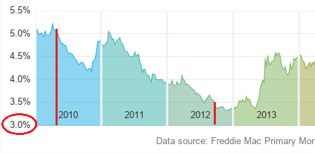
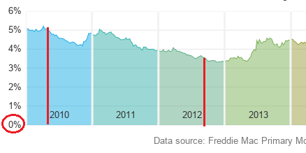
Perhaps it's easier to notice the problem now, in my simplified version? ... Do you notice that the mortgage rates at the beginning of 2010 visually appear to be about 4 times as high as the rates at the end of 2012? (see graph marked in red below) That's because the area under the line is shaded, which makes it appear visually similar to a bar or needle plot ... except the y-axis does not start at zero. In a bar chart, the y-axis starts at zero, and the heights of the bars are therefore proportional to the values they represent. In this shaded area chart, you get the "illusion" that the height of the shaded areas represent something proportional, but since the y-axis does not start at zero the heights of the shaded areas can't really be compared.
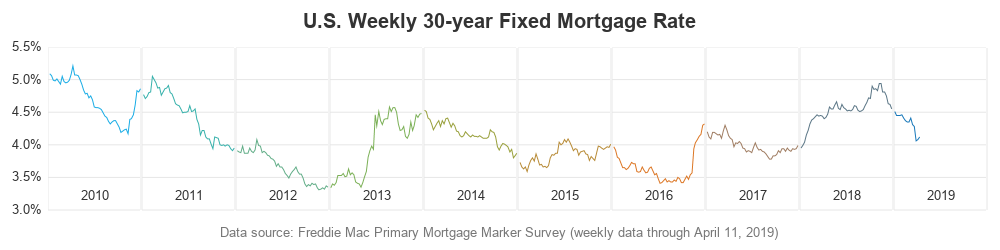
My rule of thumb is that if you're going to let the y-axis auto-scale, or not start it at zero, then you should probably use a line chart to avoid the mis-perception of "heights" and proportional comparisons. Here's the same chart plotted with just the line:
But I actually want to compare the mortgage rates - therefore I created a third graph, with the area under the line shaded, and the y-axis starting at zero. In my mind, this is the version that most truthfully represents the data, and allows for visual comparison:
Here's that same subset as before, so you can easily see the difference - now 2010's rates don't look 4x higher than 2012's rates:
So, for the past ~10 years, the mortgage rate has been hovering about 3.5-5%. Looks like they haven't really changed a lot. But being a "child of the 80s" I remember that rates used to be much higher. Therefore I thought it would be interesting to include some older years in the graph, to help put the current rates into perspective. Here's the same graph, going back four decades. I've scaled each decade all the same, so you can visually compare them.
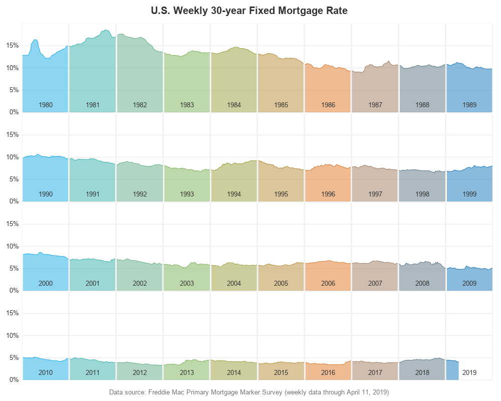
Wow! - The current mortgage rates are so much lower than they've been in the past, eh?!? Therefore, perhaps it's a pretty good time to buy a house if you don't already have one (just my personal opinion - I'm not a banking or realty expert!)
I might not be able to give you banking or realty advice, but I can give you some expert graphing advice. Pay attention to how you scale your axes - it can make a big difference in how the data is perceived!
See also: Mortgage rates - overlaying multiple years in the same graph


5 Comments
I tried it and it creates great plots! It would be so nice if you could share how you color code the years? TIA!
Click the 'full code' link right before the first graph to see all the code. I used an attribute map (data myattrs) to map the desired color to each year.
Thank you Robert!
Pingback: Mortgage rates - overlaying multiple years in the same graph - Graphically Speaking
Pingback: These mortgage rates look shady to me! - Graphically Speaking