SAS Global Forum 2019 (SGF) is rapidly approaching - and which of the hundreds of presentations are you planning to attend? Well, no matter what types of analyses you perform with SAS software, you'll most likely want to present your findings in a really nice/informative graph! Therefore I highly recommend attending at least a few visualization presentations!
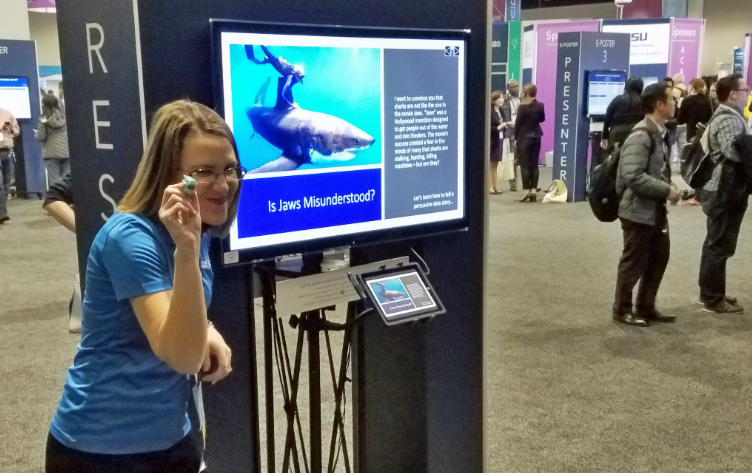
And to get you into the mood for some fun & educational presentations, here's a random picture of my friend Jaime doing a fun presentation about sharks at a previous SGF.
But what about *this* year's SGF? How will you know which graph/visualization sessions to attend? Well, you could start by going to the official 'search page', and entering keywords you're interested in. But the words 'graph' and 'visual' are likely to return so many results they'll overwhelm you.
What's my alternate approach? I downloaded the spreadsheet of all the SGF presentations, imported it into SAS, programmatically performed a bunch of keyword searches, excluded some false-positives, included some that didn't match my keywords ... and then plotted the results against a timeline axis. Here's a snapshot of my graph (click the image below to see the interactive version).
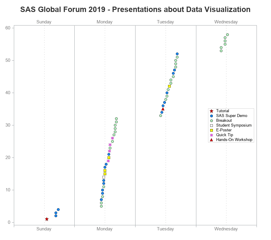
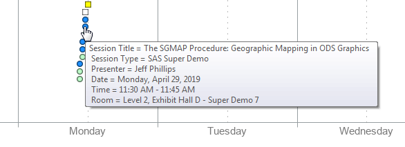
When you click the image above to see the interactive version, you can then hover your mouse over the plot markers to see a description of the presentation, such as ...
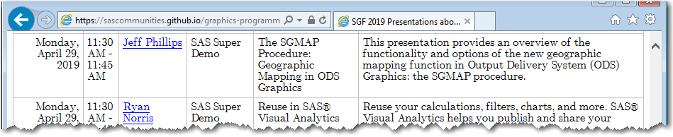
And when you click on a marker, it will jump to the description of that presentation in the table, so you can read the full abstract. (then click your browser's "back" button to go back to the graph)
Hopefully my visualization about visualization presentations will help make choosing your schedule a fun & easy task!
How'd he do that?
Here are some of the SAS tools I used to create this graph:
- I used Proc Import, with dbms=xlsx, to import the data from the spreadsheet.
- I used a data step with 'if' statements and the index() function to check for keywords.
- I used Proc SGplot to plot the data.
- I used the 'dataskin=pressed' option to give the markers a tiny bit of 3d shading.
- I used SGplot scatter's tip= option to control the mouse-over test, and the url= option to control the drilldown.
- I used a '#' and the session_id as the drilldown to an HTML anchor in the table (below the graph), and I inserted the anchors into the table by stuffing the raw HTML anchor characters into the string containing the session title that I printed in the table.
Here's a link to the full SAS code, if you'd like to download it, and experiment with it. (Note that since the text contains some special characters, such as the Rupee symbol, you'll need to be running a SAS session with utf8 encoding to run the code cleanly.)

1 Comment
Thanks for the shout out Robert! What a creative way to show the data - as usual!