Graphically Speaking
Data Visualization with a focus on SAS ODS Graphics
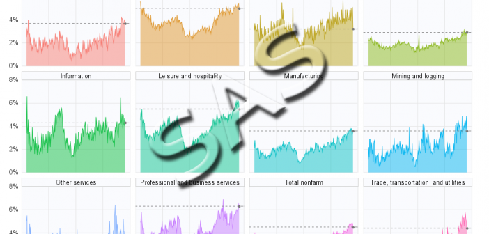
This is another in my series of blogs where I take a deep dive into converting customized R graphs into SAS graphs. Today I show how to combine several graphs with shared axes, which we'll call paneled graphs. This time I'll be plotting the Job Openings Rate by Industry, similar

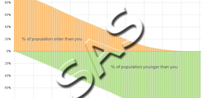
This is another in my series of blogs where I take a deep dive into converting a customized R graph into a SAS graph. Today I'm focusing on a diverging bar chart (where one bar segment is above the zero line, and the other is below). What type of data

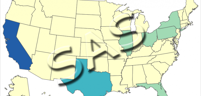
This is another in my series of blogs where I take a deep dive into converting a customized R graph into a SAS ODS Graphics graph. Can you guess what data I'll be using this time? Here's a photo with a hint. This is Keeler, California (just west of Death
