I was recently reading David Mintz's excellent SESUG 2018 conference paper on Five Crazy Good Visualizations and How to Plot Them, and saw a map that caught my eye. David showed how to create a similar map, but with completely different data - I decided to try creating a map that was a bit more like the original. Follow along, as I demonstrate how...
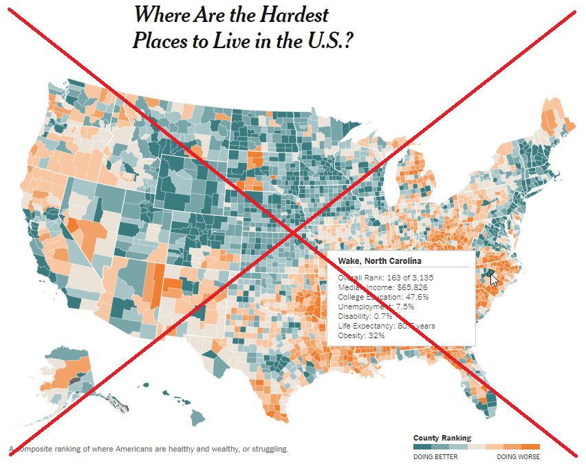
Original Map
The original map that David referenced was from a NY Times article, and the he liked that it had mouse-over text so you could see the details about each county. Here's a screen-capture:
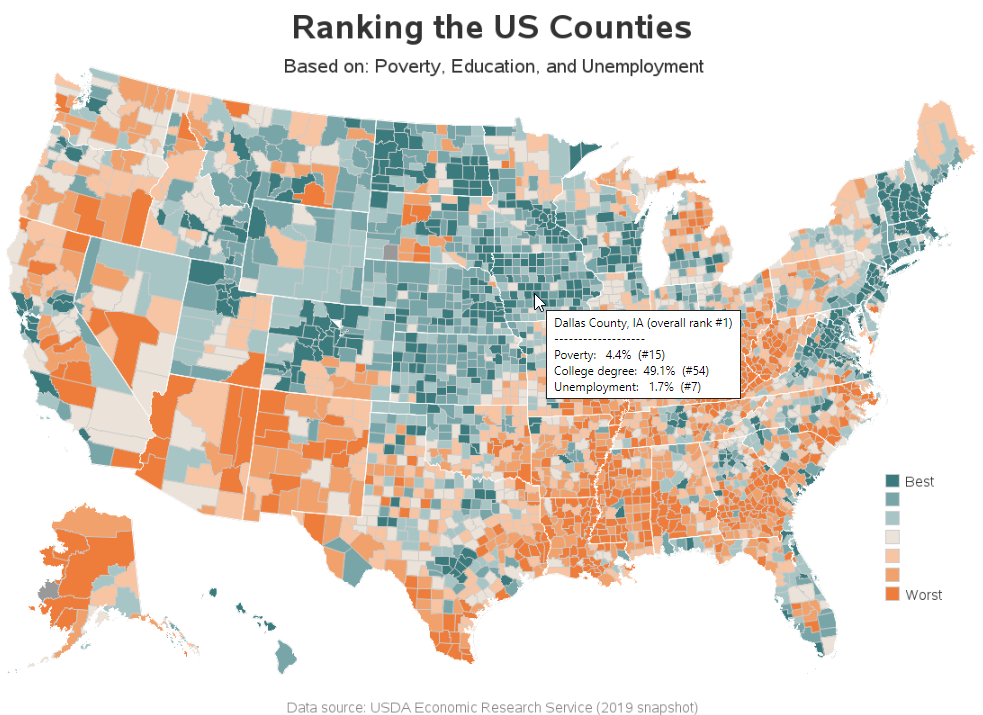
My Map
And here is a screen-capture of my version, I created with SAS. (Click here to see the interactive version, where you can mouse-over each county to see the details.)
How'd He Do That?
For those of you who are programmers, or who like to plot data on a map, here are below are the details...
Finding the Data
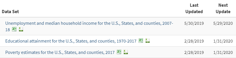
I didn't use the exact same data as the NY Times, but I found a source that provided data in 3 of the areas. Here's a link to the USDA Economic Research Service page where you can download 3 spreadsheets with data on unemployment, education, and poverty.
Preparing the Data
I imported each spreadsheet into SAS, sorted by the variable of interest, and then assigned a rank. Here's some sample code for poverty:
proc import out=poverty datafile="PovertyEstimates.xls" dbms=xls replace;
range='Poverty Data 2017$A4:K0';
getnames=yes;
run;
proc sort data=poverty out=poverty;
by Poverty;
run;
data poverty; set poverty;
poverty_rank=_n_;
run;
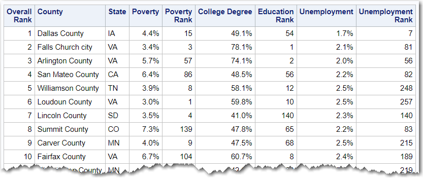
I combined/joined the three datasets with SQL, combined the three ranks (giving each one equal weight), and then assigned an overall rank based on the combined values.
data my_data; set my_data;
combined=(poverty_rank+education_rank+unemployment_rank);
run;
proc sort data=my_data out=my_data;
by combined;
run;
data my_data; set my_data;
overall_rank=_n_;
run;
Here's what the resulting data looks like:
Drawing the Map
I used the code below to draw the final graph. Here are a few important things about the code:
- Notice that I use the title to describe exactly what is being plotted (the original map's "Hardest Places to Live" is a bit vague).
- I also gave the footnote a link to the data source (in the interactive version).
- I annotated the white state outline onto the county map, similar to the original.
- I use a note, rather than a title2, so that text can share/overlap into what would otherwise be the map's space.
- And I used the html= option to add the mouse-over text for each county.
title1 ls=1.5 "Ranking the US Counties";
footnote
link='https://www.ers.usda.gov/data-products/county-level-data-sets/download-data/'
c=gray "Data source: USDA Economic Research Service (2019 snapshot)";
proc gmap data=my_data map=my_map all anno=anno_outline;
id statecode county;
note move=(29,89.5) h=16pt "Based on: Poverty, Education, and Unemployment";
choro overall_rank / levels=7 legend=legend1
cdefault=gray99 coutline=graycc
html=my_html;
run;
Here's a link to the interactive version of the map. And if you'd like to see all the nitty-gritty details, here's a link to the full SAS code.


4 Comments
Robert,
You map makes me rethink where I need to find a new job.
BWT, where can I find your SAS data set named "robsmaps.uscounty" in your code?
Thanks for sharing your excellent work.
Ethan
Here's how I created the base map:
http://robslink.com/SAS/democd97/uscounties_info.htm
Yes - I don't have the same data as they used in the original map!
Your color range appears to be different, most notably several western states worse off than the original map.... Alaska, California, Arizona, New Mexico, Wyoming... but also states like Pennsylvania.