Many cities have Open Data pages. But once you download the data, what can you do with it? This is my fifth in a series of blog posts where I download public data about Cary, NC, and demonstrate how you might analyze that type of data (for Cary, or any city!)
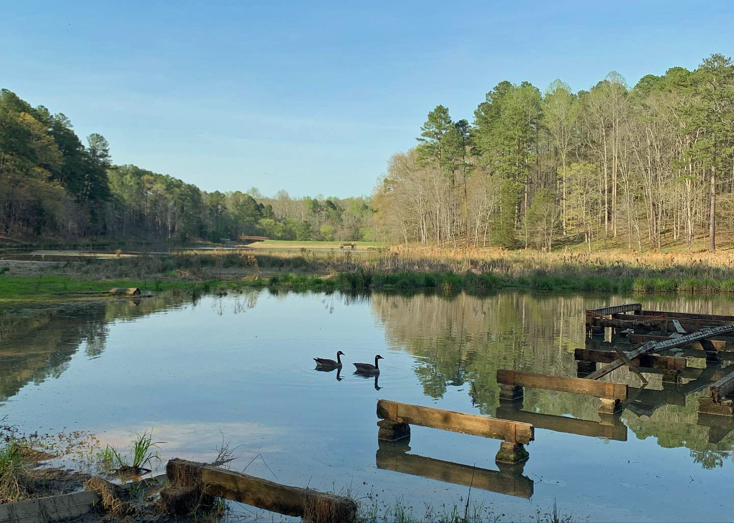
And what data did I choose this time? Here's a hint, in the form of a picture ... My friend Tasha is an avid hiker (and a pretty darn good photographer), and she often posts pictures from her hikes. She's a big fan of water and birds, and this picture has the best of both worlds:
The Data
If you guessed "parks and trails" data, then you are correct! I used the Cary Parks csv file, and the Cary Trails shapefile, as the data for this example.
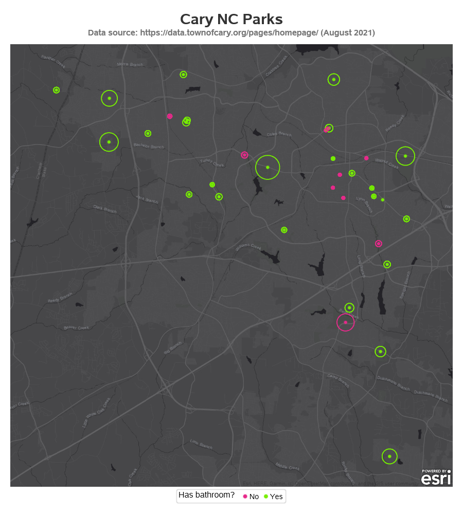
Parks Map
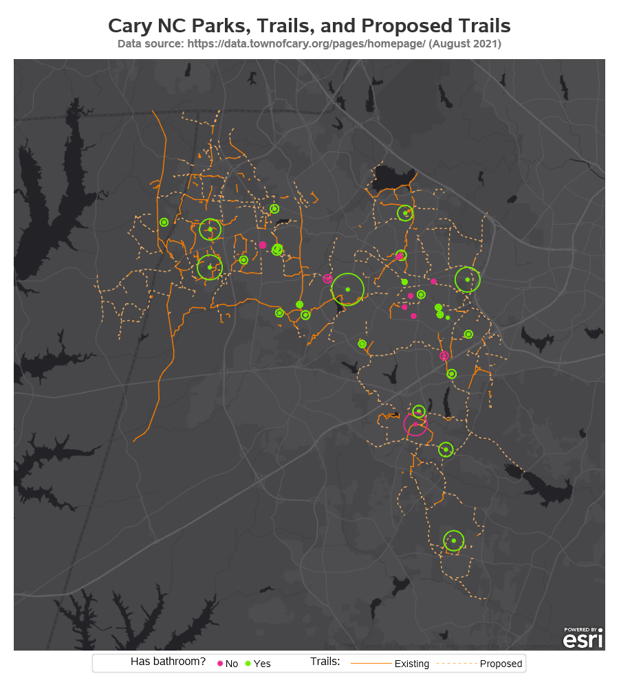
I tackled the parks data first, because it was simpler (there's only one lat/long coordinate for each park). I used Proc SGmap, and plotted the park locations as markers on a dark gray Esri background/tile map. I then overlaid a 'bubble' (circle) around each park, using the size of the park to control the size of the bubbles. Rather than just leaving all the parks the same color, I decided to color them based on whether or not they have bathroom facilities (which can be an important consideration when visiting a park!)
Here's what the map looks like - click it to see the interactive version, which has mouse-over text, and allows you to click on each park to go to that park's information page.
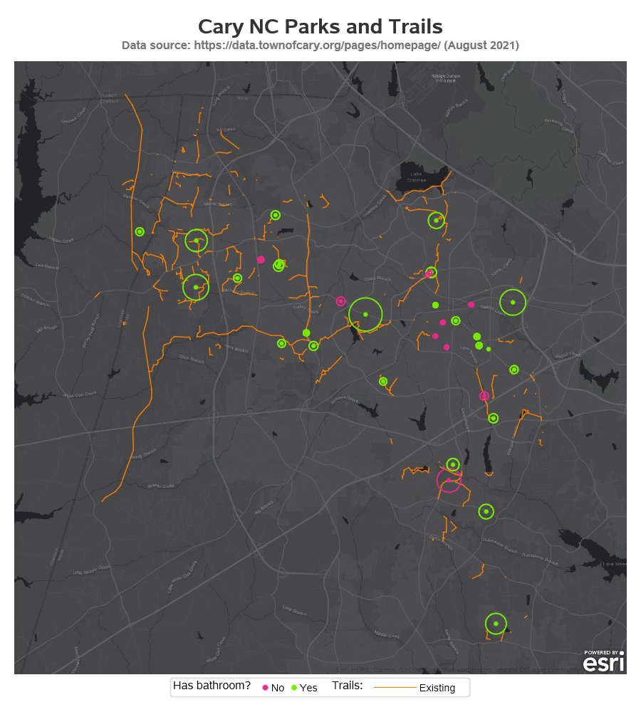
Existing Trails
Next, I tackled the trails. The data contains data for both existing and proposed trails - I decided to plot the existing trails first. The trail data has thousands of lat/long coordinates, describing points along the many trails. I overlaid them as a series plot on the map, but I had to insert 'missing' values between each separate piece of trail (by default the series plot connects all the points with a line - whereas the missing value triggers a break in the line). You can click the image below to see the interactive version - it will let you hover your mouse over the trails to see the trail names.
Proposed Trails
For the proposed trails, I thought it would be intuitive to show them with a dashed line (whereas the existing trails are a solid line). I was happy to see that there are several proposed trails in the area where I live (the northeast part of Cary).
Table
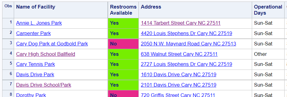
Although a map is a great way to visualize this data, it's also useful to have a table. The table lets you see all the text names, perform text searches, and copy-n-paste the information. It also allows those who are visually impaired to use technology that 'reads' the table out loud. And some people just prefer viewing data in tabular form. I made restroom field color-coded like the maps above, and added links to the park information pages, and the address links perform a Google lookup on the address. Click the below screen-capture to see the interactive table:
Discussion
How'd you like these maps? Did you find any new parks you didn't know existed? Do you like the plans for the new trails?
What would you add (or remove) from these maps? What other data (other than parks and trails) could be plotted using these techniques, in your professional field or interests? Feel free to discuss in the comments section.
How'd He Do That?!?
If you're not a programmer, you probably won't be interested in the coding details below. If you are a programmer (especially a SAS programmer) then you might want to see the tricks I used to make the above maps happen! 🙂
Importing the Data
If you paid close attention, you might have noticed that the data was in two different kinds of files - a csv, and a shapefile. Since these two kinds of files are very different, SAS provides two separate procedures to import them. The csv requires more lines of code, but those lines are pretty standard (I use these same lines for just about every csv file.
proc import datafile="parks-and-recreation-feature-map.csv"
dbms=dlm out=park_data replace;
delimiter=';';
getnames=yes;
datarow=2;
guessingrows=all;
run;
The shapefile was a bit trickier. When SAS imports a shapefile, it creates a numeric 'segment' variable. But this shapefile already had a character segment variable in it. Therefore I had to add a command to rename the shapefile's segment variable to something else.
proc mapimport datafile="greenway-trails.shp" out=trail_data contents;
rename segment=segment_description;
run;
Park Map Code
The park data didn't require much processing. Basically, the only thing I had to do was parse the latitude and longitude out of the geo_point_2d variable. These were the first and second comma-delimited fields of the geo_point_2d variable.
data park_data; set park_data;
park_lat=.; park_lat=scan(geo_point_2d,1,',');
park_long=.; park_long=scan(geo_point_2d,2,',');
run;
The code to draw the parks map is a bit long (because I'm using both a scatter plot and a bubble plot), but it's pretty simple and straightforward. I use a dark gray Esri background map, and then overlay a scatter plot marker for each park, and a bubble/circle. I suppress the default legends (noautolegend), and then add a color legend for just the scatter plot, indicating whether or not the park has bathrooms.
proc sgmap plotdata=park_data noautolegend;
esrimap url="http://services.arcgisonline.com/arcgis/rest/services/Canvas/World_Dark_Gray_Base";
scatter x=park_long y=park_lat / group=restrooms_available
markerattrs=(symbol=circlefilled size=5pt) tip=none name='bathroom';
bubble x=park_long y=park_lat size=size_of_park / bradiusmin=3px bradiusmax=25px outline
group=restrooms_available;
keylegend 'bathroom' / title='Has bathroom?' autoitemsize;
run;
Existing Trails Map Code
The trail data is a bit trickier to plot. The trail data had thousands of lat/long points along the trails, which made the output file very large and slow to load (with all the HTML code for mouse-over text for each point). Therefore I used Proc Greduce to keep only the points I needed to have a reasonable representation of the trails. This helped reduce the size of my HTML file from about 8MB to less than 1MB.
proc greduce data=trail_data out=trail_data;
id name segment_description segment status;
run;
data trail_data; set trail_data (where=(density<=2));
run;
Proc SGmap's series statement draws a line through all the lat/long points. But in this case, rather than one continuous line through all the points of all the trails, I want a break in the line between each piece of trail. Therefore I use a data step, and insert a 'missing' value (with a '.' as the value for the lat and long) after the last data point for each separate trail, or piece of trail.
data trail_data; set trail_data (rename=(x=trail_long y=trail_lat) where=(status^=''));
by name segment_description segment status notsorted;
output;
if last.name or last.segment_description or last.segment or last.status then do;
trail_long=.;
trail_lat=.;
output;
end;
run;
In Proc SGmap, all of the response data must be in one dataset, therefore I combine the parks and trails data. Notice that I previously assigned different names for the lat/long variables (such as park_long, park_lat & trail_long, trail_lat) so that I can refer to them separately in this combined dataset.
data combined_data; set park_data trail_data;
run;
And then in Proc SGmap, I plot the combined_data, and use a series statement to add lines for each trail. I use the name='trails' so I can later add a keylegend for 'trails'.
proc sgmap plotdata=combined_data (where=(status^='Proposed')) noautolegend;
esrimap url="http://services.arcgisonline.com/arcgis/rest/services/Canvas/World_Dark_Gray_Base";
series x=trail_long y=trail_lat / group=status nomissinggroup name='trails';
scatter x=park_long y=park_lat / group=restrooms_available nomissinggroup
markerattrs=(symbol=circlefilled size=5pt) name='bathroom';
bubble x=park_long y=park_lat size=size_of_park / bradiusmin=3px bradiusmax=25px outline
group=restrooms_available;
keylegend 'bathroom' / title='Has bathroom?' autoitemsize;
keylegend 'trails' / title='Trails:';
run;
Proposed Trails Map Code (and using an Attribute Map)
Next, I add the the proposed trails (by removing the where clause that excluded them). But the default colors and line styles are a bit boring. I could use a styleattrs statement to add a list of custom colors - but it assigns them in the order it encounters grouping variable values in the data ... which can be a bit haphazard. I want to guarantee that certain things get certain colors and line patterns. Therefore I create an attribute map dataset (here the term 'map' is used to talk about mapping one value to another, not a geographical map).
data myattrs;
length value $100 markercolor linecolor $12 linepattern $20;
id="some_id";
value='No'; markercolor='cxe7298a'; linecolor=markercolor; output;
value='Yes'; markercolor='cx76EE00'; linecolor=markercolor; output;
markercolor='';
value='Existing'; linecolor='cxff7f00'; linepattern='solid'; output;
value='Proposed'; linecolor='cxfdb462'; linepattern='shortdash'; output;
run;
And I tweak my SGmap to become aware of the attribute map, and use the desired colors and line patterns for the corresponding group= values being plotted. The combination of options marked in bold below tell SGmap to use the colors and line patterns from the attribute map, for the values of the group= variables:
proc sgmap plotdata=combined_data noautolegend dattrmap=myattrs;
esrimap url="http://services.arcgisonline.com/arcgis/rest/services/Canvas/World_Dark_Gray_Base";
series x=trail_long y=trail_lat / group=status nomissinggroup attrid=some_id name='trails';
scatter x=park_long y=park_lat / group=restrooms_available nomissinggroup attrid=some_id
markerattrs=(symbol=circlefilled size=5pt) name='bathroom';
bubble x=park_long y=park_lat size=size_of_park / bradiusmin=3px bradiusmax=25px outline
group=restrooms_available attrid=some_id;
keylegend 'bathroom' / title='Has bathroom?' autoitemsize;
keylegend 'trails' / title='Trails:';
run;
Interactive Maps
If you clicked on the maps above, you might have noticed that it has mouse-over text for the parks and trails, and drill-down links for the parks. I controlled those using SGmap's tip= and url= options, and specify the variables from the dataset I want to use for each of those:
proc sgmap plotdata=combined_data noautolegend dattrmap=myattrs;
esrimap url="http://services.arcgisonline.com/arcgis/rest/services/Canvas/World_Dark_Gray_Base";
series x=trail_long y=trail_lat / group=status nomissinggroup attrid=some_id tip=(name) name='trails';
scatter x=park_long y=park_lat / group=restrooms_available nomissinggroup attrid=some_id
markerattrs=(symbol=circlefilled size=5pt) tip=none name='bathroom';
bubble x=park_long y=park_lat size=size_of_park / bradiusmin=3px bradiusmax=25px outline
group=restrooms_available attrid=some_id
tip=(name_of_facility full_address operational_days operational_hours
size_of_park restrooms_available) url=website;
keylegend 'bathroom' / title='Has bathroom?' autoitemsize;
keylegend 'trails' / title='Trails:';
run;
Interactive Table
I also add a table of all the parks below the maps, and set up various fields in the table to have HTML drill-down links. When you click the park it goes to the park URL, and when you click the street address it launches a Google map query for that location.
data park_data; set park_data;
length name_link address_link href $300;
href='href='||quote(trim(left(website)));
name_link = '<a ' || trim(href) || ' target="_self">' || trim(left(Name_of_Facility)) || '</a>';
href='href='||quote('https://www.google.com/maps/place/'||trim(left(full_address)));
address_link = '<a ' || trim(href) || ' target="_self">' || trim(left(full_address)) || '</a>';
run;
I also color-code the background of certain cells of the table, to show whether or not the site has a bathroom (same colors as I used for the park markers in the map). I do that by creating a user-defined-format for those colors, and then apply that format as the style for the data. Rather than specifying all the table variables on one var statement (as is usually done), I split it into multiple var statements so I can apply the custom style to jus the Restrooms_Available variable.
proc format;
value $nfmt
'No' = 'cxe7298a'
'Yes' = 'cx76EE00'
;
run;
proc print data=park_data label;
var name_link;
var Restrooms_Available / style(data)=Header{background=$nfmt.};
var address_link Operational_Days Operational_Hours Size_of_Park;
run;
SAS Code
I show bits and pieces of the code above, but here's a link to the entire SAS job, if you'd like to experiment with it.