During the 2020 Coronavirus pandemic, you've probably formed a great appreciation for good, informative graphics. Good graphics can help you get a handle on thousands of individual data values, see the geographical distribution, or look for trends. In February, I wrote a blog post about creating a coronavirus dashboard with SAS code. And some of my colleagues wrote a blog post about using SAS Visual Analytics (which is more point-and-click) to create a fancier dashboard with more sophisticated analytics.
Dashboards are great at showing many things on one page, but sometimes you might want to focus on just one thing. And in those cases, an individual graph might work best. I've been keeping an eye out for what I consider to be 'good' graphs, and have created my own version of many of them using SAS code. I'd like to share that SAS code with you, in case you might want to create a similar graph someday. I describe the main procedures I used in the blog text, but you'll want to look in the actual code to see how I worked out all the little details (the subtle details might actually be the most important part!).
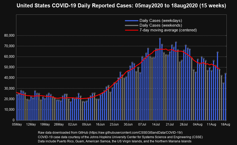
This first graph shows the daily reported cases of COVID-19, over a several week time window. I first saw the original version in Troy Hughes post on LinkedIn. I especially like that Troy used a different color for Saturday/Sunday (because there definitely appears to be a weekly trend in the data). The red line overlay shows a 7 day moving average for the data values. I re-created this graph using Proc SGplot, with overlaid needle and series plots. I controlled the color of the needles (skinny bars) using the group= option. Here's a link to the complete SAS code, for my SAS version below.
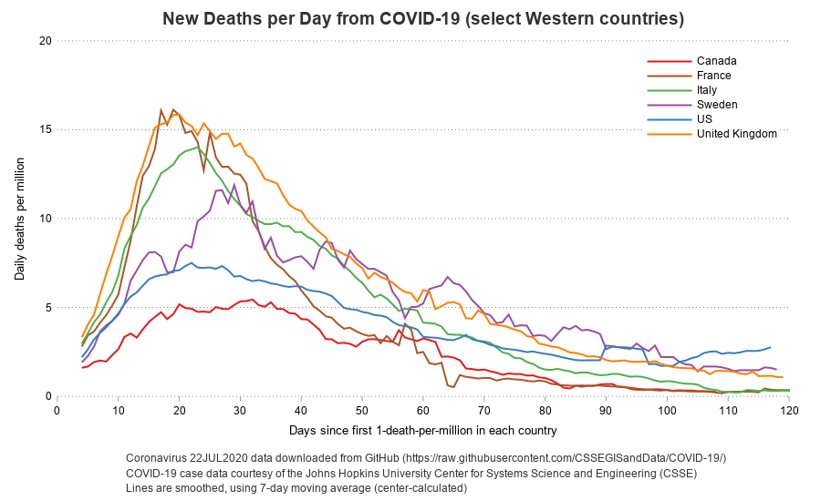
If you're graphing data for one area, you can show the raw values - but if you're wanting to compare data between multiple areas with differing populations, it's best to convert the values to per capita (such as "cases per 1,000,000 population"), which this next example demonstrates. I saw the original version in a Twitter post. In my SAS version, I used Proc SQL to merge in the population data, so I could calculate deaths per million. I used Proc SGplot to draw the graph, and the series plot's group= option to assign a unique color to each country. Here's a link to the complete SAS code, for my SAS version below.
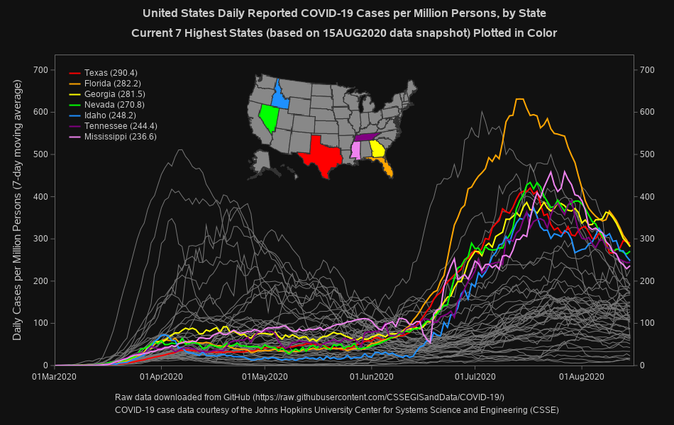
This next graph is a bit fancier. And at first glance, it might appear a bit cluttered ... until you realize that the focus is just on the "top 7" states (the other 50 state lines in gray are just for context). I first saw this graph in another of Troy Hughes' posts on LinkedIn (he's become one of my data visualization favorites!). In my SAS version, I use a Proc SGplot series plot to draw a gray line for each of the 50 states' data, and then overlay another series plot for the top 7 (using the group= option to assign a unique color to each). I create the map separately (using Proc SGmap), and then annotate the png image onto the graph. Most of the tricky parts are in preparing all the data just right. Here's a link to the complete SAS code, for my SAS version below.
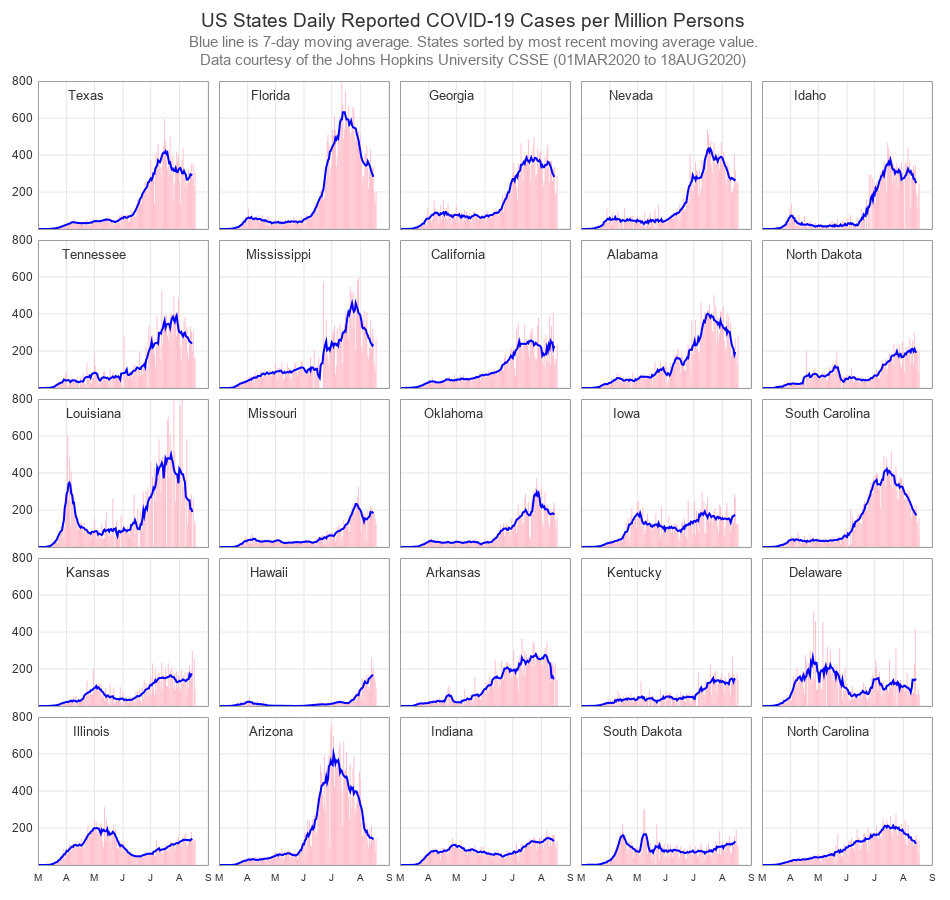
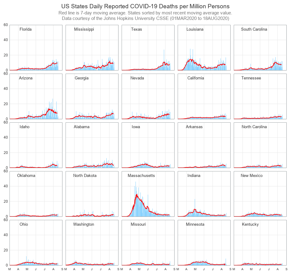
Some of my friends who saw the graph above were lamenting that they could not tell which of the gray lines represented the state they lived in. Therefore I used Proc SGpanel to create a grid of graphs, with one graph for each state (all plotted to the same scale, for easy comparisons). I sorted them such that the states with the highest most-recent moving average were shown first. The code produces two 5x5 grids, to create graphs of all 50 states - below is the first 5x5 grid. Here's the SAS code.
Some might be more interested in seeing the number of deaths, rather than the number of cases - and with a slight tweak of the (above) code, I was able to produce that graph easily. Here's the modified SAS code.
As these examples demonstrate, sometimes it's useful to create an individual graph, with an emphasis on one particular thing. And when creating such a graph, it's very handy to be using a software that lets you control every little aspect of the graph, so you can get it exactly like you want it ... and that's something creating graphs with SAS code is extremely good at!


1 Comment
Great post! Thanks as always.