All Posts
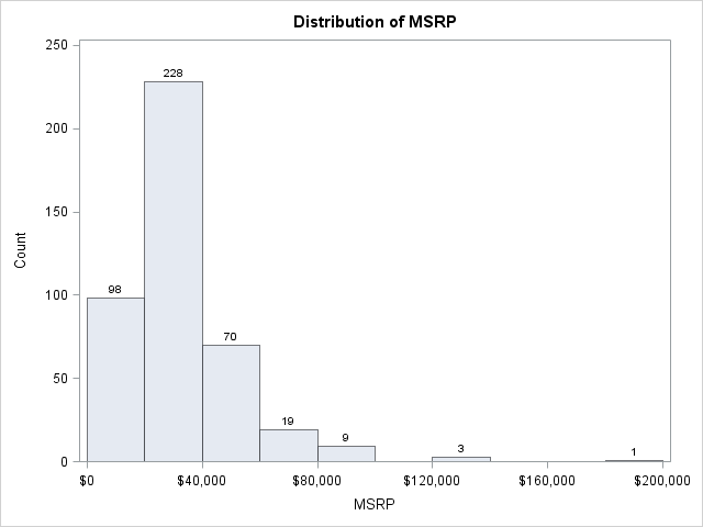

A histogram displays the number of points that fall into a specified set of bins. This blog post shows how to efficiently compute a SAS/IML vector that contains those counts. I stress the word "efficiently" because, as is often the case, a SAS/IML programmer has a variety of ways to

Have you ever wanted to compute the exact value of a really big number such as 200! = 200*199*...*2*1? You can do it—if you're willing to put forth some programming effort. This blog post shows you how. Jiangtang Hu's recent blog discusses his quest to compute large factorials in many programming languages.


Who doesn’t like bargains? I’m sure you will all agree that good quality at a next-to-nothing cost is irresistible. My recent Dollarama run had me ecstatic about the gloves that come in all colours, styles and sizes for just over a dollar. (Fact: big retail stores charge over 10 times
The other day I needed to check that a sequence of numerical values was in strictly increasing order. My first thought was to sort the values and compare the sorted and original values, but I quickly discarded that approach because it does not detect duplicate values in a montonic (nondecreasing)
In a previous post, I described ways to create SAS/IML vectors that contain uniformly spaced values. The methods did not involve writing any loops. This post describes how to perform a similar operation: creating evenly spaced values on a two-dimensional grid. The DATA step solution is simple, but an efficient


Tomorrow I'll be taking a few hours away from work to build something important: the self-esteems of a handful of middle-school-aged children. I'm volunteering as a judge in a middle-school science fair. And even though I'm not a scientist ("computer science" isn't a category), I understand enough about physical science
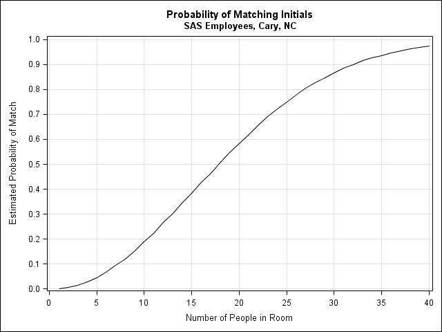
"What is the chance that two people in a room of 20 share initials?" This was the question posed to me by a colleague who had been taking notes at a meeting with 20 people. He recorded each person's initials next to their comments and, upon editing the notes, was
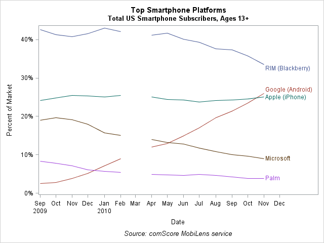
A colleague posted some data on his internal SAS blog about key trends in the US Mobile phone industry, as reported by comScore. He graciously shared the data so that I could create a graph that visualizes the trends. The plot visualizes trends in the data: the Android phone is


I think being greedy is a virtue – especially when you are trying to feed your intellectual curiosity! You can satiate that hunger at SAS Global Forum, which offers an unlimited buffet of thought-provoking ideas and discussions. To give you a glimpse of what to expect at Las Vegas this
When your data are in rows, but you need them in columns, use the matrix transpose function or operator. The same advice applies to data in columns that you want to be in rows. For example, the vectors created by the DO function and the index creation operator are row
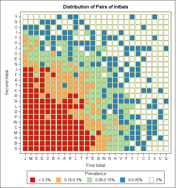
A colleague related the following story: He was taking notes at a meeting that was attended by a fairly large group of people (about 20). As each person made a comment or presented information, he recorded the two-letter initials of the person who spoke. After the meeting was over, he
SAS/IML software is often used for sampling and simulation studies. For simulating data from univariate distributions, the RANDSEED and RANDGEN subroutines suffice to sample from a wide range of distributions. (I use the terms "sampling from a distribution" and "simulating data from a distribution" interchangeably.) For multivariate simulations, the IMLMLIB

AUTOEXEC.SAS wasn't enough for you. Yes, it's a sure-fire way to run SAS statements (such as LIBNAME assignments or macro definitions) whenever you start your SAS session, but you found it has limitations when used in configurations with lots of users who connect with SAS Enterprise Guide. Limitations such as:
It is often useful to create a vector with elements that follow an arithmetic sequence. For example, {1, 2, 3, 4} and {10, 30, 50, 70} are vectors with evenly spaced values. This post describes several ways to create vectors such as these. The SAS/IML language has two ways to

Computing probabilities can be tricky. And if you are a statistician and you get them wrong, you feel pretty foolish. That's why I like to run a quick simulation just to make sure that the numbers that I think are correct are, in fact, correct. My last post of 2010