All Posts

Fire department operations are very complex, with multi-faceted missions that include not only fire prevention and suppression, but emergency response and fire inspections. These must be coordinated with area growth and development decisions, and water system management decisions. When a fire or an emergency occurs, the right equipment, with the right people,
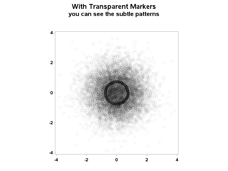
When working with "big data" you usually have too many points to view in a plot, and end up subsetting or summarizing the data. But now, in SAS 9.3, you have an alternative! For example, the following scatter plot of 10,000+ points is just a visual "blob": But using a new
When comparing results by category and group, putting the items to be compared close together usually leads to a graph that is easier to decode. Take the case of the data (simulated) shown below. Here we have population by age group and sex. To compare the population by sex, it is

We've introduced the topic of the Four E's and discussed the role of analytics in Enforcement and Engineering. Now let's delve into Emergency Response. A quick emergency response can make all the difference in saving the lives of crash victims. Many vehicles can now communicate directly with emergency responders immediately after
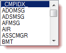
A SAS Professionals attendee and Twitter follower named Marco asks for help: ..struggling to find a method with custom tasks in EG to be able to list the datasets in a library, can you help please? Sure, no problem. This is easy-peasy-lemon-squeezy. First, make sure that you have a reference
A key element of graphs used for analysis of safety data for clinical research is the inclusion of statistical data (or tables) about the study that are aligned with the x axis of the graph. A common example of this comes from the paper "Graphical Approaches to the Analysis of

Most management literature and studies posit that organizations with a clear mission and work objectives, understood by all levels of the organization, are the most productive. The key to that success is effectively communicating the mission, agreeing on key performance indicators and giving employees at all levels access to relevant
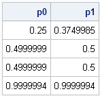
When you are working with probability distributions (normal, Poisson, exponential, and so forth), there are four essential functions that a statistical programmer needs. As I've written before, for common univariate distributions, SAS provides the following functions: the PDF function, which returns the probability density at a given point the CDF

Suppose that you have two data vectors, x and y, with the same number of elements. How can you rearrange the values of y so that they have the same relative order as the values of x? In other words, find a permutation, π, of the elements of y so
Update 24Nov2015: The methods in this post no longer work for Twitter, as Twitter has discontinued support for its "share count" API that was used within the Twitter share buttons. But the Facebook method still works, and I've described a method for counting LinkedIn shares on another post. As of
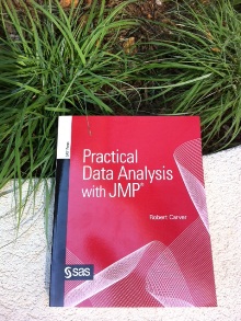
If you're using JMP, please read on. This week's tip is from Professor Robert Carver and his popular book Practical Data Analysis with JMP. To read a free chapter and reviews of the book, visit Robert's author page. The following excerpt is from SAS Press author Robert Carver and his book "Practical Data Analysis with JMP" Copyright ©
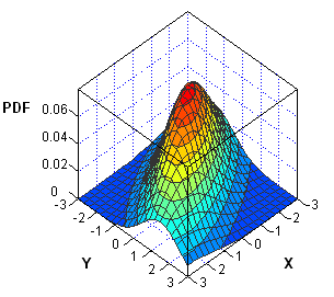
I've been working on a new book about Simulating Data with SAS. In researching the chapter on simulation of multivariate data, I've noticed that the probability density function (PDF) of multivariate distributions is often specified in a matrix form. Consequently, the multivariate density can usually be computed by using the
Spark lines, made popular by Edward Tufte, provide a way to visualize trends in a concise space, often inline with the rest of the narrative or data. Previously, I posted an article on Spark Plots in which I created different plot types, some of which included multiple graphs and data in each row. For such
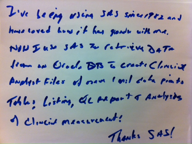
It's so important for companies to build what customers want rather than build a product and then convince the market to buy it. So I love it when I hear or read remarks like the one below - SAS has grown with me. That means that we have listened to

We've all heard of her. A little blond girl with a penchant for trespassing, and very finicky preferences in mattresses and breakfast food. Unfortunately, Goldilocks isn't just part of a fairy tale, she is alive, well, and causing havoc throughout government. If you haven't made the connection yet, "bear" with


