All Posts


The first step is to answer the question of what “real-time” actually means. Depending on the program and industry speed of response, I’ve heard answers that varied from milliseconds for the biggest banks in processing credit card charges to 24 hours for some government programs. A better description of what


I’ve heard it said that the only thing you can count on in life is change. The same can be said of technology. Change is certain, and the rate of change seems to accelerate with each passing year. Change requires us to adapt, but as we race to keep up with
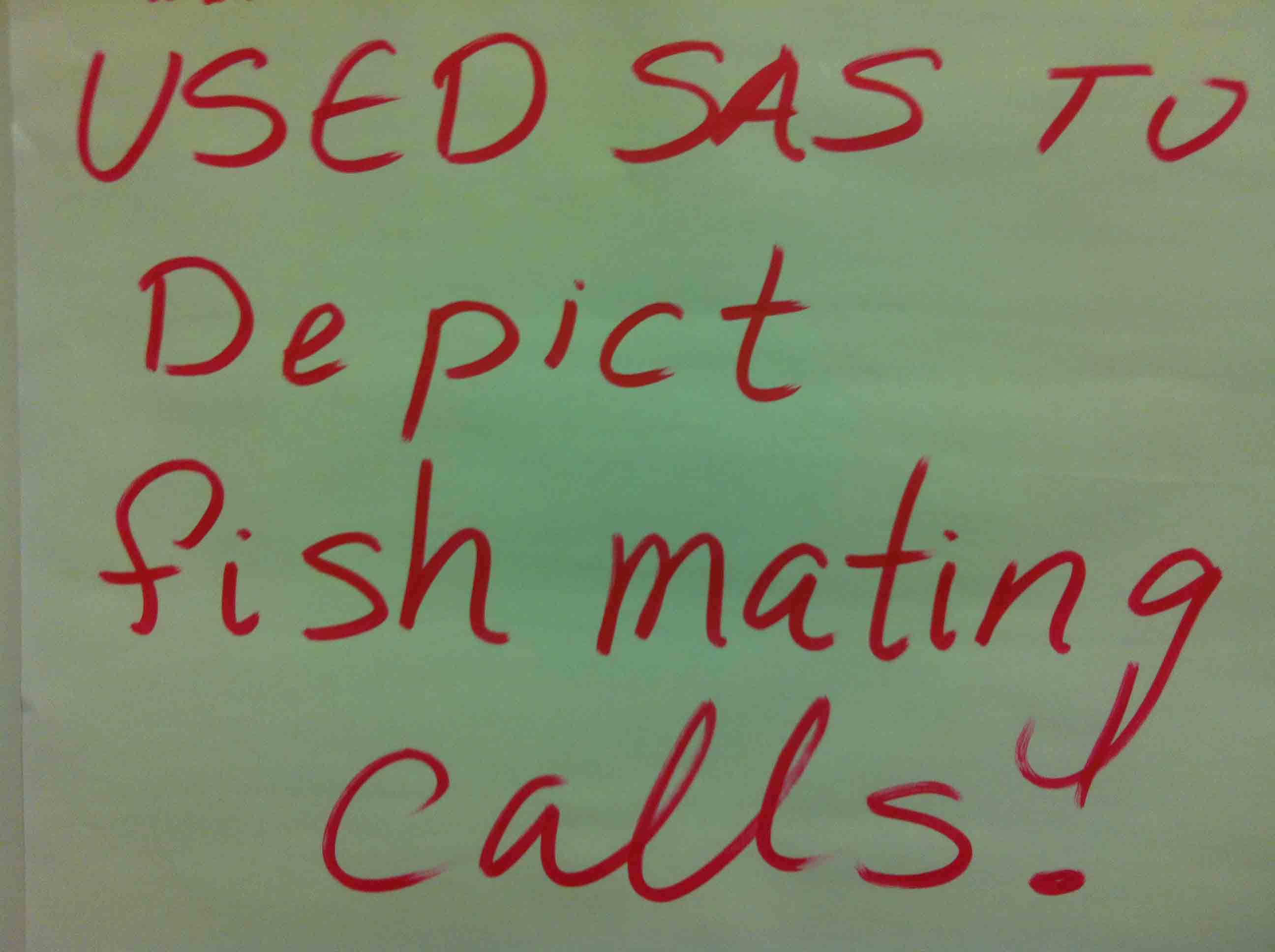

I'm going to handle this Friday's Innovation Inspiration a bit differently from the way I usually do; rather than helping you find information so that you can try this on your own, I'd like to know what you would use to display fish mating calls. Obviously you would need a few

You may still believe that Hadoop is going to solve all of the world’s problems with big data. It won’t. Hadoop is a framework for storing large-scale data processing with both pros and cons for organizations. Christopher Stevens, from Greenplum, explained that Hadoop is rapidly becoming the go-to for big

Leanne Tang has learned a lot about encoding in her work of providing relevant user data and securing the database from accidental changes. There are hundreds of SAS users at the National Agricultural Statistics Service. Tang didn’t want to create thousands of accounts and passwords to allow those users to

This SESUG conference was a very energetic and rewarding experience, with many user presentations on graphics using SAS/GRAPH and ODS Graphics. One standout presentation for me was on "Data Merging and Exploration to Identify Associations Between Environmental Factors and Disease Outbreaks" by Neeta Shenvi, et. al. The key part of

Congratulations to all of these winners in the MWSUG Best Contibuted Papers! I hope you have all submitted your papers to the 2013 SAS Global Forum. The deadline for submissions ends soon! Here's a list that I know you have all been waiting for:
Leanne Tang had a problem. She has one giant database that houses data from all of the units at National Agricultural Statistics Service. She has hundreds of people who need access, but she wants individual users to have access only to the data that meets their needs. In Tang’s
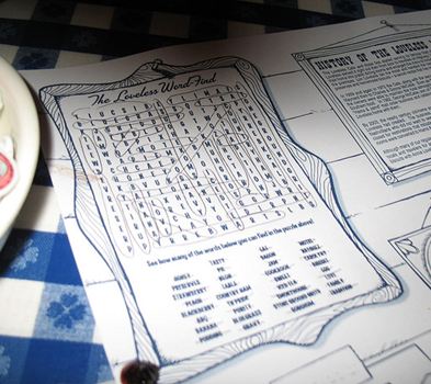
Do you finish the Word Search in the Sunday paper? Several years ago, Robert Matthews decided to design a word search to help his kids in their school work. Matthews wanted to be able to put in the words of his choice and provide difficulty levels so that game users could

The Macro facility is a powerful and flexible tool, but sloppy techniques can make macros one of your biggest headaches. Poorly handled macros may run without error but leave your users with unexpected results and litter your system with unwanted files and variables.


Living in the Washington, D.C. area I expect the morning news shows to spend a lot of time reporting on traffic. Crashes on the beltway, downed power lines delaying train service…that’s a normal day. D.C. is the most congested city, according to the Texas Transportation Institute’s annual report.). Commuting to
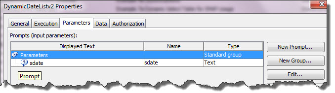

Last week I provided the steps for how to go on a date, at least by using dynamic prompts in BI Dashboard. Now that you have seen how to create them, lets discuss making them smarter. For this example, the customer is asking for two prompts to affect a single


Andy Pulkstenis of State Farm thinks it is, stating that this red-headed stepchild among modeling technques is where predictive modeling was ten years ago. He opened his talk, "Do You Know or Do You Think You Know? Creating a Testing Culture at State Farm," at the A2012 conference in Las Vegas with
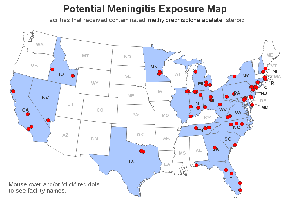

You've all heard about the recent meningitis outbreak, right? Being a data-guy and a map-guy, I went looking for maps related to the outbreak. I found the following map on the Centers for Disease Control (CDC) website. It shows the states that received the recalled drug used in epidurals (for back

Have you registered for the 20th annual SouthEast SAS Users Group conference (SESUG) yet? NO? What are you waiting for? I've heard it going to be a real party, so come help us celebrate SESUG's 20th birthday (hmm ... SESUG isn't even old enough to drink). The last time I went was