All Posts
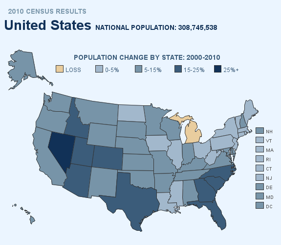

By now, most of you probably already know how to add drill downs and hover text to your SAS graphs. But did you know you can add pop-up images and graphs? Here are a couple of examples ... In this first example, when you hover your mouse over each state, you

75 degrees, 30% humidity and a cloudless, blue sky: It’s hard to beat Fall in North Carolina! Something else I enjoy this time of year is the colors of Fall, both outdoors and in the kitchen. Many fruits and vegetables are at their peak right now providing amazing, colorful menu
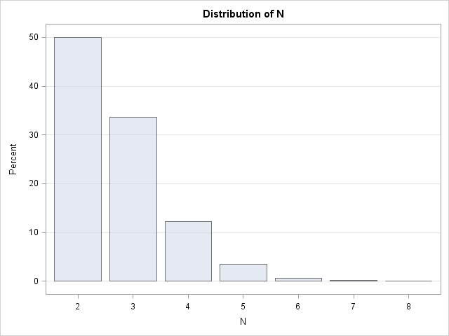

I was recently flipping through Ross' Simulation (2006, 4th Edition) and saw the following exercise: Let N be the minimum number of draws from a uniform distribution [until the sum of the variates]exceeds 1. What is the expected value of N? Write a simulation to estimate the expected value. For


This summer’s education conferences have been dominated by sessions discussing the “next generation,” Common Core aligned assessments in English and mathematics. As 44 states plan for the transition from their state tests to the new PARCC and Smarter Balanced Assessment Consortium assessments, SAS has received repeated questions from our partners


If you remember Andy Kuligowski for nothing else, you probably remember that he was the SAS Global Forum conference chair for 2012. I remember that he has a wonderful sense of humor, which he used more than once during his Hands on Workshop at the MidWest SAS Users Group conference


You may recall that I am a novice SAS user - I've been using SAS for about two years now and work for Canada's largest pediatric hospital as a database administrator and data analyst. In April, during SAS Global Forum 2012, I wrote my first blog post on the SAS Users
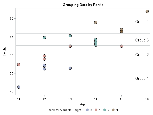
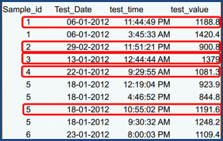
Sometimes it is useful to group observations based on the values of some variable. Common schemes for grouping include binning and using quantiles. In the binning approach, a variable is divided into k equal intervals, called bins, and each observation is assigned to a bin. In this scheme, the size
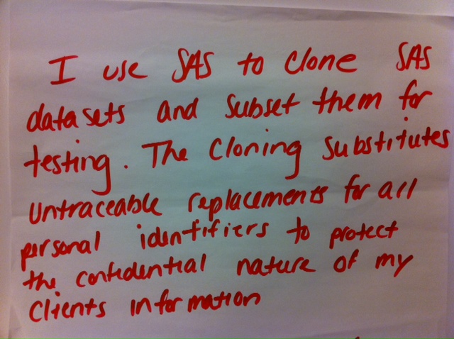
Diane Olson, from SAS, wrote a SAS Global Forum paper in 2011 that seems ready-made for this SAS user's Post-It note. Olson wrote about PROC COPY and PROC APPEND. In her paper, she lets you in on the inside tricks on how to clone your data set to the same library, copy


Detecting and preventing fraud isn't easy. Many tools and techniques are required, and while the digital age and advanced technologies have made fraud much easier in many ways, those same technologies have opened up new ways to combat it. One of those comes in the form of social network analysis,
Chris Hemedinger is not the only person who’s excited about the capabilities of SAS Enterprise Guide. Tom Miron, from Systems Seminar Consultants, a SAS author with more than 35 years of SAS experience, shared some great advice for using SAS Enterprise Guide.


Dear Miss SAS Answers, I have read through a few Dear Miss SAS Answers blog posts, but I cannot seem to find what I am looking for. I need to extract only the second duplicate from a whole list of duplicates per account number. Is there a way to
There are five short, simple, quick rules to help you take advantage of indexes. An index lets you retrieve information from SAS data sets or tables. And according to Kirk Paul Lafler, if you keep these rules in mind, your information retrieval will be more efficient. Lafler is the Senior

Last week I attended a meeting of the Toronto Area SAS Society. (Okay, I didn't just attend; I was a presenter as well.) This user group meeting contained a feature that I had never seen before: "Solutions to the Posed Problem". Weeks before the meeting, an "open problem" was posted
Are you just starting out in your career? What if you think you’ve been around the block and there is nothing new you can do in your career? Everyone has their own perspective on what career planning is, but Bill Donovan from OckhamSource has a plan to help SAS users make a career
Every fall (fall in the US, that is), I try to attend as many SAS Users Groups events as humanly possible. This year, I’m starting with the MidWest SAS Users Groups conference in Minneapolis, then SouthEast SAS Users Group conference in Durham, NC (my home base) and finishing the season