All Posts
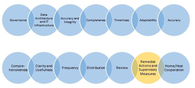

Principle 13: Remedial actions and supervisory measures - Supervisors should have and use the appropriate tools and resources to require effective and timely remedial action by a bank to address deficiencies in its risk data aggregation capabilities and risk reporting practices. Supervisors should have the ability to use a range

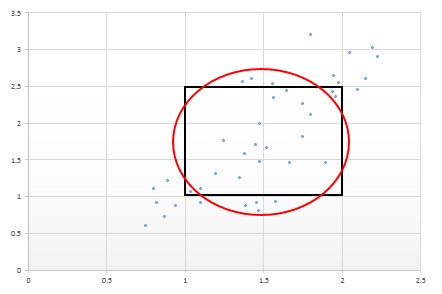
The topic of VENN diagrams had come up a while ago. At that time, I thought it may be interesting to build a proportional VENN diagram. But, reading up on VENN Diagrams, I learned that VENN diagrams represent all intersections of N sets, regardless of whether there are actually any observations in one
By now you have heard all about the SAS(R) STUDIO software that provides access to the power of SAS analytics in a Web browser. The SAS(R) University Edition is also available free for higher education teaching, learning and research. This software includes ODS Graphics software for creating graphs. You can

In the energy industry, oil and gas companies as well as utilities are struggling with many changes at once. First, they're facing what the oil and gas industry has coined "the big crew change," meaning the retirement of those with the most skills and experience on how to run their


SAS administration and support can be a real challenge for some companies. It all has to do with not having the right resources and skills. Business analysts are often charged with maintaining SAS. They know data, but they don’t have the IT skills needed to properly support SAS. IT teams


Protein seems to be everywhere these days from television ads to magazines to grocery store shelves. With all the publicity surrounding protein, you’d think Americans weren’t getting enough of it while in reality, most of us consume more than enough protein.

Did you check your email and/or favourite social media site before leaving for work this morning? Did you do it before getting out of bed? Don’t worry, you’re not alone. I do it every morning as a little treat while I “wake up” and whether I realize it or not,

I speak with executives in every industry – in companies big and small – and they all have the same challenge: They’re overwhelmed with data. The problem? There’s a huge gap between the amount of data they possess and the number of employees who can analyze it. This lack of
At PharmaSUG 2014 in San Diego, I had the pleasure of attending "Swimmer Plot: Tell a Graphical Story of Your Time to Response Data Using PROC SGPLOT", by Stacey Phillips. In this paper, Stacey presented an interesting graph showing the effects of a study drug on patients' tumor size. Stacey


Having spent a good part of my career “owning” the data hub in IT for analytics solutions, I think I can say, the myth that IT controls all things data has become less and less true through the years – and eventually it will be completely false. Or maybe it


Last month, SAS launched our new no-cost software for higher education teaching, learning and research – SAS® University Edition. Available to students, professors, academic researchers and lifelong learners, SAS University Edition provides local access to BASE SAS®, SAS/STAT® software, SAS® Studio, SAS/IML® software and SAS/ACCESS® Interface to PC Files. SAS University Edition


My esteemed colleague and recently-published author Jared Dean shared some thoughts on how ensemble models help make better predictions. For predictive modeling, Jared explains the value of two main forms of ensembles --bagging and boosting. It should not be surprising that the idea of combining predictions from more than one
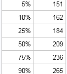

A colleague asked me an interesting question: I have a journal article that includes sample quantiles for a variable. Given a new data value, I want to approximate its quantile. I also want to simulate data from the distribution of the published data. Is that possible? This situation is common.


Today it is common knowledge that a classroom teacher is the single largest in-school influence on student academic growth[1]. So when South Carolina received ESEA flexibility in July, 2012, the State Department of Education immediately began an initiative empowering teachers to increase their own effectiveness. Known as the Educator Evaluation System
Recently, a user posed a question on how to plot stacked frequencies on a time axis. The data included frequencies of different viruses by week. The data is modified to preserve confidentiality and is shown below. The user's first instinct was to use a bar chart with stacked groups. This works for automatically computing frequencies