All Posts


El comercio electrónico en México continúa avanzando de forma importante. El intercambio de bienes y servicios a través de Internet pasó de $ 481,232 millones de pesos (mdp) a $ 803,103 mdp, lo que representa el 4 % del Producto Interno Bruto (PIB). La Asociación de Internet.MX y ComScore, por

There is tremendous value buried text sources such as call center and chat dialogues, survey comments, product reviews, technical notes, legal contracts... How can we extract the signal we want amidst all the noise?


Each week in February, your Work/Life team has invited therapists and dating professionals in the community to respond to questions about relationships. For this final blog in the series, we asked our experts… How do you thrive as a single person? Kate Freiman-Fox, Ph.D. Matchmaking, Date and Relationship Coaching


There's a chasm in today's business world between "can" and "should." Let's hope that gap closes soon.


The SAS Learning post has merged with the SAS Users blog to provide you with all the training, certification, books, events, and programming tips you need.


In this post, we continue our discussion of geography variables, the foundation of Visual Analytics Geo maps. This time we will look at Custom Coordinates. As with any statistical graph, understanding your data is key. But when using Custom Coordinates for geographic maps, this understanding becomes even more important. Use
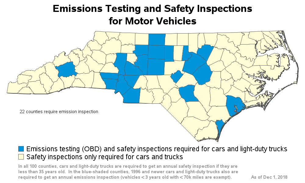

If you live in North Carolina, chances are you have to get your vehicle inspected each year, before you can renew your license plate. The inspection consists of a safety portion, and in some counties an emissions portion. In the past, 48 of NC's 100 counties required the emissions portion


High blood pressure, or hypertension, is unfortunately very common, affecting 1 billion people worldwide. According to the CDC, 1 in 3 American adults have hypertension (about 75 million people!), and only about half of them (54%) have it under control. Having high blood pressure greatly increases your risk of heart
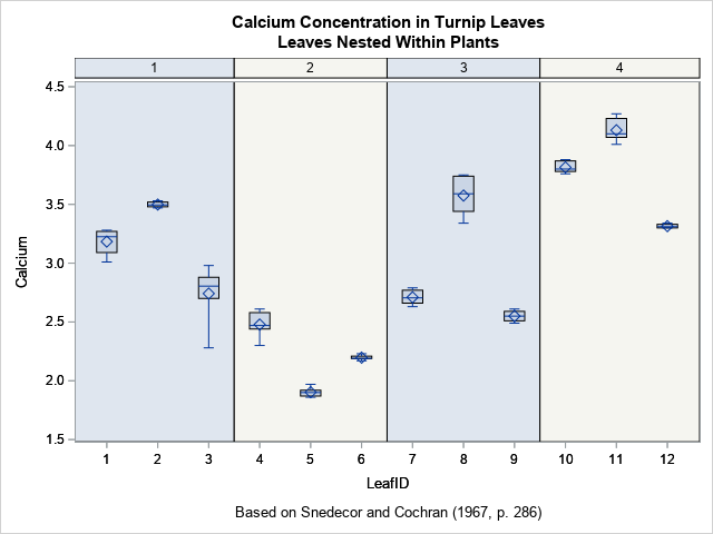

Box plots are a great way to compare the distributions of several subpopulations of your data. For example, box plots are often used in clinical studies to visualize the response of patients in various cohorts. This article describes three techniques to visualize responses when the cohorts have a nested or


El impacto de la recaudación fiscal es vital para el funcionamiento económico de un país. Los gobiernos diseñan políticas en esta materia enfocadas en elevar los fondos públicos que se dedicarán al desarrollo de infraestructura, financiar programas sociales, prestar los servicios que demandan los ciudadanos y fomentar el crecimiento socioeconómico.


En mi opinión, sommelier no es un título, es un oficio. No se aprende, se vive... Un sommelier es un experto en vinos, él conoce de variedades y sabe cuál se adapta a cada menú. A lo largo del tiempo el concepto de sommelier evolucionó y se aplica a otros

Every year Lisa and I look forward to our dating clinics where we meet with employees to talk about all things dating and relationships. We offer these as part of our annual February Relationship Series. Although we promote these in February, we can meet with employees anytime to talk about

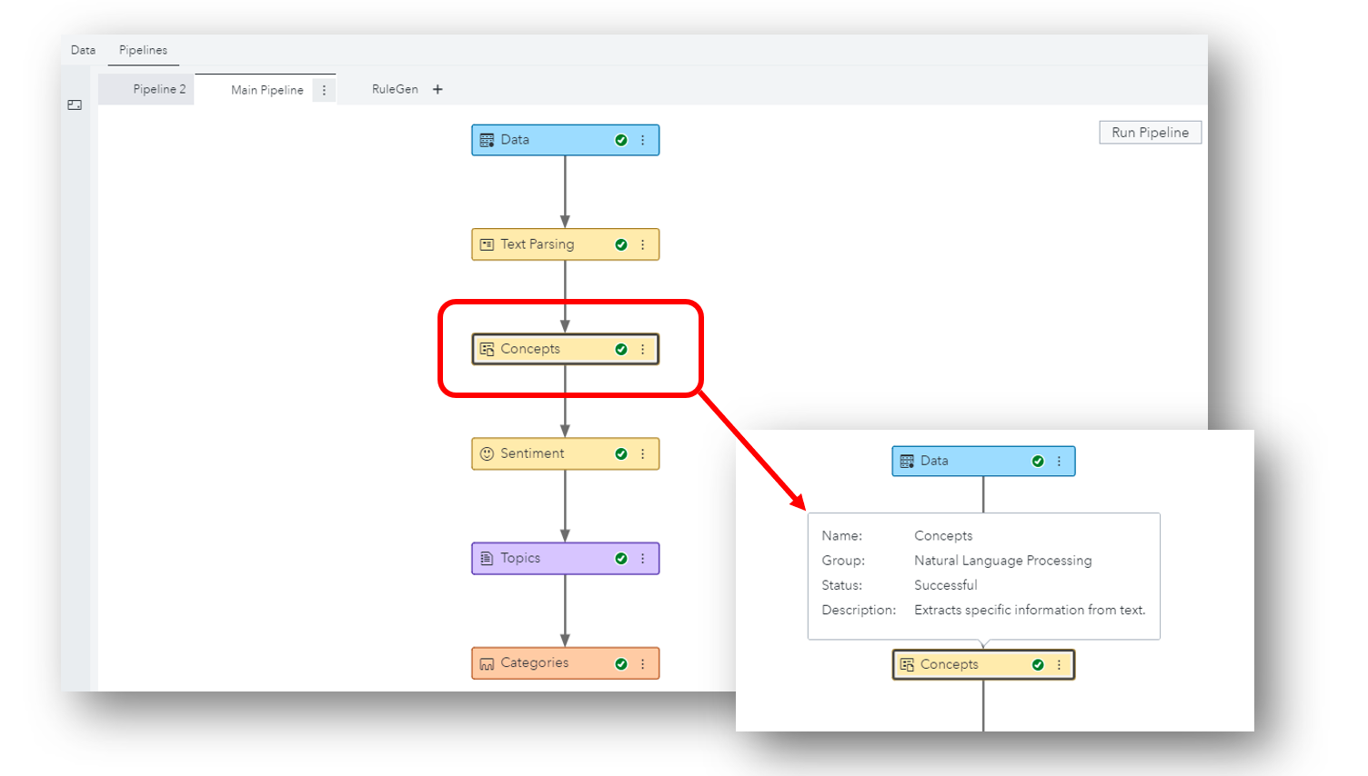
データサイエンティスト(以降、DSと表記)は、お好みのプログラミング言語を使用して、日々モデリングを行っています。昨今は、その中でもオープンソースのプログラミング言語であるPythonやRを使用されている方の割合が多くなってきているようです。その結果として、企業の分析組織やチーム内には複数の異なる言語を活用するDSが混在するケースも見受けられます。(一人で両方の言語を操る方もいます。) 「Pythonを操るAさんが作成されたモデルと、Rを操るBさんが作成されたモデル、どちらの精度が高いのかを容易かつビジュアルに比較することができたら…」 ということで、今回は、SAS ViyaのModel Studioを使用し、ビジュアルなパイプライン上での異なる言語間モデル精度比較をご紹介します。 手順は以下の通りです。 ① プロジェクトの新規作成と学習用のデータソース選択 ② パイプラインの作成と実行 ③ 実行結果(モデル精度)の確認 ① プロジェクトの新規作成と学習用のデータソース選択 「SAS Viya: ビジュアルパイプラインで予測モデル生成(基本編)」の「1.プロジェクトの新規作成と学習用のデータソース選択」を参照ください。 ② パイプラインの作成と実行 画面上部にある「パイプライン」をクリックします。 パイプラインには「データ」ノードのみが表示されています。左端の機能ノードアイコンをクリックすると、 パイプラインに追加可能な機能ノードのリストが表示されます。 まずは学習データに対する前処理として、欠損値補完を行います。 「データマイニングの前処理」内にある「補完」を「データ」ノード上にドラッグすると、 「データ」ノードの下に「補完」ノードが追加されます。 同様の手順で、「その他」内にある「オープンソースコード」を「補完」ノード上へドラッグすると、「補完」ノードの下に「オープンソースコード」ノードが追加されます。 機能ノードごとのオプション設定は、右側画面内で行います。 「言語」が「Python」であることを確認し、「開く」をクリックします。 開かれた画面内に、比較対象のPythonのコード(ランダムフォレストのモデル)をコピーします。右上の「保存」(フロッピーディスクアイコン)をクリックし、「閉じる」をクリックします。 ※ターゲット変数名や入力変数リスト名など、画面左側の変数名を使用することによって、オープンソースコードノードとその他のノード間でのデータ連携が可能となり、異なる言語のモデル間での精度比較も可能になります。各種規定変数名の詳細に関しては、オンラインマニュアルを参照してください。 「オープンソースコード」ノードの右側にある3つのドットが縦に並んでいる(スノーマン)アイコンをクリックし、「名前の変更」を選択し、 「Pythonフォレストモデル」に変更します。 このようにドラッグ操作でノードを追加する以外に、パイプライン上のメニューからノードを追加することもできます。 「補完」ノードのスノーマンアイコンをクリックし、「下に追加」>「その他」>「オープンソースコード」の順に選択すると、 「補完」ノードの下に「オープンソースコード」ノードが追加されます。 以降、同様の手順で比較対象のRのコード(ランダムフォレストのモデル)をコピーし、ノードの名前を変更します。 「オープンソースコード」ノードは、データに対する前処理として使用することもできます。デフォルトでは、「オープンソースコード」ノードは、データに対する前処理として認識されているので、これを「教師あり学習」に切り替えます。 PythonとRのモデルノードそれぞれのスノーマンアイコンをクリックし、「移動」>「教師あり学習」を選択します。 すると、「モデルの比較」ノードが追加され、PythonとRのモデルノードと接続されます。 パイプラインが完成したので、右上の「パイプラインの実行」アイコンをクリックし、実行します。 ③ 実行結果(モデル精度)の確認 処理が正常に完了したら、「モデル比較」ノードのスノーマンアイコンをクリックし、「結果」を選択します。 Rのフォレストモデルの方が精度が高い、チャンピオンモデルであると表示されました。 リフトやROC、様々な統計量で、精度を詳細に比較することもできます。 以上が、ビジュアルパイプラインでPythonとRのモデル精度を比較する手順です。 もちろん、必要に応じて、PythonやRのモデルとSASのモデルの精度を比較することもできます。 ※ビジュアルパイプラインでPythonとRのモデル精度を比較は、SAS Viya特設サイトにある動画でもご覧いただけます。 ※実際にPythonとRのモデル精度比較を試してみたい方は、Githubに公開されているアセットを活用ください。
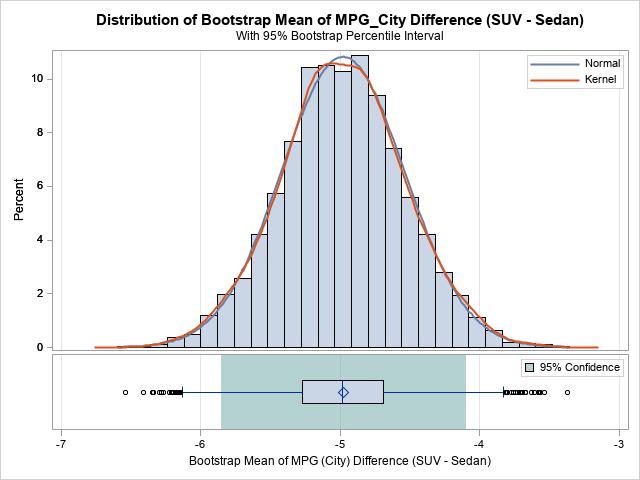
When I run a bootstrap analysis, I create graphs to visualize the distribution of the bootstrap statistics. For example, in my article about how to bootstrap the difference of means in a two-sample t test, I included a histogram of the bootstrap distribution and added reference lines to indicate a

There will be more than 55 billion IoT devices by 2025 – more than four devices for every person on earth. That means that big data is only getting bigger. All of that high frequency, high velocity data from connecting the physical world to the digital world is available, and