All Posts
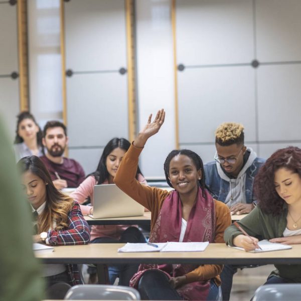

Building a data and analytics culture in higher education means equipping key stakeholders with the skills necessary to analyze and leverage insights extracted from data. Doing so can drive faster, more accurate decision-making. When I hear “data and analytics culture,” I immediately think of the work Jason Simon and his team
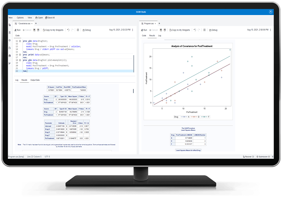
SAS Analytics Pro Advanced Programming offers key statistical capabilities in a docker container. The product bundles selected executables from SAS Viya to create the container, which eases or streamlines the setup required for fixes and updates to the software.
With all that’s happened over the last two years, there has never been a greater need for inspiration, connectedness and learning. And for that, we need to look no further than our curious employees! That’s the idea behind Big Ideas, our internal series of short, inspiring employee talks. Each year,
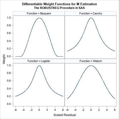

An early method for robust regression was iteratively reweighted least-squares regression (Huber, 1964). This is an iterative procedure in which each observation is assigned a weight. Initially, all weights are 1. The method fits a least-squares model to the weighted data and uses the size of the residuals to determine

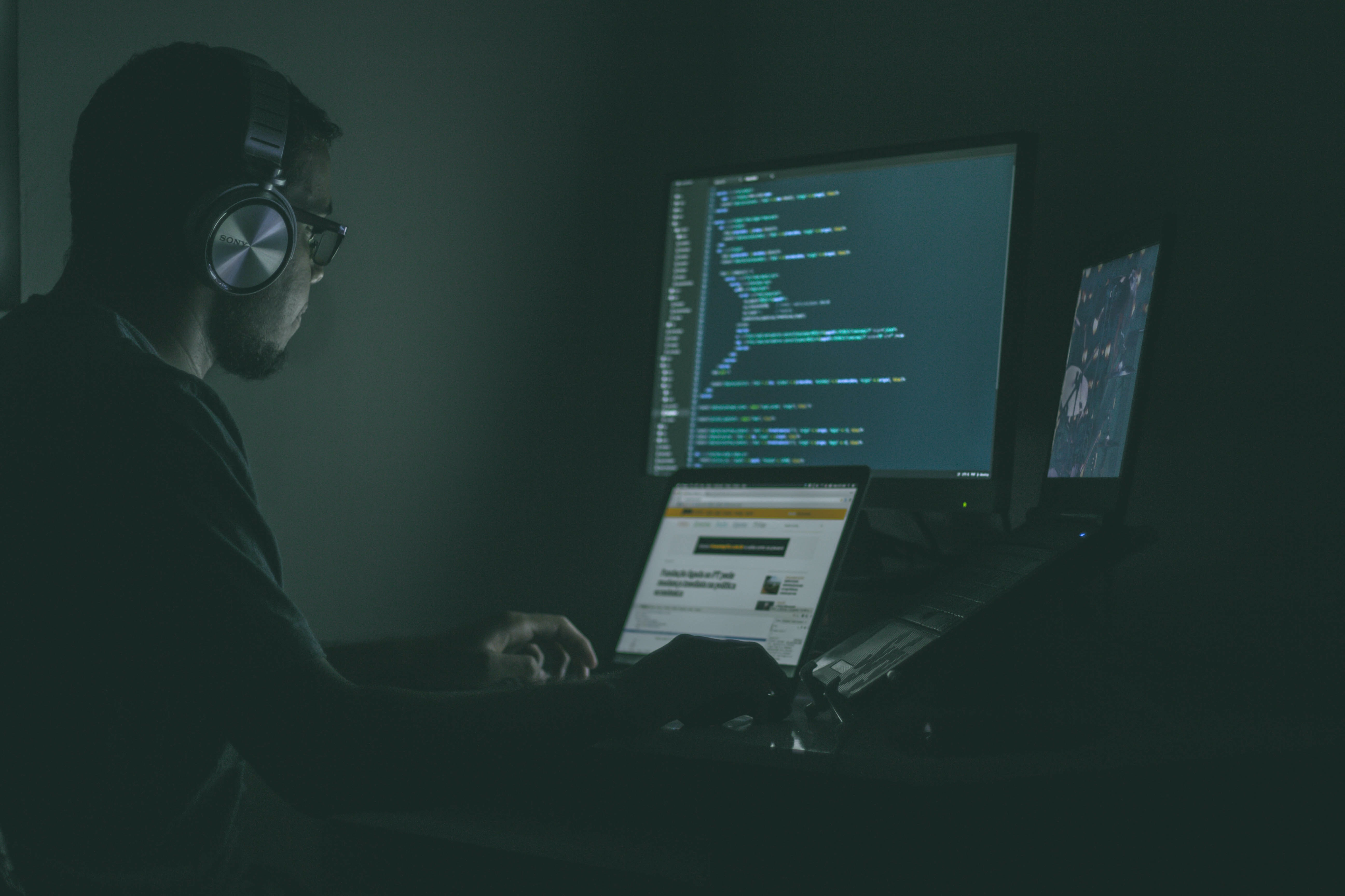
Robert Blanchard's role as a data scientist at SAS has afforded him the flexibility to live where he wants, in his case, on a beach in San Diego.

Toc, toc, toc. En algún lugar de Berlín a comienzos del siglo XX, tras esos pequeños tres golpes, se podía observar inconfundibles caras de asombro entre los periodistas y curiosos. En cambio, Wilhelm Von Osten reflejaba en su rostro algo más: felicidad, realización y por qué no, el disfrute de

In the face of rapid digitalization and modernization, data scientists in Cameroon joined the SAS Hackathon seeking a way to preserve indigenous African languages.
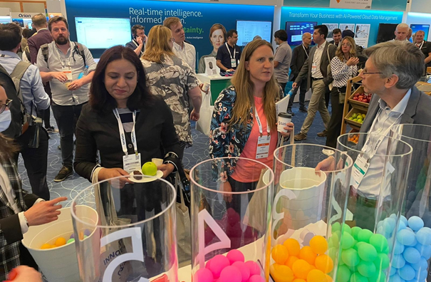

After two years of virtual events we finally got the chance to attend (an in-person event at) the Gartner Data & AI Summit that took place in London. Keen to take advantage of the combined knowledge and experience of the +1500 attendees, we decided to ask them a question at
Self-care is something we should all do on a daily basis. It's good for the body, mind and spirit. While we have a plethora of breathing and meditation audios in our SAS RFC gallery, apps are great too. In this article, I’m sharing six free meditation apps that can assist
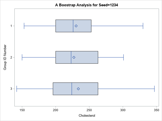
A common question on SAS discussion forums is how to randomly assign observations to groups. An application of this problem is assigning patients to cohorts in a clinical trial. For example, you might have 137 patients that you want to randomly assign to three groups: a control group, a group
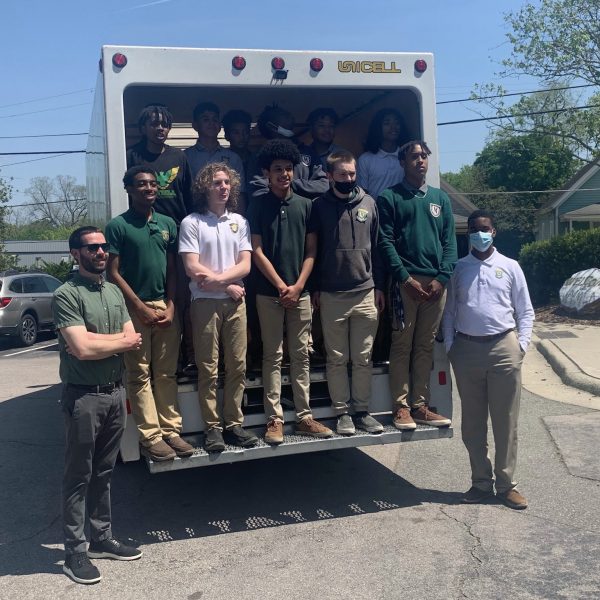
Six scholars from North Carolina A&T State University in technology– or STEM-focused majors helped foster the next generation of data-literate students while also donating to those in need. SAS recently facilitated a donation drive with students from the Wake County Young Men's Leadership Academy (WYMLA) in Raleigh, North Carolina and scholars from
If you use formatted variables in a CLASS statement in procedures such as MEANS or UNIVARIATE, SAS will use the formatted values of those variables and not the internal values. For example, consider you have a data set (Health) with variables Subj, Age, Weight, and Height. You want to see
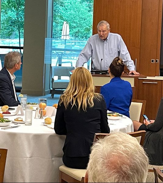

A delegation of 26 members of the American Chambers of Commerce of the European Union (AmCham EU) made their way to the Research Triangle. Representatives learned about local methods and best practices for developing the American economy and locating potential business partners. Leaders from countries across Europe first met with

They look the same, don’t they? It can be hard to tell one duck from another, but one of them is from a bad egg (I’ll tell you which one at the end of the article). Business rules are a bit like this. They find you lots of alerts, but

One of the most exciting aspects of working at SAS is seeing #Data4Good projects come together. For example, SAS is an official analytics supplier to the Special Olympics, part of the inclusion movement for people with intellectual disabilities. For the 2019 edition of the Special Olympics, we brought together a