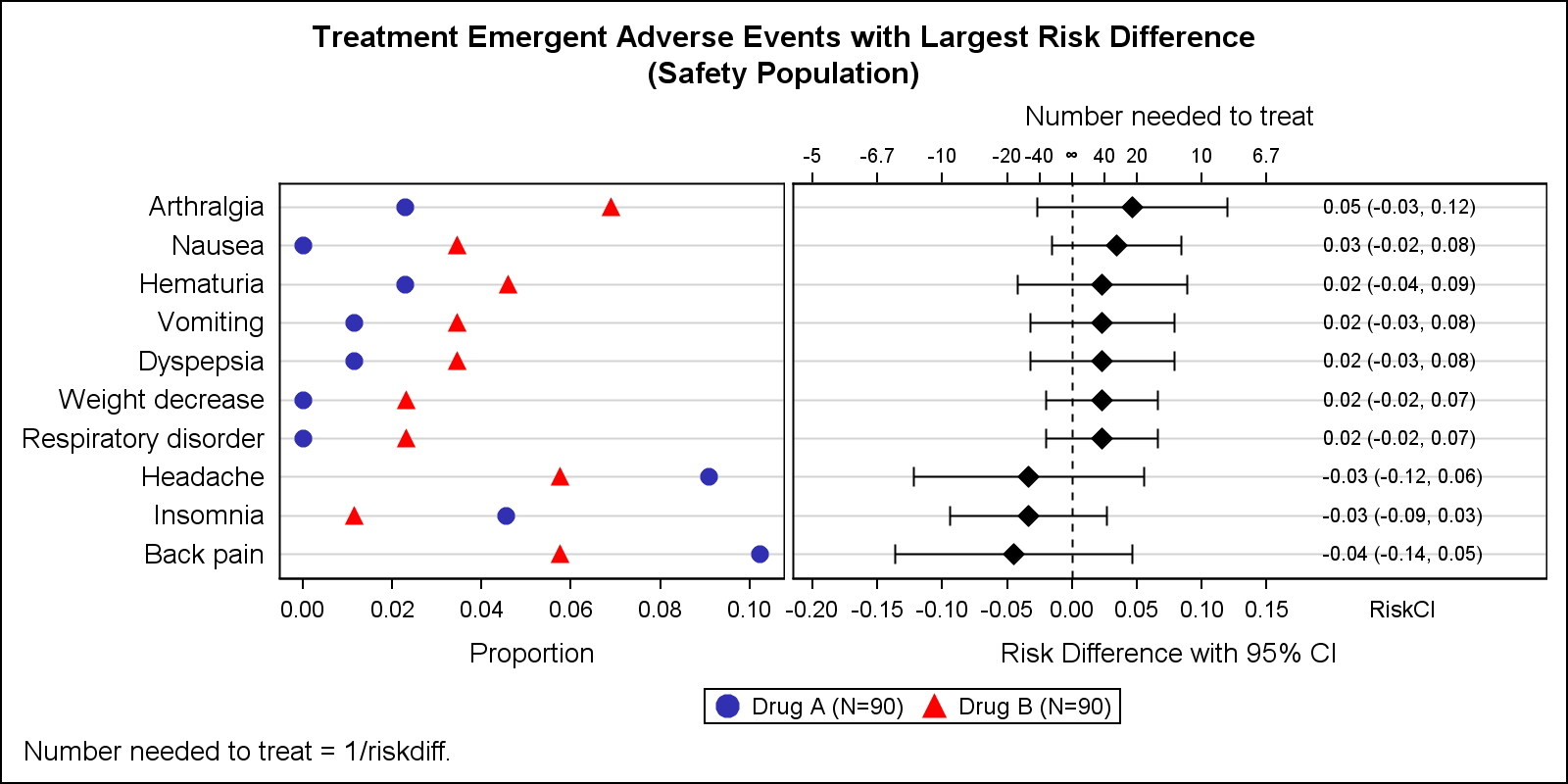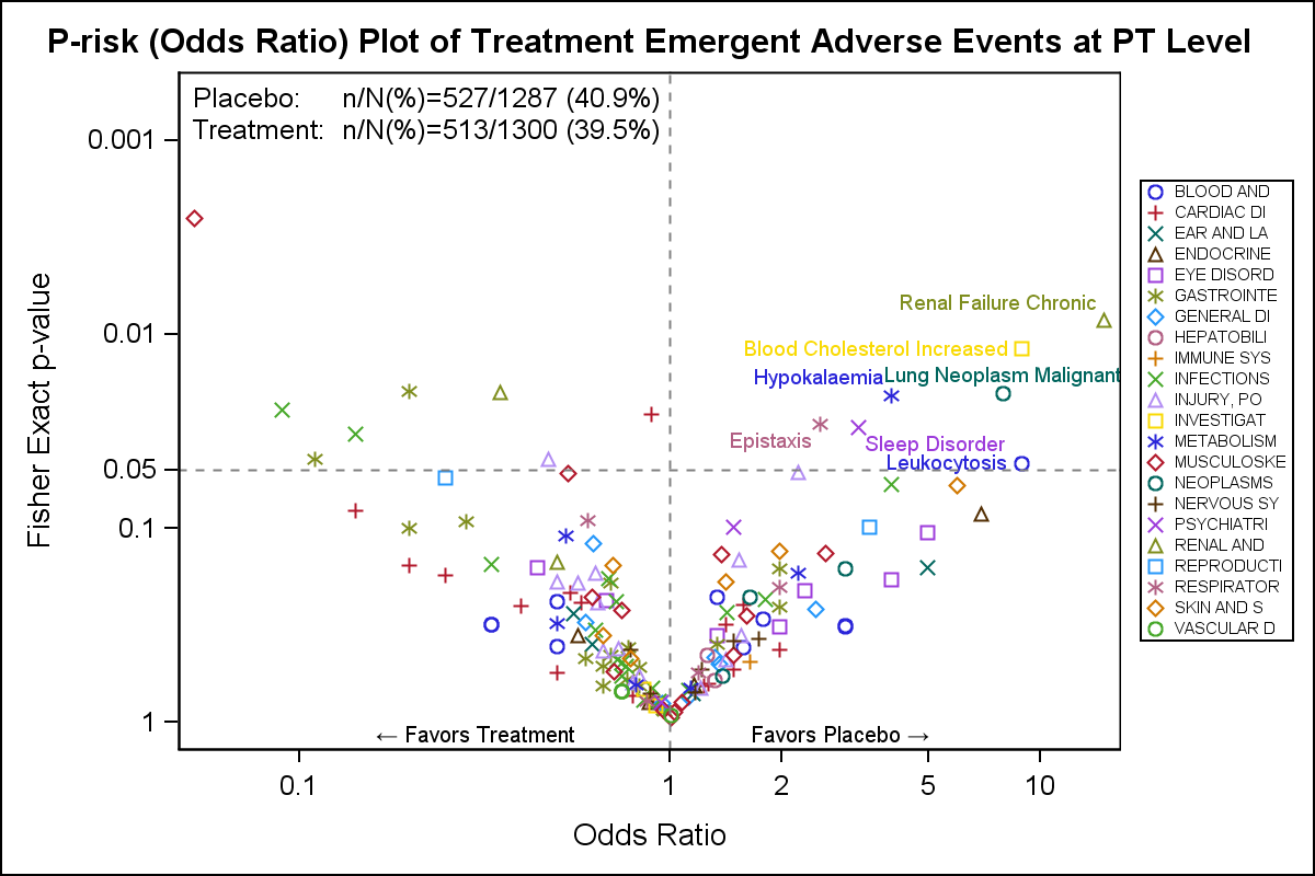
A Volcano Plot is a type of scatter-plot that is used to quickly identify changes in large data sets composed of replicate data. In the clinical domain, a Volcano Plot is used to view Risk difference (RD) of AE occurrence (%) between drug and control by preferred term. One example of
Search Results: Unicode (79)
Early last year I wrote an article on how to create the "Most Frequent Adverse Events Sorted by Relative Risk" graph using the SGPLOT procedure. The key issue here is that such a graph normally displays two plots side by side, a scatter plot of the proportion values by treatment
When we first released GTL and SG Procedures back with SAS 9.2, Box Plots and Bar Charts would always treat the category axis as discrete. We realized soon enough that we need to support box plots on scaled interval axes for many clinical applications, and this was added in SAS
We all want to customize our graphs just so, and have our personal preferences. Over the past few releases SG Procedures and GTL have added options to customize the look and feel of our graphs. In this article, I will describe new ways in which you can customize your legends. We will also see some
My previous blog was about popular first names ... now for a blog about popular surnames (ie, last/family names)! But before we get started, here's a little pop-quiz - what country is my friend Mr. Foley's surname from?
If you have programmed with SAS in the last 15 years, you have probably had a reason to share your SAS results in PDF format. The ODS PDF destination, much like a well-designed car, has evolved over the years, offering progressively nicer features like security, enhanced image formatting and embedded
Do you support a multilingual reporting audience? This is a fast-growing requirement for many of you, and now your SAS Visual Analytics reports can be easily configured to support any number of languages. From SAS Visual Analytics Designer, there is an option under the File menu called Localize Report. This
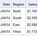
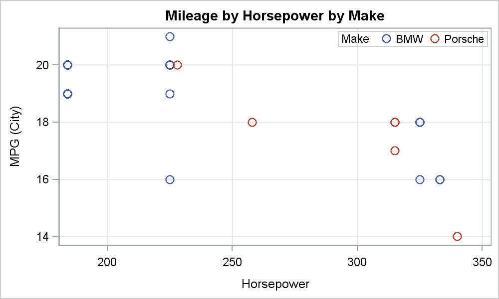
There has been much discussion on the SAS Communities page on usage of different symbols in a graph. The solutioin can vary based on the SAS release. New features have been added at SAS 9.4 releases to SG Procedures and GTL that make this very easy. With SAS 9.4M1, almost any combination is
Beginning with the first maintenance of SAS 9.4, you have the ability to define your own symbol markers using the SYMBOLCHAR and SYMBOLIMAGE statements. With these statements you can select a Unicode value or you can select an image file that exists on the local file system—making the possibilities for
If you live in an English speaking country you are used to a relatively unadorned alphabet. Take a look at the French and Spanish languages, where vowels are decorated with accents like “acción” in Spanish, and the circumflex, or the hat used in “pâte” in French. Look at the gorgeous
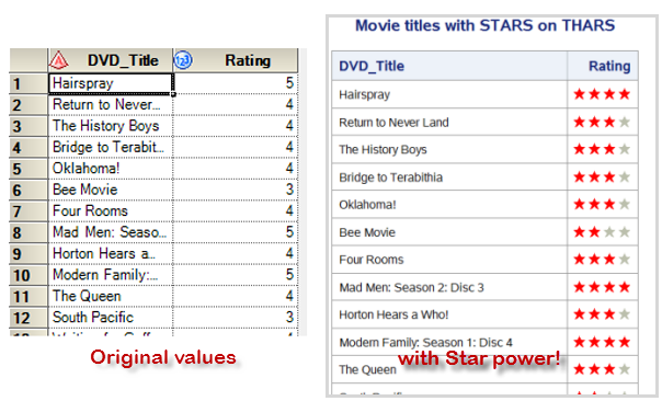
Now, the Star-Belly Sneetches Had bellies with stars. The Plain-Belly Sneetches Had none upon thars. - from "The Sneetches", by Dr. Seuss Recently a user on the SAS-L mailing list had this challenge: "I would like to display stars in a table (created by PROC REPORT) based on variable values.
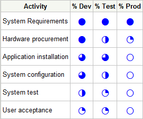
I'm currently working on a large project for a SAS customer. The project comprises many activities and phases, so there is a need to track progress on many different levels. During a recent meeting the project manager announced, "I'm putting together a status deck, and I'll include some Harvey Balls
Browsing graphs on the web, this graph caught my eye: The Arctic Sea Ice Volume Graph. My interest is not so much in the debate on Climate Change or Global Warming. To me, this graph has some interesting features that can help show the benefits of plot layering to
Users have often expressed the need for more marker symbols. ODS Graphics supports over 30 scalable marker symbols, both filled and empty. As mentioned in an earlier article, with SAS 9.4, filled markers can now have outlines and fills, and can also have special effects. Also with SAS 9.4, now you
I needed to construct a string to use in the title of a scatter plot. The scatter plot showed a line, and I wanted to include the equation of the line in the plot's title. This article shows how to construct a string that contains the equation in a readable
The Swiss army knife is known for its versatility, with a variety of tools and blades to help you complete the task at hand. When you are creating graphics, you sometimes have a special feature you want to add, but you can't seem to find the right syntax "tool" to
Have you ever seen question marks in ODS output, diamonds with question marks in them where a copyright symbol should be, or unexpected symbols in your Web browser? In other words, do you sometimes see garbage instead of text? Manfred Kiefer’s new book, SAS Encoding: Understanding the Details can help.
In a previous article we discussed how to add axis aligned statistics table to a Lipid graph using GTL. Other graphs such as the Survival Plot also utilize the same technique to display the "at risk" statistics aligned by time or visits along the X axis. Often, we also need to display
Today's featured topic on support.sas.com teaches you how to use SAS to work with multiple languages and character sets in a single SAS session. The ability to switch locales and languages "on the fly" depends on the improved support for Unicode within SAS 9.2. Although it's a less heralded component