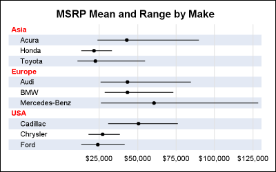
The previous post on Multiple Blank Categories showed how to include multiple blank categories on the axis. But, given the purpose for this was to separate different segments in the data, I also included ideas on how to segmented a discrete axis using reference lines or Block Plot. A similar idea
Tag: Forest Plot
Axis tables can use the SUM= option to summarize data and display means, medians, sums, and percentages. They can instead be used to display data, text, and statistics without any summarization.
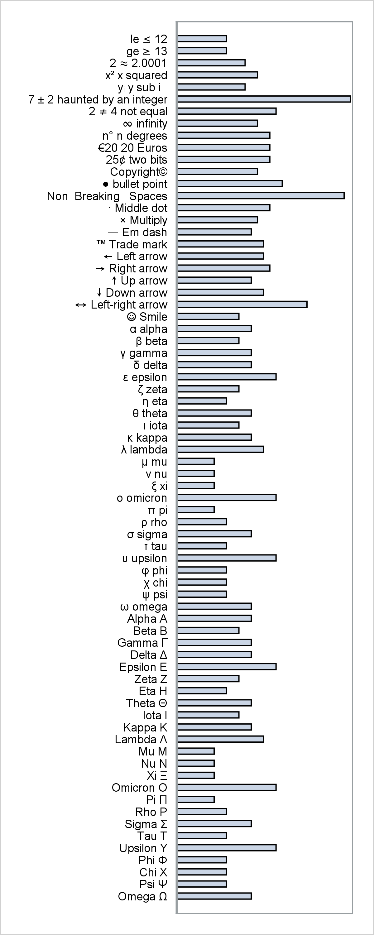
This post provides a general macro that enables you to easily display special characters (Unicode) in axis table columns.
One key aspect of graphs used in the statistical or clinical research domains is the need to display numerical or textual information aligned with the data in the plot. Examples of such graphs are the Survival Plot or the Forest Plot. These graphs use the AXISTABLE statements available with SAS
Today, I focus on the steps needed to make a graph that is composed of multiple heterogeneous components (in this case, dendrograms and a heat map).
Last week I had the pleasure of presenting my paper "Graphs are Easy with SAS 9.4" at the Boston SAS Users Group meeting. The turn out was large and over 75% of the audience appeared to be using SAS 9.4 back home. This was good as my paper was focused on the cool new
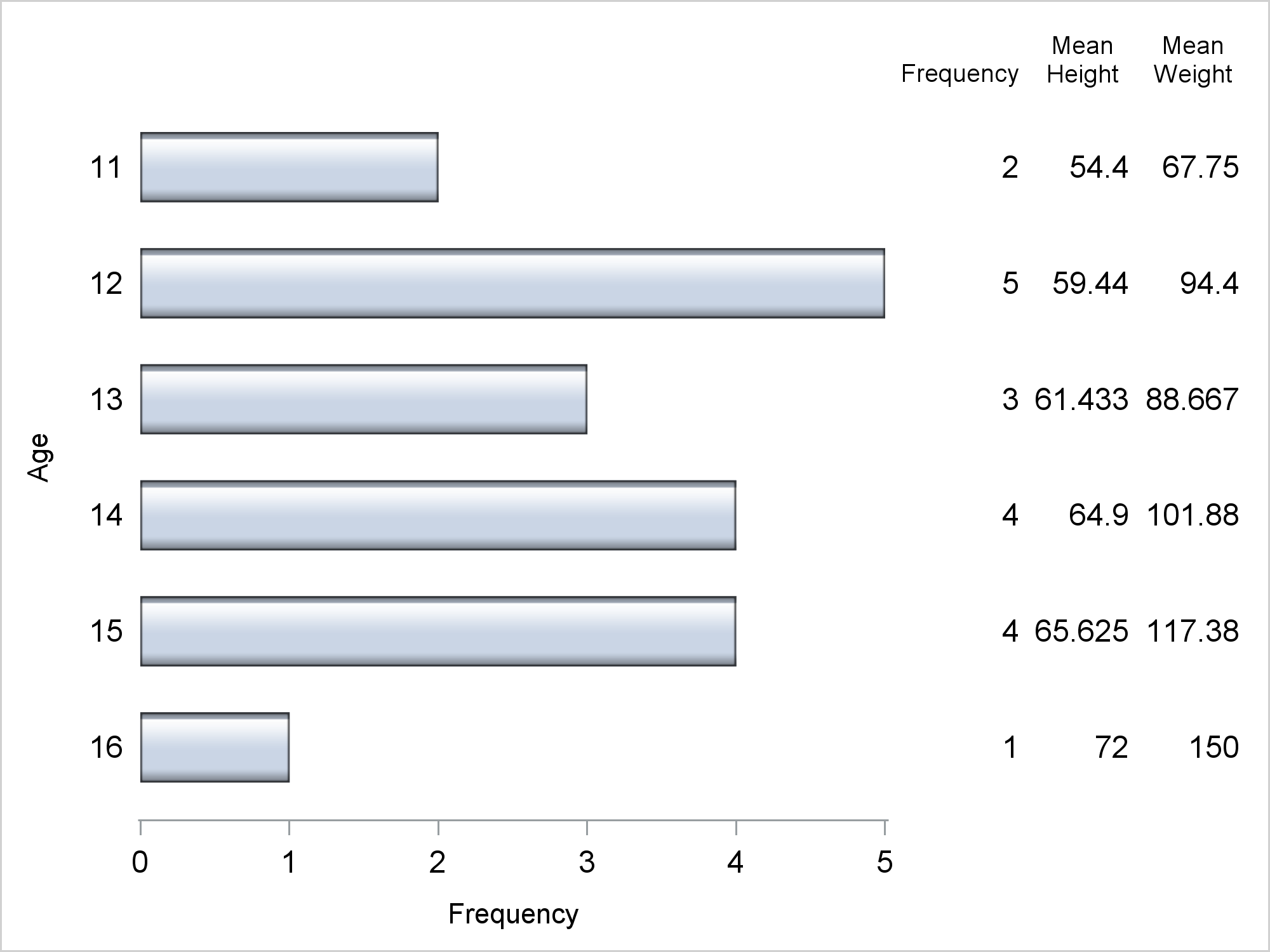
As often is the case, this article is prompted by a recent post on the SAS/GRAPH and ODS Graphics page communities page. A user wanted to create a Graph Table showing a bar chart with tabular data for each of the category values along the x-axis. The user was creatively using
The advent of the AXISTABLE statement with SAS 9.4, has made it considerably easier to create graphs that include statistics aligned with x-axis values (Survival Plot) or with the y-axis (Forest Plot). This statement was specifically designed to address such needs, and includes the options needed to control the text attributes of
Most regular readers may have already noticed the release of my new book "Clinical Graphs using SAS", as indicated by the icon of the book cover and the link to the SAS Press page under the "About this blog" section on the right. This book is a result of the various
I have written a new book on advanced ODS Graphics examples. It is available as a free PDF file on the web. It is in color, and all of the SAS code is available by double clicking a link at the beginning of each example. Advanced ODS Graphics Examples Update:
All axis customization features are always welcome. Especially since SGPLOT statements can often be used to create non standard graphs, having the ability to customize the axes is important. This article presents ways in which you can customize the discrete axes. By default, the x axis will try to display the
PharmaSUG 2015 in Orlando was held at the Renaissance had a record breaking attendance of over 650. Weather was great, except for a huge downpour on the evening of the last day. All the popular presenters were in attendance including Art Carpenter, Kirk Lafler, Arthur Li and many others. Presentations
A common scenario is where we have a table of multiple measures over time. Here we have a simple example of Frequency and Response by Day. The Response is a linear function of the Frequency, as shown in the table on the left below. The shape of the data is
This week I had the opportunity to present a 1/2 day seminar on creating clinical graphs using the SG procedures during an In-House SAS Users' group meeting. I have presented this seminar quite a few times now, and I always learn something. The audience was very receptive, with some people
Most simple graphs generally include graphical representation of data using various plot type such as bar charts, scatter plots, histograms, box plots step plots and more. Both SG procedures and GTL provide many easy ways to create such graphs. However, for many real world use cases, we need to display related textual data in
SAS 9.4 releases today with a ton of new features. As eloquently stated by Craig Rubendall, the driving themes are "Enable. Simplify. Innovate". The same sentiment applies to the ODS Graphics, with a ton of new features for the SG Procedures, GTL and ODS Graphics Designer. In the next few articles,
The Graph Template Language (GTL) provides you the ability to create complex graphical layouts. We have seen how to create a regular grid of cells based on one or more classification variables using the SGPANEL procedure. Each cell contains the same type of plot. This topic was covered in Dan's article on
OK, I promise this is the last article on Forest Plots (at least for a while). In the previous article on Subgrouped Forest Plot with Font Attributes, I discussed how to use bold text for subgroup headings. I mentioned that increasing the font size would not work as it would
Just a few days ago our "super-duper tech support trooper" called in asking for the link to the subgrouped Forest Plot with bold headings. She was referring to this Forest Plot with Subgroups I had posted earlier. However, as you can see, while the subgroup values are indented from the subgroup headers, the headers
In addition to the Forest Plot with Subgroups, another popular graph in the clinical research space is the Most Frequent Adverse Events Sorted by Relative Risk graph. Recently, I worked with folks from some pharmaceutical companies to contribute SAS code for this graph to the CTSPEDIA resource for statistical graphics. The data for number
During SAS Global Forum 2012, I had conversations with many SAS users who wanted to create Forest Plots. However, there was one new twist. The study names were subgrouped by categories like 'Age', 'Sex', etc., with multiple entries under each subgroup. The name of each study within the subgrouped was indented
Forest plots come in many flavors. An example of a Forest plot using GTL is available on the SAS support web site. Simple forest plots can also be created using SGPLOT procedure by using the SCATTER statement with MARKERCHAR to display data aligned with the plot by study names. One issue
PharmaSUG 2012 conference drew to a close today, concluding two and a half days packed with papers, presentations, posters, hands-on demos and super demos by SAS staff. While the weather outside was a bit chilly from time to time, the conference what hopping with many user papers on how to
In December of last year, the book "Statistical Graphics Procedures by Example" co-authored by Dan Heath and I was published. On the back cover, it proclaims "Free Code on the Web". Now, who can resist such an offer? Since most of the examples in the book have very short syntax,