SAS Users
Providing technical tips and support information, written for and by SAS users.
To be and not to be – the uncertainty principle in SAS
If I were to say that we live in uncertain times, that would probably be an understatement. Therefore, I won’t say that. Oops, I already did. Or did I? For centuries, people around the world have been busy scratching their heads in search of a meaningful answer to Shakespeare’s profoundly

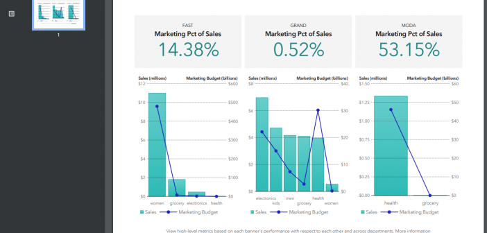
Programmatically export a Visual Analytics report to PDF
Readers of my earlier post Discover Visual Analytics Report Paths with REST APIs asked for ways to export SAS Visual Analytics (VA) report content programmatically. I know this is a topic of interest from many VA report designers. So, I think it’s better to write something on this and I

How to conditionally stop SAS code execution and gracefully terminate SAS session
SAS' Leonid Batkhan reveals a fuss-free way to halt SAS program execution and terminate SAS session in batch-processing scenarios.

