SAS Users
Providing technical tips and support information, written for and by SAS users.
As word spreads that SAS integrates with open source technologies, people are beginning to explore how to connect, interact with, and use SAS in new ways. More and more users are examining the possibilities and with this comes questions like: How do I code A, integrate B, and accomplish C?

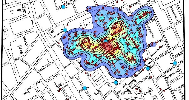
The catch phrase “everything happens somewhere” is increasingly common these days. That “somewhere” translates into a location on the Earth; a latitude and longitude. When one of these “somewhere’s” is combined with many other “somewhere’s”, you quickly have a robust spatial data set that becomes actionable with the right analytic

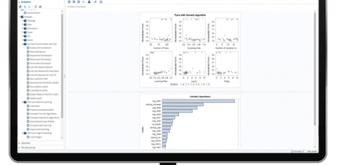
Recently, you may have heard about the release of the new SAS Cloud. The platform allows fast access to data-science applications in the cloud! Running on the SAS Cloud and using the latest container technology, SAS Cloud eliminates the need to install, update, or maintain software or related infrastructure. SAS


