The catch phrase “everything happens somewhere” is increasingly common these days. That “somewhere” translates into a location on the Earth; a latitude and longitude. When one of these “somewhere’s” is combined with many other “somewhere’s”, you quickly have a robust spatial data set that becomes actionable with the right analytic tools.

In today’s modern world, GPS-enabled devices are ubiquitous, and their use continues to increase daily. Cell phones, cars, fitness trackers, and cameras are all able to locate and track our position. As a result, the location analytics market is expected to grow to over USD 16 Billion by 2021, up 17.6% from 2016 [1].
Waldo Tobler, an American-Swiss geographer and cartographer, developed his First Law of Geography based on this concept of everything happening somewhere. He stated, “Everything is related to everything else, but near things are more related than distant things”[2]. As analytic professionals, we are accustomed to working with these correlations using scatterplots, heatmaps, or clustering models. But what happens when we add a geographic map into the analysis?
Maps offer the ability to unlock a new level of insight into our data that traditional graphs do not offer: personal connection. As humans, we naturally relate to our surroundings on a spatial level. It helps build our perspective and frame of reference through which we view and navigate the world. We feel a sense of loss when a physical landmark from our childhood – a building, tree, park, or route we used to walk to school – is destroyed or changed from the memories we have of it. In this sense, we are connected, spatially and emotionally, to our surroundings.
We inherently understand how data relates to the world around us, at some level, just by viewing it on a map. Whether it is a body of water or a mountain affecting a driving route or maybe a trendy area of a city causing housing prices to increase faster than the local average, a map connects us with these facts intuitively. We come to these basic conclusions based solely on our experiences in the world and knowledge of the physical landmarks in the map.
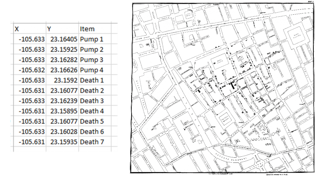
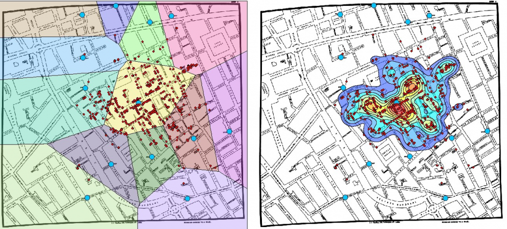
One of the best examples of this is the 1854 Cholera outbreak in London. Dr. John Snow was one of the first to use a map for understanding the origin of an epidemiological outbreak. He created a map of the affected London neighborhood by plotting the location of all known Cholera deaths. In addition to the deaths, he also plotted the location of 13 community wells that served as the public water supply. Using this data, he was able to see a clustering of deaths around a single pump. Armed with this information, Dr. Snow was able to convince local officials to remove the handle from the Broad Street pump. Once removed, new cases of Cholera quickly began to diminish. This helped prove his theory the outbreak’s origin was not air-borne as commonly believed during that time, but rather of a water-borne origin. [3]


SAS Global Forum 2019 is being held April 28-May 1, 2019 in Dallas, Texas. If you are planning to go to this year’s event, be sure to attend one of our presentations on the latest mapping features included in SAS Visual Analytics and BASE SAS. While you’re there, don’t forget to stop by the SAS Mapping booth located in the QUAD to say ‘Hi!’ and let us help with your spatial data needs. See you in Dallas!
Introduction to Esri Integration in SAS Visual Analytics
Monday, April 29, 4:30-5:30p, Room: Level 1, D162
There’s a Map for That! What’s New and Coming Soon in SAS Mapping Technologies
Tuesday April 30, 4:00-4:30p, Room: Level 1, D162
Creating Great Maps in ODS Graphics Using the SGMAP Procedure
Wednesday May 01, 11:30a-12:30p, Room: Level 1, D162
[1] https://www.marketsandmarkets.com/Market-Reports/location-analytics-market-177193456.html
[2] https://en.wikipedia.org/wiki/Tobler%27s_first_law_of_geography
[3] https://www1.udel.edu/johnmack/frec682/cholera/
