The SAS Dummy
A SAS® blog for the rest of us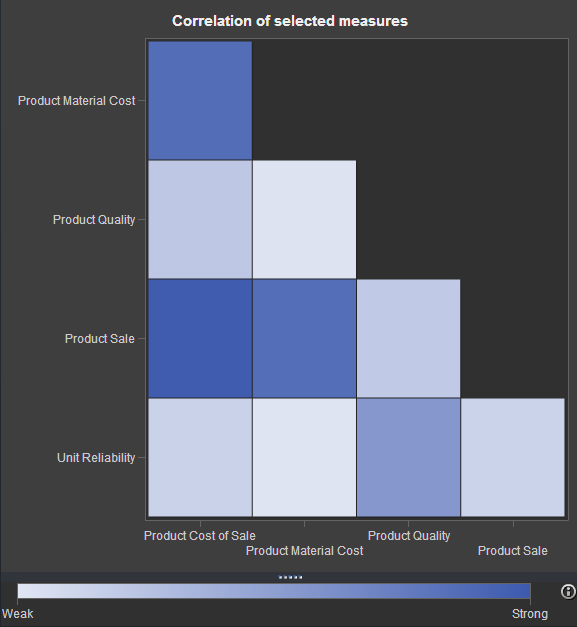

If you've watched any of the demos for SAS Visual Analytics (or even tried it yourself!), you have probably seen this nifty exploration of multiple measures. It's a way to look at how multiple measures are correlated with one another, using a diagonal heat map chart. The "stronger" the color
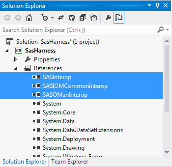
As part of my follow-up to SAS Global Forum 2013, I've posted a few articles about how to create your own client apps with SAS Integration Technologies. This article shows how to use Microsoft .NET -- the same approach used for SAS Enterprise Guide and SAS Add-In for Microsoft Office

One of the great things about SAS libraries is that you can write your programs to read and write data without having to worry about where the data lives. SAS data set on a file system? Oracle table in a database server? Hadoop data in Hive? For many SAS applications,