The DO Loop
Statistical programming in SAS with an emphasis on SAS/IML programs
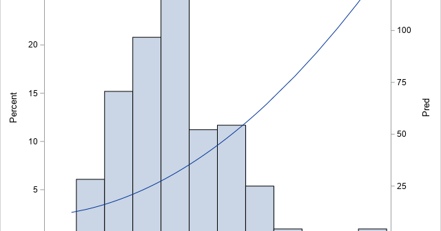
In a previous article, I showed how to overlay a density estimate on a histogram by using the Graph Template Language (GTL). However, a SAS programmer asked how to overlay a curve on a histogram when the curve is not a density estimate. In this case, the vertical axis for

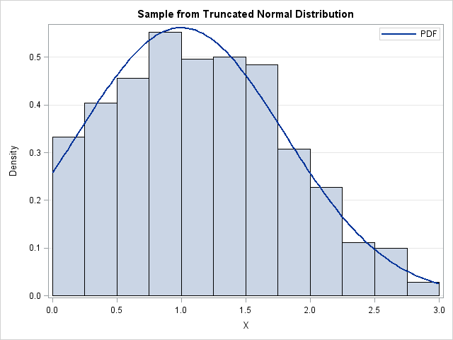
When the SAS statistical graphics (SG) procedures were designed in the early 2000s, a goal was to create a comprehensive Graph Template Language (GTL) and leverage the GTL by using SG procedures that perform common tasks easily without having to write any GTL. This project was hugely successful, and "ODS

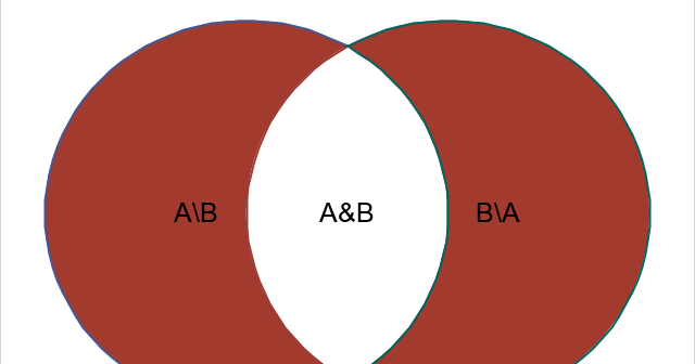
A previous article discusses how to compute the union, intersection, and other subsets of a pair of sets. In that article, I displayed a simple Venn diagram (reproduced to the right) that illustrates the intersection and difference between two sets. The diagram uses a red disk for one set, a
