The DO Loop
Statistical programming in SAS with an emphasis on SAS/IML programs
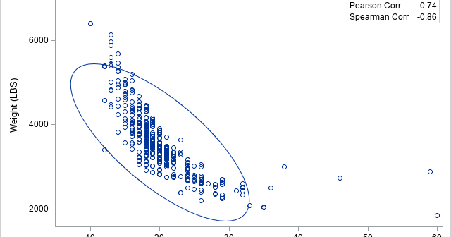
A previous article discusses rank correlation and lists some advantages of using rank correlation. However, the article does not show examples where an analyst might prefer to report the rank correlation instead of the traditional Pearson product-moment correlation. This article provides three examples where the rank correlation is a better

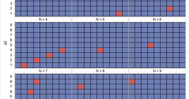
I recently discussed introductory programming with a colleague who teaches Python at a university. He told me about the following introductory programming assignment: Let N be an integer parameter in the range [1, 9]. For each value of N, find all pairs of one-digit positive integers d1 and d2 that
A previous article discusses the issue of a confounding variable and uses correlation to give an example. The example shows that the correlation between two variables might be affected by a third variable, which is called a confounding variable. The article mentions that you can use the PARTIAL statement in
