The DO Loop
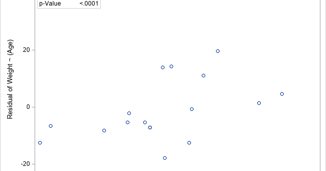
Statistical programming in SAS with an emphasis on SAS/IML programsA previous article discusses the issue of a confounding variable and uses correlation to give an example. The example shows that the correlation between two variables might be affected by a third variable, which is called a confounding variable. The article mentions that you can use the PARTIAL statement in

A data analyst wanted to estimate the correlation between two variables, but he was concerned about the influence of a confounding variable that is correlated with them. The correlation might affect the apparent relationship between main two variables in the study. A common confounding variable is age because young people

In a previous article about Markov transition matrices, I mentioned that you can estimate a Markov transition matrix by using historical data that are collected over a certain length of time. A SAS programmer asked how you can estimate a transition matrix in SAS. The answer is that you can
