The DO Loop
Statistical programming in SAS with an emphasis on SAS/IML programs
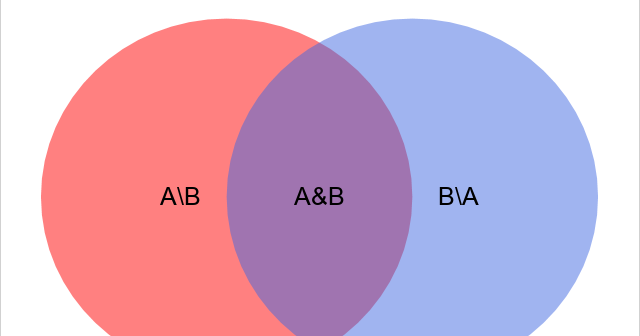
The fundamental operations on sets are union, intersection, and set difference, all of which are supported directly in the SAS IML language. While studying another programming language, I noticed that the language supports an additional operation, namely the symmetric difference between two sets. The language also supports query functions to

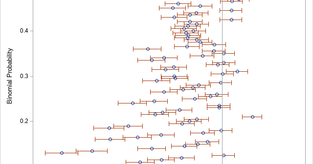
The "Teacher’s Corner" of The American Statistician enables statisticians to discuss topics that are relevant to teaching and learning statistics. Sometimes, the articles have practical relevance, too. Andersson (2023) "The Wald Confidence Interval for a Binomial p as an Illuminating 'Bad' Example," is intended for professors and masters-level students in

A journal article listed the mean, median, and size for subgroups of the data, but did not report the overall mean or median. A SAS programmer wondered what, if any, inferences could be made about the overall mean and median for the data. The answer is that you can calculate
