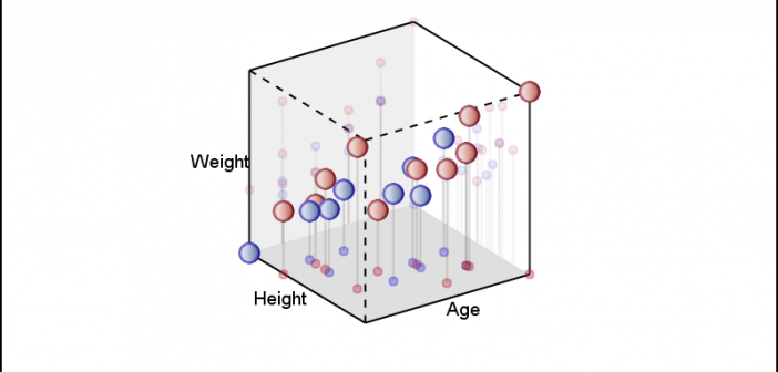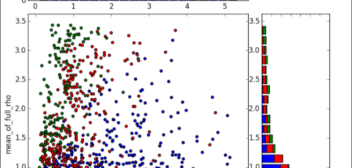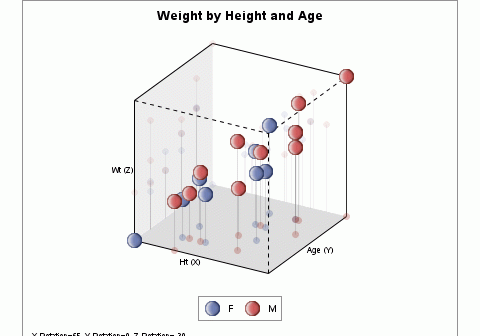
In the previous article, I described the process to create a 3D Scatter Plot using a 3D Orthographic View matrix and the SGPLOT procedure. I posted a macro that can be used to create a 3D scatter plot from any SAS data set, using 3 numeric columns, one each for
Tag: SGPLOT
The SG Procedures do not support creating a 3D scatter plot. GTL has some support for 3D graphs, including a 3D Bi-variate Histogram and a 3D Surface, but still no 3D point cloud. The lack of such a feature is not due to any difficulty in doing this as
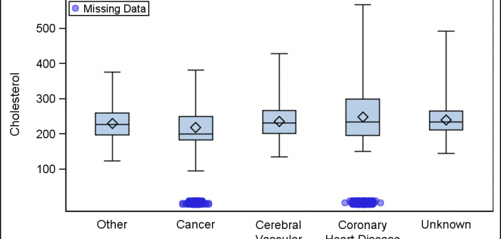
Last week a user wanted to view the distribution of data using a Box Plot. The issue was the presence of a lot of "bad" data. I got to thinking of ways such data can be visualized. I also discussed the matter with our resident expert Rick Wicklin who pointed
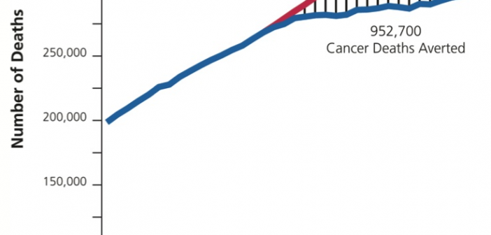
Significant progress in reduction of Cancer mortality is shown in a graph that I noticed recently on the Cancer Network web site. This graph showed the actual and projected cancer mortality by year for males. The graph is shown on the right. The graph plots the projected and actual numbers
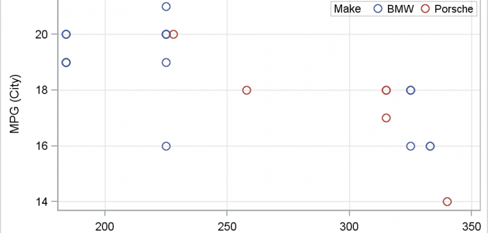
There has been much discussion on the SAS Communities page on usage of different symbols in a graph. The solutioin can vary based on the SAS release. New features have been added at SAS 9.4 releases to SG Procedures and GTL that make this very easy. With SAS 9.4M1, almost any combination is
Over the Christmas Holidays I saw an graph of agricultural exports to Russia in 2013. The part that caught my eye was the upper part of the graph, showing the breakdown of the trade with Russia as a horizontal stacked bar with custom labels. The value for each region / country
Last week a user expressed the need to create a graph like the one shown on the right using SAS. This seems eminently doable using GTL and I thought I would undertake making this graph using SAS 9.3. The source data required to create this graph is only the
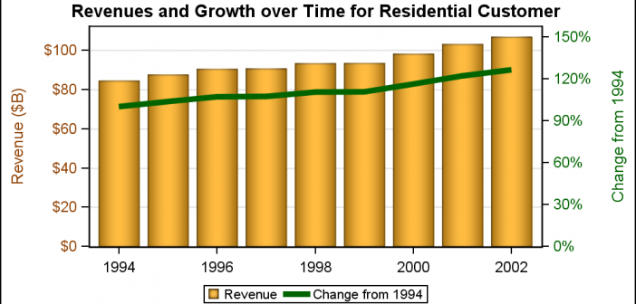
Often we need graphs that display two or more responses by the same category values. In many cases it is useful to plot both responses on the same response (Y) axis. This can be helpful to understand the data and compare the magnitudes side by side. This works when the scales
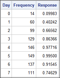
A common scenario is where we have a table of multiple measures over time. Here we have a simple example of Frequency and Response by Day. The Response is a linear function of the Frequency, as shown in the table on the left below. The shape of the data is
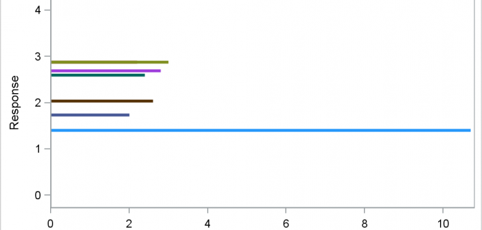
Often, we have data where most of the observations are clustered within a narrow range, with a few outliers positioned far away. When all the data is plotted, the axis is scaled to accommodate all the data, thus skewing the scale. Techniques to handle such data have been addressed earlier