Tag: SGPLOT

Data Visualization
Sanjay Matange 4
Infographics using SAS

Infographics are all the rage today.  Open any magazine or newspaper and we see data and numbers everywhere.  Often, such information is displayed by adding some graphical information to add context to the data.  A couple of good examples are Communicating numeric information, and Facts about Hot Dogs. Riley Benson, our UX

Data Visualization
Sanjay Matange 0
Axis Customizations

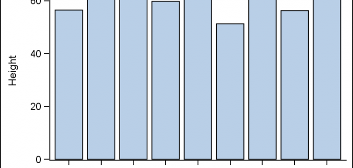
All axis customization features are always welcome.  Especially since SGPLOT statements can often be used to create non standard graphs, having the ability to customize the axes is important.  This article presents ways in which you can customize the discrete axes. By default, the x axis will try to display the

Data Visualization
Sanjay Matange 6
Is that Annotate?

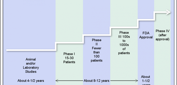
The SGPLOT procedures includes features to add annotations to your graph in many different ways.  Annotations provide you a flexible way to add features to your graph that are not available through the standard plot statements. Recently, I saw this graph on the web that caught my attention.  Clearly, this looks like

Data Visualization
Sanjay Matange 4
Report from PharmaSUG 2015

PharmaSUG 2015 in Orlando was held at the Renaissance had a record breaking attendance of over 650.  Weather was great, except for a huge downpour on the evening of the last day.  All the popular presenters were in attendance including Art Carpenter, Kirk Lafler, Arthur Li and many others. Presentations

Data Visualization
Sanjay Matange 11
Sankey Diagrams

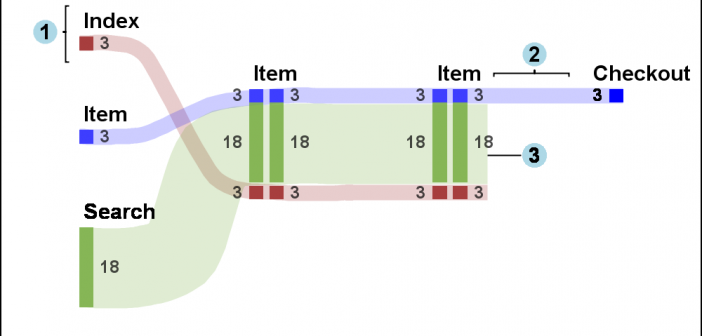
Sankey Diagrams have found increasing favor for visualization of data.  This visualization tool has been around for a long time, traditionally used to visualize the flow of energy, or materials.   . Now to be sure, GTL does have a statement design for a Sankey Diagram which was implemented only in Flex for use

1 9 10 11 12 13 15