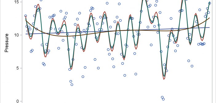
Today's post illustrates the REG, PBSPLINE, LOESS, SERIES, and SPLINE statements in PROC SGPLOT. The GROUP= and BREAK options in the SERIES statement are also discussed.

Today's post illustrates the REG, PBSPLINE, LOESS, SERIES, and SPLINE statements in PROC SGPLOT. The GROUP= and BREAK options in the SERIES statement are also discussed.
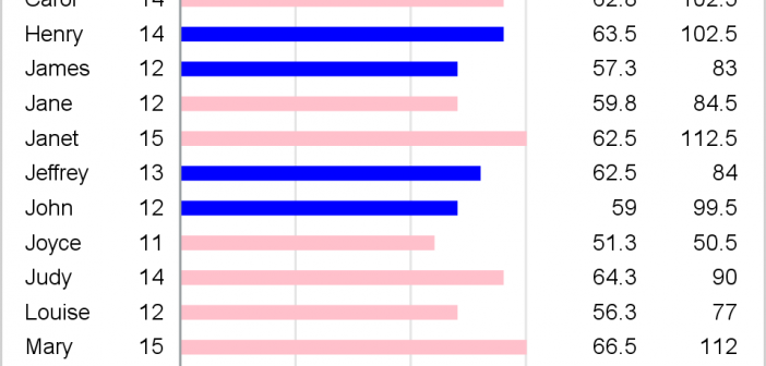
PROC SGPLOT writes a graph template and uses it to create a graph. You can edit the template and then create a modified graph.
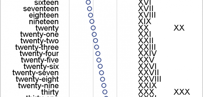
I review some fundamental principles of creating axis tables along with graphs that have TYPE=LINEAR or TYPE=DISCRETE axes.
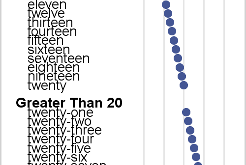
Axis tables enable you to combine tabular and graphical information into a single display. I love axis tables. My involvement with axis tables dates back over 30 years to their ancient predecessor, the table that contains an ASCII bar chart. In the mid 1980s, I created a table in PROC
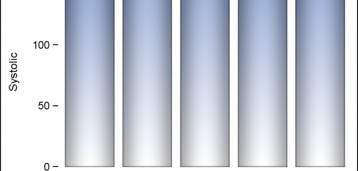
Displaying nicely rendered axis values reduces clutter and makes the graph more readable. With SAS 9.4, we added the ability for splitting x-axis tick values on white space to create a nice and readable x-axis as shown in the graph on the right. It is always a challenge to fit
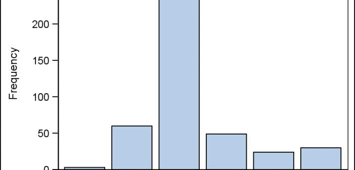
This is the 2nd installment of the "Getting Started" series, and the audience is the user who is new to the SG Procedures. It is quite possible that an experienced users may also find some useful nuggets here. One of the most popular and useful graph types is the Bar
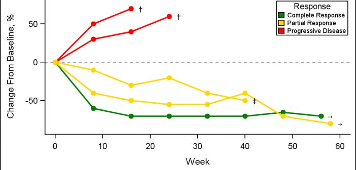
A Spider Plot is another way of presenting the Change from Baseline for tumors for each subject in a study by week. The plot can be classified by response and stage. Another way of displaying Tumor Response data was discussed earlier in the article on Swimmer Plot. This article is prompted
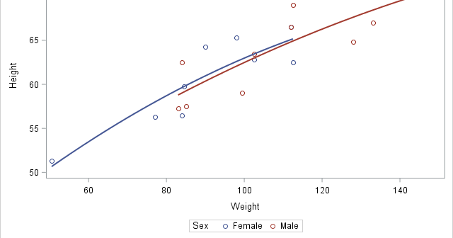
In this post, I will show you how to control the order of the entries in a legend and explicitly control the correspondence between groups and style elements in PROC SGPLOT. In many cases, the colors that are used to differentiate groups do not matter--the graph simply needs to display
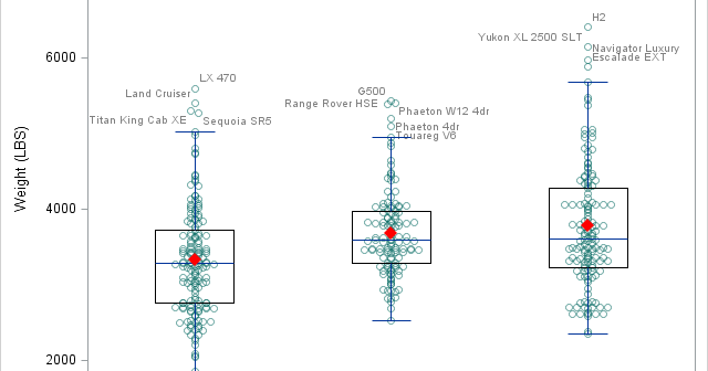
There was a recent comment on the original 'Unbox Your Box Plots', where a user wants to see the original data for the box, but only label the outliers. As noted in the comment, labeling all the scatter markers and turning on the outlier display is not ideal. But there

I have written a new book: Basic ODS Graphics Examples. It is available as a free PDF file on the web. It is in color, and all of the SAS code is available by double clicking a link at the beginning of each example. This new book complements my other