Graphically Speaking
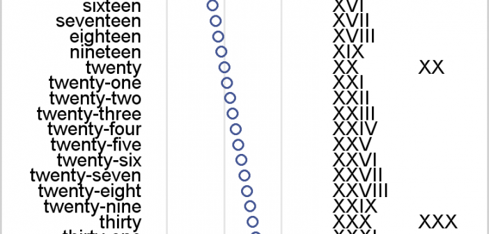
Data Visualization with a focus on SAS ODS GraphicsThe Adverse Event Timeline graph posted earlier used the MARKERCHAR option of the SCATTER plot to draw the AE names. This option places a center-justified label at the marker position. There is no option in SAS 9.2 version to right-justify the label. Hence, we have to compute an offset in data
Bubble plots are often used to display social and economic data as Gapminder effectively does. With the addition of the BUBBLEPLOT statement to SAS 9.3, it is now possible to create bubble plots in SAS with a few lines of code: proc template; define statgraph bplot; begingraph; entrytitle 'Bubble Plot
In the previous post, “Roses are red, violets are blue…”, I discussed the general problem of getting style attributes to line up with specific group values and some ways to overcome the problem. In this installment, I want to elaborate on the attribute map functionality in the Graph Template Language
This classic start to a romantic poem assumes that the correct colors are always assigned to the correct flowers; but, for those who create graphs for reports, consistent color assignment can be more of a challenge than an assumption. This challenge is particularly true for the display of group values.
Here is the promised follow up on the Dashboard graph. In the previous article, I posted the code to create a panel of bullet KPIs displaying three different metrics. For each KPI, I used 5 columns of data which resulted in a wide and inconvenient structure. A more convenient data structure is
In this blog we have been discussing graphs useful for analysis of data for many domains such as clinical research, forecasting and more. SG Procedures and GTL are particularly suited for these use cases. So, when I came upon a dashboard image from Steven Few's Visual Business Intelligence blog, showing the