The Adverse Event Timeline graph posted earlier used the MARKERCHAR option of the SCATTER plot to draw the AE names. This option places a center-justified label at the marker position. There is no option in SAS 9.2 version to right-justify the label. Hence, we have to compute an offset in data coordinates based on half the length of the AE name string using the font size, graph width and data extents. Unfortunately, this can only be an approximation.
This exercise made it clear to us that we needed a better way to do such graphs which led to new options and features in SAS 9.3.
But in the meantime, what to do using SAS 9.2? In response to a readers comment, I dug in some more. One possibility is to use the DATALABEL option with the scatter plot. I did not use this earlier for two reasons:
- The labels are placed above and to the right of the marker position.
- The collision avoidance algorithm can shift the label positions.
But, what if we can turn off the collision avoidance? We can at least get the labels reliable on the upper right side of the event without need for any kludged code.
Collision avoidance gets expensive as the number of observations increase, so it is disabled when the number of labels exceed LABELMAX. We can set LABELMAX=1 to disable collision avoidance. The labels are still drawn at the upper-right side of the marker.
Here is the resulting graph:
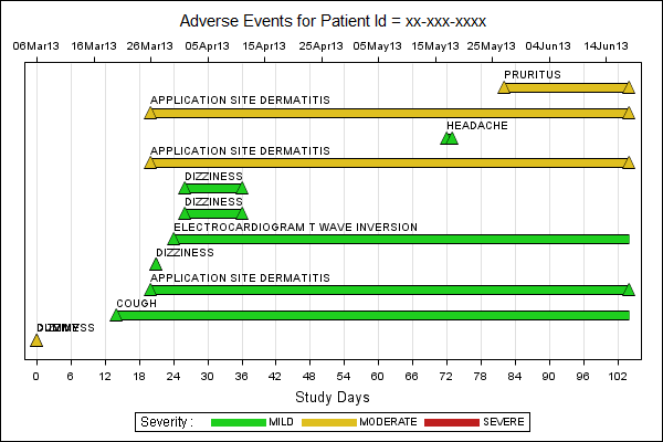
As you can see, the AE labels are placed to the top right of the marker position. We have turned off the marker itself. If this data label position is acceptable for an AE timeline graph, then it becomes much easier to produce this in a scalable and deterministic way. The key features of this technique are:
- Use LABELMAX=1 on the ODS GRAPHICS statement.
- Use a SCATTER with DATALABEL option and zero size markers.
- Place the labels 0.25 units above the event bar for ease of reading.
- There is no need to compute an approximate data position for the labels.
- Start from -10 day can be avoided if necessary.
Graph height is easier to estimate based on number of observations, font height and some constants for titles, legends, etc.
Full SAS code : AE_Timeline_Graph_92


1 Comment
Very nice. 1 comment - please note your "dummy" is overwriting "dizziness" in the bottom left corner. you calculate yc before you reset y=100, so yc is still 1.25. Consider changing this.
I've used this as a solution for conmeds as well as AEs.