Bubble plots are often used to display social and economic data as Gapminder effectively does. With the addition of the BUBBLEPLOT statement to SAS 9.3, it is now possible to create bubble plots in SAS with a few lines of code:
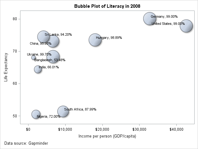
proc template; define statgraph bplot; begingraph; entrytitle 'Bubble Plot of Literacy in 2008'; layout overlay; bubbleplot x=gdp y=life_expectancy size=literacy / dataskin=matte; scatterplot x=gdp y=life_expectancy / datalabel=label markerattrs=(size=0) datalabelattrs=(size=8) datalabelposition=auto; endlayout; entryfootnote halign=left 'Data source: Gapminder'; endgraph; end; run; |
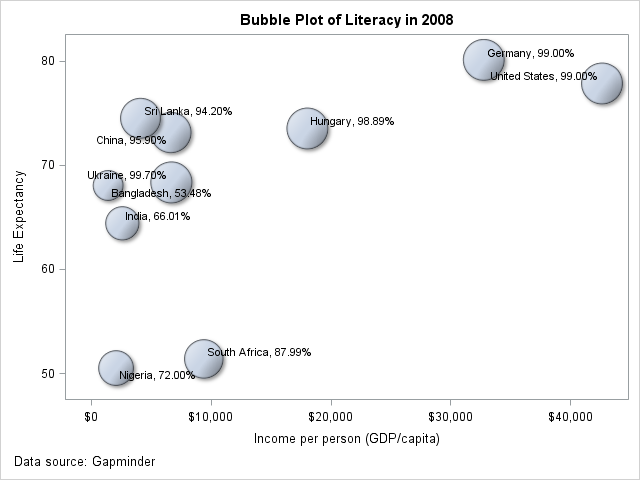
However, in some cases, as in the example above, the representation can be misleading. For instance, the area of the Bangladesh bubble may lead users to think that Bangladesh has a literacy rate half that of India and India has a literacy rate half that of USA. However that is not the case as the data labels show. In situations like this, it is important to scale the bubble sizes proportionately. This can be achieved by setting the BUBBLERADIUSMIN=0 and adding a "fake" observation in the data with the variable mapped to size (literacy in this case) to 0. This results in the graph below where the sizes represent the relative literacy values more accurately.
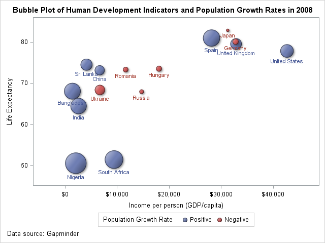
In situations where the data may have both negative and positive values it is desirable to represent both the magnitude and nature of the value. This can be done by using a pair of eval functions to transform the data column to two columns; one that contains the absolute value and the other the sign of the value. The absolute value can then be mapped to the bubble size while the sign can be used to color the bubbles.
proc template; define statgraph bplot1; begingraph / designheight=480 designwidth=640; entrytitle 'Bubble Plot of Human Development Indicators and Population Growth Rates in 2008'; layout overlay; bubbleplot x=gdp y=life_expectancy size=eval(abs(pop_growth_rate)) / bubbleradiusmin=0 dataskin=matte name="bubble" datalabelattrs=(size=8) datalabel=country datalabelposition=bottom group=eval(ifc(pop_growth_rate<0,'Negative','Positive','Missing')); discretelegend "bubble" / title="Population Growth Rate" pad=5; endlayout; entryfootnote halign=left 'Data source: Gapminder'; endgraph; end; run; |
This results in the graph below, from which one can more easily conclude that Japan, Germany, Russia, Ukraine, Romania and Hungary had negative population growth rates in 2008.


5 Comments
Very interesting! Nice code.
I think your correction ought to be the default, or, at least, an option.
Something else interesting - if you are doing a bubble plot of a proportion where most of the proportions are very high (as above) then you will get a very different impression if you bubble plot the other side of the proportion (e.g. above, illiteracy rates). Then India (literacy = 66% so illiteracy = 34%) is 34 times the size of the US (literacy = 99% so illiteracy = 1%).
Thanks for the feedback!
Yes, I agree. In fact, we are discussing adding support for the proportional behavior as an option in a future release.
If I recall correctly, the old GPLOT statement automatically coloured positive and negative bubbles differently. Are there plans to add this convenience feature to GTL-based graphics?
It is certainly worth considering, especially for SGPLOT use case. For GTL, usage of eval syntax provides more flexibility. For example, color change and magnitude computation for temperature with 32 f as the inflection point is straightforward with this feature.
This is article bubble plot calculations are valuable information and as well as the complete SAS program unbelivable information thankz Sir,valuable article......