Graphically Speaking
Data Visualization with a focus on SAS ODS Graphics
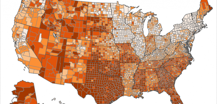
"With great power comes great responsibility." I'm not sure exactly where this quote comes from, but I think everyone should keep it in mind when creating graphs and maps! There are many design decisions that can influence how the end user perceives the data in a graph. For example: The

How long do dogs live? ... That's a good/tough question. Some live longer than others, but what are the determining factors? Let's throw some data to this problem, and see if we can fetch some answers! But before we get started, how about a random picture to get you into

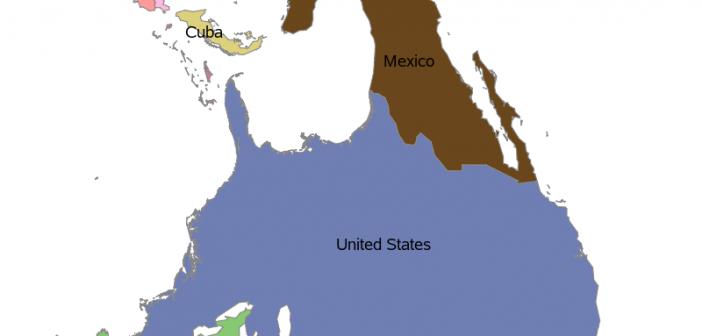
Who's to say that 'north' should always be at the top of a map? Perhaps in certain situations, you might want 'south' (or some other direction) to be at the top. Perhaps you're one of our crazy Australian customers who looks at the world a little differently. Well, whatever the
