An UpSet plot is used to visualize intersections of sets. In this post, we will illustrate techniques to create this plot using the Graph Template Language (GTL). We assume that you are familiar with GTL.
From the point of view of construction, we leverage the LATTICE layout available in GTL using which can create a panel of graphs. We break down the layout into the following pieces:
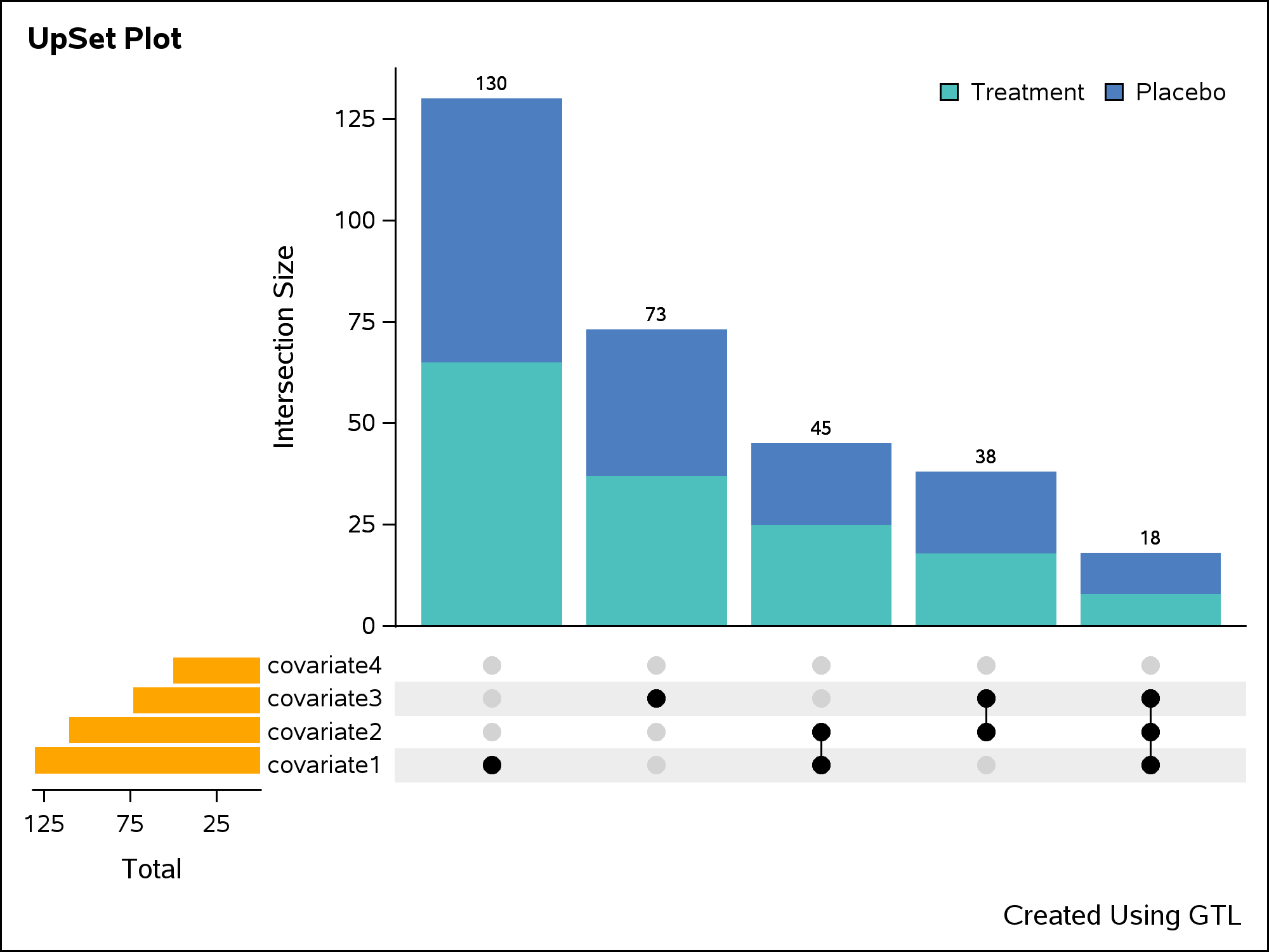
- The main barchart at the top that represents the intersection sizes.
- The horizontal barchart at the bottom that represents the univariate sizes.
- The bottom matrix that represents the composition of intersection.
About the data: We have used imaginary data for all of the respective pieces described above and then combined them to create a final dataset that can be used for plotting purpose. This includes:
- Summarized data for both barcharts described in the first and second pieces above.
- For the third piece, we need to set up the data to plot the matrix layout. In order to do this, we need the data about the composition of intersection. Each observation in this dataset represents whether a covariate or category is present in a certain set. Assuming the nature of data for covariates to be of binary type, we can assign the values ‘1’ and ‘0’ that are mapped to their respective levels, for example, 'Present' and 'Absent'. Subsequently, we process this dataset further to add dummy group variables to control display of the connect lines.
Let us now look at the template code for the plot.
As a first step, we will define a discrete attribute map that can be used to control the visual attributes of the graph. In this map, we specify the attributes for marker colors, line thickness and fill color on the VALUE statement within the DiscreteAttrMap block. The DiscreteAttrVar statements are used to associate the attribute map with appropriate dataset variables. Once the map is defined, this can be consumed by one or more plots within the template. Below is the block of code for the discrete attribute map.
DiscreteAttrVar attrvar=MYID_VALUE var=VALUE attrmap="__ATTRMAP__MYID"; DiscreteAttrVar attrvar=MYID_JOIN var=JOIN attrmap="__ATTRMAP__MYID"; DiscreteAttrVar attrvar=MYID_GROUP var=GROUP attrmap="__ATTRMAP__MYID"; DiscreteAttrMap name="__ATTRMAP__MYID" /; Value "0" / markerattrs=( color=CXD3D3D3) lineattrs=( thickness=0); Value "1" / markerattrs=( color=CX000000) lineattrs=( thickness=2); Value "Treatment" / fillattrs=( color=BIBG) ; Value "Placebo" / fillattrs=( color=BIGB) ; EndDiscreteAttrMap; |
We then define a 2x2 panel of graphs within the LATTICE layout. Keeping the first cell empty cell, we use the second cell to plot the vertical bar chart. We can use appropriate options in the nested OVERLAY layout statement to control the display for the border, wall and axes of the chart. In addition to the layout and axis options, the GROUP option in barchart is used to create the stacked bars for different groups. We use the appropriate discrete attribute variable for the GROUP option that we defined earlier.
layout lattice / rows=2 columns=2 rowweights=(0.7 0.3) columnweights=(0.2 0.8); |
cell; layout overlay / border=false walldisplay=none xaxisopts=(display=none) yaxisopts=(label="Intersection Size"); barchart X='xlabel1'n Y='count1'n / display=(fill) barlabel=true Group=MYID_GROUP name="BAR1" groupdisplay=stack includemissinggroup=False; discretelegend "BAR1" / border=False location=inside autoalign=(topright); endlayout; endcell; |
The next cell block can be used to plot the horizontal barchart with suitable options.
cell; layout overlay / border=false walldisplay=none xaxisopts=(reverse=True label="Total") y2axisopts=(display=none); barchart X='xlabel2'n Y='count2'n / display=(fill) displaybaseline=off fillattrs=(color=orange) name="BAR2" orient=horizontal yaxis=y2; endlayout; endcell; |
The final cell in the LATTICE layout is used to create the matrix panel. A scatter plot is used to plot the dots representing the covariates. The markers of the scatter plot are color coded by the cardinality of the covariate. The connect lines are created by overlaying a series plot on the scatter plot. The discrete attribute variable created earlier is consumed by the GROUP option in both the plots to get the desired visual attributes.
cell;
layout overlay / border=false walldisplay=none
    yaxisopts=(display=(tickvalues) discreteopts=(colorbands=odd colorbandsattrs=(color=lightgray transparency=0.6)))
    xaxisopts=(display=none );
  scatterplot X='xlabel3'n Y='ylabel3'n / subpixel=off primary=true
    group=MYID_VALUE Markerattrs=( symbol=circlefilled size=12)
    legendLabel="ylabel3"
    name="SCATTER";
  seriesplot X='xlabel3'n Y='ylabel3'n / group=MYID_JOIN
    lineattrs=( Color=CX000000) legendLabel="ylabel3"
    name="SERIES";
endlayout;
endcell; |
You can check out the complete code here.


12 Comments
Is there any specific reason for nesting the LAYOUT OVERLAY blocks within CELL blocks?
Cell blocks make it easier to see the cell boundary in the code. It may add some length to the code but it may also help to keep it organized. Besides, users can also add cellheaders if needed (although I don’t have any in the example).
Thank you for posting these codes! They are very helpful.
I am using multiple UpSet plot to visualize large amount of data with 10 or more subgroups. In the first UpSet plot that I created I had 15 subgroups and 4 univariate groups. The plot came out perfect. In the second plot I had 15 subgroups and 5 univariate groups. This time the line joining the last subgroup only in the series plot came out as dashed instead of solid line. In the third plot I had 23 subgroups and 6 univariate groups and this time the line joining the last 10 subgroups in the series plot came out as dashed. Any idea why this is happening?
If I understand your issue correctly, I believe it can be resolved by adding PATTERN=SOLID to the LINEATTRS option in the SERIESPLOT. Please respond here if that solves it.
Thanks for your comment. But I have tried that and it does not work.
If I add PATTERN=SOLID to the LINEATTRS option in the SERIESPLOT [Lineattrs=( Color=CX000000 Pattern=solid) LegendLabel="ylabel3"], it overrides the values defined in the attribute map and joins all dots in the scatter plot which is not what I want. I want it to join only those dots for which join=1.
I also tried using Pattern=SOLID in the attribute map (see below). But it does not work either.
/* tip: for the matrix layout, we don't need to display the joined lines where join=0, so we will hide it by setting the linethickness=0 */
Value "0" / markerattrs=( color=CXD3D3D3) lineattrs=( thickness=0 Pattern=solid);
Value "1" / markerattrs=( color=CX000000) lineattrs=( thickness=1 Pattern=solid);
I am just perplexed why some lines are solid and other are dashed.
Any other suggestions? Thanks!
I am guessing that it may have something to do with the number of univariate subgroups on the horizontal barchart? Because when I had only 4 subgroups, just like shown in this example, the plot was perfect, but when I increased the number of subgroups to 5 or 6 I started having problems with the SERIESPLOT.
Using the posted code as a reference, do a PROC PRINT of your plot data before the PROC SGRENDER call to make sure all of the values in the "value" variable used for the GROUP option are all 0 and 1 values. If not, that could explain the behavior you're seeing. Let me know what you find out.
The values in the "value" variable are all 1 and 0.
I think I see it now. The issue is with the "join" variable. In your case, it probably contains values other than 0 or 1. Try adding more entries the attrmap to account for the additional join groups.
I already tried that. It doesn't work. Also, in the example given here the "join" variable has values - 0, 3, 4, and 5. So, I don't think that's the issue either....
Try adding this VALUE statement in your attribute map to see if it helps.
Value Other / lineattrs=( thickness=2 pattern=solid) ;
It worked! It was a simple solution. Thank you so much for all your help!!!