Graphically Speaking
Data Visualization with a focus on SAS ODS Graphics
Motivated by Ted Conway's post on creating a sequence of graphs showing the Solar Eclipse, I thought it would be fun to extend his code and create a gif animation. I used a frame count to 81, and used the printerpath feature to create the animation using SGPLOT with BY

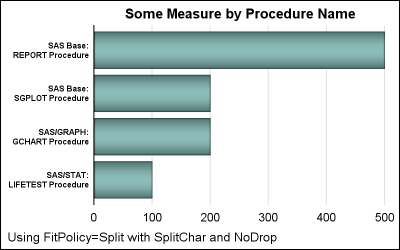
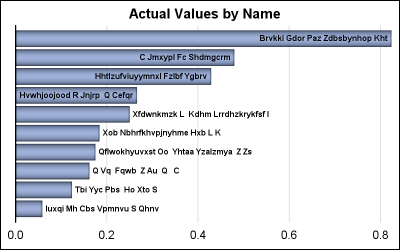
Long category values occur frequently in real world use cases. This can happen with graphs for analysis of clinical research data, and also for graphs showing survey data where the question asked may be long (even a paragraph). Managing such long categories on the x or y axis is always

A few days ago, I posted an article on displaying first N bars from a data set. This is useful when the data is sorted by descending response, and only the first few values are significant. There were a few interesting comments, including one that was regarding the treatment of
