Graphically Speaking
Data Visualization with a focus on SAS ODS Graphics
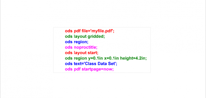
PROC SGPLOT displays titles inside the graph. If you want to display a title inside the graph and a different title outside the graph, you can use the ODS LAYOUT or the GTL. The ODS LAYOUT gives you precise control over your output and enables you to display multiple graphs and tables in each page.

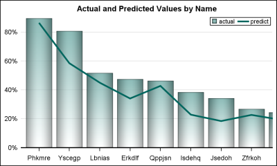
Often we have a graph with many bars (or categories) on the x or y axis. These categories may be sorted by descending response such as frequency of a % value. An example with simulated data is shown below. title 'Actual Values by Name'; proc sgplot data=bars2 noborder; vbar name /

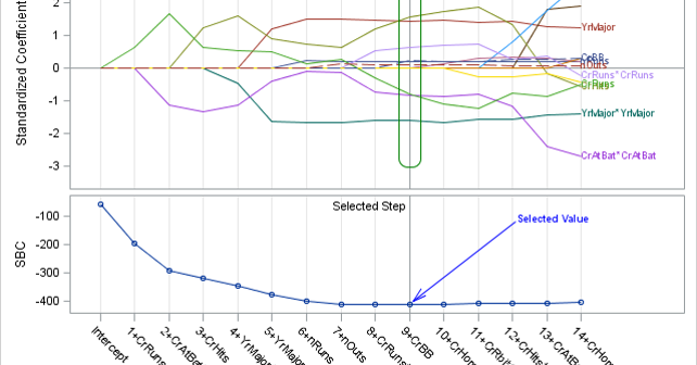
SG annotation is a powerful technique for adding text, lines, arrows, shapes, and images to graphs. This post provides a macro that can help you when you make a mistake in writing the annotations.

